We Tested Raw vs. Flashy vs. Weird—You Won't Believe Which Style Converts
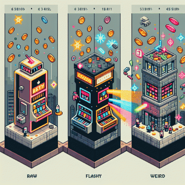
Raw: The Scrappy, Shot-on-Phone Vibe That Builds Instant Trust
Think of the scrappy, shot-on-phone clips that feel like a friend talking into your feed—raw does the heavy lifting of trust. When we tested versions side by side, these low-gloss moments cut through skepticism because they look usable, unscripted, and human. People convert not just from spectacle but from believable demonstrations: a real hand opening a box, a quick before-and-after, or a candid testimonial framed against a messy kitchen table.
Turn authenticity into a repeatable formula: hook in the first three seconds with a clear problem, keep shots tight to the subject to avoid wandering attention, and use natural light for flattering, believable color. Add readable captions because many watch muted. Limit each clip to one main idea, and end with a simple, direct call to action that feels like advice rather than a hard sell. Little edits are fine; heavy polishing kills the vibe.
- 🆓 Relatable: Show imperfection—smudges, quick retakes, real reactions—to lower doubt.
- 💁 Practical: Demonstrate use cases in 10–20 seconds so viewers can picture ownership.
- 🚀 Repeatable: Create short templates you can film in bulk to keep freshness high.
Operationalize the style: A/B test raw assets against flashy and weird variants, measure CTR and micro-conversions (clicks, signups, add-to-cart) over a 7–10 day window, then double down on winners. Keep a catalog of raw angles to rotate so authenticity does not become formulaic. In short: be honest, be quick, and let genuine moments do the converting work for you.
Flashy: High-Gloss, Big-Budget Energy—Does It Really Pay Off?
Flashy creative is the cinematic, high gloss stuff: drone shots, neon palettes, celebrity cameos and polished sound design. It wins attention in busy feeds because humans are visual and attracted to spectacle. That attention can be expensive, and the production bill usually arrives with a shock, so the question is not whether it dazzles but whether it delivers.
It shines for brand launches, hero product reveals, holiday bursts and audiences that expect spectacle. To convert, the big idea must carry a clear value proposition and speak like a real customer, not a studio pitch. Use one unmistakable promise per spot, test variations with small audiences, and favour action-first creative over long cinematic indulgence when your goal is revenue.
Practical fixes to make the sparkle pay include aligning the hook to your price point, compressing the narrative into the first three seconds, and pairing the creative with a direct response landing experience that matches tone and offer. Add UTM tagging, measure micro conversions and short term ROAS, and if you need a quick audience boost for tests, try get free instagram followers, likes and views before you scale production spend.
Budget smart: allocate 20 to 30 percent of the campaign to creative testing rather than just media, and repurpose a hero video into cards, stories and thumbnails to lower per format cost. Track add to cart and initiated checkout as early warning signals, kill creatives that get clicks without downstream intent, and scale winners in sensible steps rather than all at once.
Quick mental checklist before green lighting glossy production: is the promise crystal clear, does the CTA match the landing copy, can the asset be sliced into multiple formats, and is there a test plan with KPIs? Flashy converts when strategy outclasses glitter. Do that and the shine will start paying the bills.
Weird: The Left-Field Hook That Stops Thumbs Cold on Instagram
Think of a left-field Instagram hook as a tiny mental speed bump: it doesn't try to be beautiful, it interrupts the scroll. Unexpected visuals — someone ironing a banana, a mime ordering tacos — force a pause because curiosity is a more powerful ad currency than polish. Neurologically, the brain flags anomalies and assigns attention, so a deliberate oddity is shorthand for "watch this." Aim for intention so the audience asks "what next?" instead of "is this broken?"
Start with a 0.8–1.5 second anomaly: a weird camera angle, an offbeat sound, or an object behaving like it has its own agenda. Layer in an abrupt cut or a tiny reversal and you've got a micro-story that hooks. Use real people, pets, or found props; keep it relatable so the oddity invites, not alienates. Shoot five variations fast, publish them as short reels, and keep the one with the strongest early retention.
Don't let weird be meaningless — pair it with a quick payoff in the next 2–3 seconds so viewers connect the oddity to your message. Use a bold caption or a one-line sticker to reframe the strange as relevant, and ask a tiny micro-question in the caption to spark comments. That combination turns eyebrow-raising into memorability and makes CTAs feel playful instead of pushy.
Actionable plan: storyboard three left-field openings, film them raw in natural light, publish as A/B reels, and track drop-off at 1s, 3s, and 6s. If retention climbs, promote the winner with a modest spend and document the exact hook variables to replicate. Weird isn't a gimmick — when used with rules, it becomes a repeatable conversion lever you can scale.
The Showdown: What We Measured, What Moved Metrics, What Missed
We measured everything that actually matters: click-through rate, conversion rate, time on page, bounce, scroll depth, social shares and revenue per visitor. Tests ran across matched audiences with identical targeting and landing templates so the creative style was the only variable. We paired analytics with heatmaps and session replays to catch micro-behaviors - where people hesitated, scrolled, or abandoned - so the results reflect real movement, not vanity.
The surprise: raw creative punched above its weight for bottom-funnel goals. Straight talk, clear benefits, and visible proof nudged visitors to convert more often. Flashy treatments were excellent at generating curiosity and CTR but often left visitors confused and increased bounce unless the landing cue matched the spectacle. Weird creative excelled at grabbing attention and shares, extending session length, and feeding organic reach but required a follow-up mechanic to monetize.
What missed expectations? Fancy animations without faster load times, mismatched CTAs, and one-off novelty that failed to explain the offer. In many cases the style did not fail; the execution did: poor hierarchy, unclear next steps, or friction in the checkout flow. Actionable fix: tighten your headline to promise, make the CTA the obvious next move, and remove form fields that do not earn their keep.
Practical playbook: if you want conversions, favor raw with bold social proof and a single, frictionless CTA. If you want reach, use flashy but pair it with a low-effort micro-conversion (email or discount). If you want virality, lean weird and capture interest with a gating step. Test each style head-to-head for 2-4 weeks, keep targeting constant, and judge by conversion lift plus downstream value, not clicks alone. Try it once, get weird, then optimize for money.
Steal This Playbook: When to Go Raw, When to Go Flashy, When to Get Weird
Stop guessing and start routing creative to outcomes. This playbook gives clear cues for when to strip everything back, when to dial up the fireworks, and when a weird pivot might earn you a viral lift. Expect concrete triggers, tiny experiment designs, and measurement rules that turn gut calls into repeatable wins.
Begin with three lenses: audience state, funnel stage, and risk budget. New prospects need clarity; engaged fans want delight; category skeptics crave novelty. Match funnel goals to one primary KPI, commit to three creative variants, and run tests for 7 to 14 days so results are actionable, not anecdotal.
- 🆓 Raw: Use when authenticity sells. Candid footage, minimal edits, and real user POVs drive trust and social proof. KPI: conversion lift and lower CPA from believable storytelling.
- 🚀 Flashy: Use for scale and attention. Fast cuts, bold hooks, and motion graphics boost clickthroughs and view retention. KPI: CTR and view-through rate that feed efficient funnels.
- 💥 Weird: Use to break category blindness. Strange humor, surreal edits, and unexpected beats earn shares when targeted tightly. KPI: virality signals and share rate to identify breakout creatives.
Operationalize it: rotate creatives into flight two, pause any that hit 2x baseline CPA, and double down on winners that lower CPM or lift conversion. Standardize a one page brief listing goal, KPI, hook, asset specs, and test length so teams ship fast. Treat the playbook like seasoning: the right mix of raw, flashy, and weird is what actually converts.