We Tested Raw vs. Flashy vs. Weird—Guess Which One Crushed It
Raw: Imperfect, honest, and shockingly high converting
Forget the polish: the rough-cut phone video, off-kilter framing and candid voiceover make people stop scrolling because they recognize a real human doing something honest. That sense of authenticity reduces friction—viewers assume the product exists, the reviews are real, and the CTA isn't a smoke screen. In our tests, these raw creatives consistently lifted click-to-conversion ratios by creating instant trust where glossy ads only created envy.
How to make this work: open with a small imperfection or problem, then show the real fix; keep edits minimal—let pauses breathe; show a real user's face or a product in context; label claims with quick social proof (screenshot, sticker, short quote); and finish with a short, human CTA. Focus on one emotional beat per asset and resist polishing every frame.
Run micro-experiments: swap a glossy thumbnail for a raw frame, test a candid voiceover versus a narrator, and compare 10–15 second cuts to longer honest takes. Track watch rate, click-through, and post-click time on site. If the raw version nudges retention even a few percent, compound gains will outpace occasional spikes from flashy creatives.
Try this 10-second script on your next ad: 'I bought this on a whim, it actually fixed the problem — here's $5 off code'. Keep the camera imperfect, speak like a friend, and measure. Raw isn't lazy— it's strategic: low-cost assets, fast learning cycles, and surprisingly high conversion because real beats staged when people are deciding in a second.
Flashy: When dazzle delights—and when it drives people away
Flash gets eyeballs fast. Bright colors, glossy motion, and a pinch of bravado can stop thumbs mid scroll and spark immediate curiosity. That initial lift is the whole point: flashy creatives are attention magnets that give campaigns a fighting chance in crowded feeds. Use them to open the door, but remember opening the door is only step one.
When dazzle converts, it does so because the shine points to something valuable behind the curtain. Pair bold visuals with a clear promise, a simple action path, and social proof so interest becomes trust. If you want more reach to test that shiny concept, try this starter boost: get free instagram followers, likes and views to validate demand quickly without draining your creative budget.
Yet too much flash can push people away. Overstimulation creates cognitive noise, and flashy content without substance signals manipulation. If metrics show low time on page, high bounce, or squinty comments, dial it back. Swap a hyper animated opener for a focused hook, reduce color clutter, and make the call to action obvious. Run small A B tests so you learn whether the dazzle helped or distracted.
Quick action checklist: Goal: Are you aiming for awareness or conversion? Audience: Do they prefer spectacle or subtlety? Follow up: Does your landing experience match the promise? Use flash to attract, but design the second interaction to deliver. When done thoughtfully, dazzle delights. When done thoughtlessly, it deserts you at the finish line.
Weird: The pattern-breaker that stops the scroll and starts conversations
You know that moment when the scroll finger pauses for no reason other than curiosity? That's your opening. Weird content interrupts the brain's autopilot with something odd but meaningful — a tiny jolt that converts a glance into a double-tap, a share, or a comment. Make the oddity earned, not just noisy.
Why it works: humans love patterns, and when one breaks we pay attention. Novelty triggers dopamine, social brains tag it as "worth talking about," and algorithms reward engagement. Actionable rule: keep the core message clear, then wrap it in a playful mismatch — a surreal visual, a contrarian line, or a format flip that still points back to your value.
Three quick weird plays to try right now:
- 💥 Contrast: pair a polished product shot with a silly prop to create cognitive dissonance and curiosity.
- 🤖 VoiceSwap: narrate customer benefits in an unexpected persona or absurdly formal tone.
- 💁 FlipCTA: use a bizarre micro-commitment (e.g., "If you're brave, tap") to boost interaction.
Test like a scientist: A/B the weird version against a control, track CTR, comment rate, watch time and DM frequency. If comments rise and viewers stick around, you've got a conversation starter, not just a click. Scale by dialing up the oddness in small steps and monitoring sentiment to avoid alienation.
Launch checklist: 1) pick one core message, 2) choose one unexpected twist, 3) run a small split test and iterate. Keep the weird honest, measurable, and repeatable — strange enough to stop the scroll, clear enough to spark the chat you actually want.
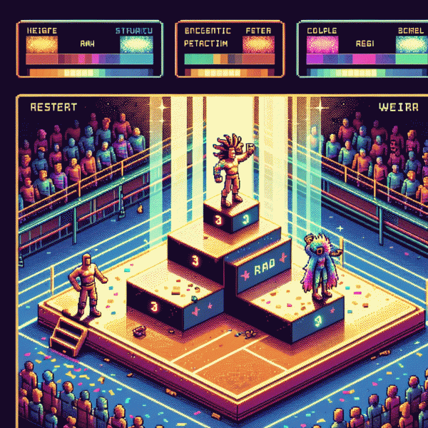
Proof, not vibes: The split-test metrics that crown a champion
We left the "gut" at the door and let metrics argue. Instead of debating which creative "felt" right, we tracked click-through, conversion rate, time-on-page, share velocity, return visits, and cost per acquisition. We also monitored cohort behavior and heatmaps to spot friction points. These are the numbers that separated curiosity from cash — flashy creatives pulled eyes, raw ads pulled conversions, and weird experiments lit up shares. The point: the real winner is the variant that objectively improves business outcomes, not the one that scores best on vibes.
Design the split like a scientist: randomize users across three arms (raw, flashy, weird), keep targeting and offer identical, and declare your primary KPI up front. Aim for statistical power around 80% with alpha at 5%, or follow a rule of thumb of roughly 1,000 unique visitors per variant or 100+ conversions per arm to get reliable signals. Use sequential testing if launching many changes at once, and avoid peeking until pre-registered stopping criteria are met unless you apply proper corrections.
Do not trust a single metric. Use a primary metric tied to revenue (for most direct-response tests that is conversion rate) and keep secondary lenses like CTR, engagement time, and share rate to catch downstream effects. A pragmatic scoring approach: 40% conversion lift, 25% CTR, 20% time-on-site, 15% shares. Also run a sanity check for novelty bias, since weird creatives often decay after the novelty effect fades; layering retention and CAC helps reveal true winners.
Final checklist you can act on: set KPI, compute sample size, run full window, test for significance, compare CPA and retention, segment by device and audience, then iterate on the winner. Numbers will still surprise — flashy can win attention, weird can win virality, raw can win dollars — but crown your champion with data, not vibes, and your next campaign will start from evidence instead of guesswork.
Your next move: A remix framework to fuse styles without losing brand voice
Think of the remix framework as a beatmaker for brand voice: pick a steady spine (the one benefit your audience actually remembers), then layer texture swaps—tone, tempo, and visual flourishes—so each track feels fresh without losing the chorus that makes you recognisable. Start small: one post, one audience segment, one measurable goal.
Want a fast way to stress-test combos? Use a safe growth toolkit to seed experiments and watch how different audiences react to each remix. Try tools that let you scale tiny tests and gather real signals, like action rates and DMs. For a quick launchpad, check out get free instagram followers, likes and views to simulate reach and see which styles spark conversation.
- 🆓 Raw: Keep it honest and immediate; pair with close-up visuals and first-person captions to drive trust.
- 🐢 Flashy: Go high-gloss and kinetic; use bold typography and upbeat pacing to grab scrollers.
- 🚀 Weird: Inject odd details and unexpected metaphors; reward attention with surprise resale value.
Execute like a scientist: define the hypothesis, isolate one variable per test, and run each variant to a minimum sample before deciding. Swap one element at a time—voice, color, CTA phrasing—so you can credit wins to a single change. Track qualitative signals too: comments and saves often reveal nuance that raw metrics miss.
Remixing is not remixing for its own sake. Treat every mashup as a sketch that can be refined into a signature act. Keep the spine intact, let the edges play, and iterate until the audience sings along. Try one tiny remix today and double down on what actually moves people.