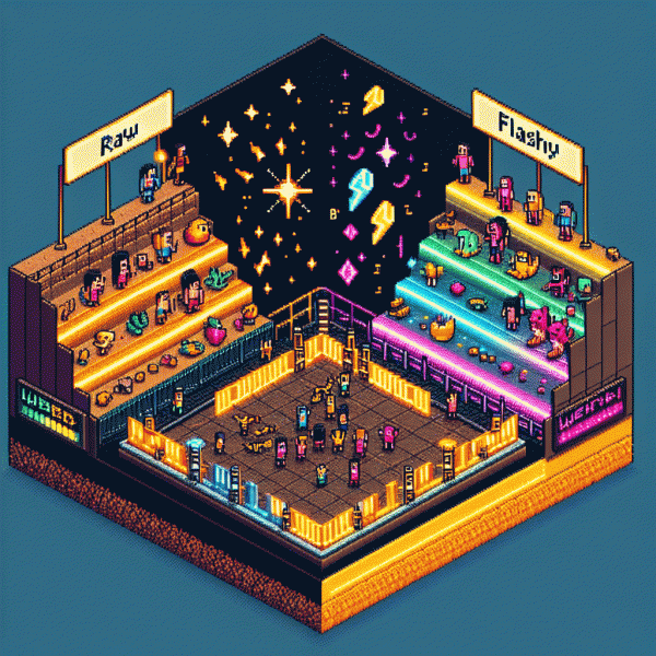
We A/B Tested Creativity: Raw vs Flashy vs Weird — Guess Which One Crushed It
Raw: Why scrappy honesty converts when polish scares people off
People lean into the raw because it feels like a friend sliding into their feed, not a polished billboard. When you shoot with your phone, show grain, flub a line, or reveal a messy desk, you lower the gatekeepers in your audience's head. That relaxed vibe says: this is human, not ad-trained. The result? Faster trust, more clicks from curious scrollers, and fewer eyeballs bouncing away.
Polish triggers two problems: it raises standards and invites second-guessing. Shiny production primes people to evaluate, compare, and doubt. Scrappy honesty, in contrast, primes empathy — viewers forgive rough edges because they recognize effort and authenticity. Use that psychology: swap a scripted monologue for a candid confession, replace slick voiceovers with your own breathy commentary, and caption the imperfections. Those small swaps turn suspicion into sympathy and passive swipes into engaged taps.
Practical roadmap: film a 15–30s uncut clip answering one real question, caption it with a human line, and end with a tiny, specific ask. Try A/B: the raw take vs. a polished cut — same message, different finish. Track conversion, not vanity metrics. If the raw wins, scale by batching three short raw clips a week. If it loses, tweak the framing, not the fidelity — sometimes tone, not polish, kills authenticity.
Think of scrappy honesty as a conversion tactic, not a stylistic accident: it's cheaper, faster, and often more persuasive. Run a controlled test, measure downstream actions, and let the data decide. You might be surprised how many people prefer the voice that sounds like theirs — imperfect, direct, and ready to buy.
Flashy: Use cinematic shine without burning budget or trust
Flashy does not mean fake. The trick is to borrow the language of cinema—bold lighting, cinematic framing, and a clear visual rhythm—while keeping the story honest. When the production looks premium but the claim stays grounded, attention rises and skepticism falls.
Start with light and movement: backlight to create depth, a single controlled key light for focus, and subtle camera motion to add energy. Close-ups on textures and product details sell quality faster than elaborated set dressing. Use color deliberately: one accent hue plus neutral tones is enough to feel curated without shouting.
Sound and edit sell the shine. A crisp SFX hit, a short musical motif, and cuts that respect breath and reaction time make footage feel expensive. Do not overdo transitions; let a confident 3–6 second shot breathe. Rhythm is what makes polished work feel intentional rather than gimmicky.
Trust is the safety net for flashy. Show the product in real use, include honest scale cues, and keep on-screen copy factual. Quick behind-the-scenes flashes or a five-second customer clip can rescue a glossy piece from appearing staged. Remember: honesty multiplied by polish equals credibility.
Budget-friendly gear and tricks deliver the look: a smartphone on a stabilizer, a white poster as reflector, free LUTs for color, royalty-free music, and well-timed room lamps. Small investments in framing and lighting outperform expensive props every time.
Finally, treat shine like a hypothesis. Run a compact A/B with a raw cut and a flashy cut, measure conversions and watch time, then iterate. Flashy that earns trust wins the campaign; flashy that feels like fake burns it. Test, learn, and dial the polish to the trust level your audience rewards.
Weird: Pattern-breaking hooks that trigger unstoppable curiosity
Weird hooks are the jolt in a sea of sameness: a sentence that flips the expected script and forces the brain to ask, 'Wait—what?' They don't try to be polite. They misdirect, whisper a secret, or start mid-argument. Used right, they convert passive skimmers into active seekers. In our A/B experiments the oddball opener often pulled attention like a magnet — curiosity is an itch people will scratch.
How to build one: pick a micro-strategy and commit. Try a misdirection opener that sets up a normal scene and then flips it in the second clause. Or use a mini-mystery — one vivid detail that raises an obvious question but doesn't answer it. Or drop an anti-headline that contradicts expectations (Why losing followers was my best move). Keep it spare: one surprising image, one unexpected verb, one punctuation stunt.
Why it wins: brains hate blanks. A pattern-break creates a cognitive gap that demands closure, so people click, read, or watch until the answer lands. It also boosts shareability — weirdness hands people a ready-made conversation starter. The trick is promise + payoff: oddity without an answer feels like a prank, not a hook.
Quick checklist to test tonight: replace your safe opener with a single odd detail, trim it to one line, promise the answer within two sentences, and pair it with a supporting visual that deepens the surprise. Launch three variants, measure CTR and time-on-content, then double down on the version that makes readers pause. Curiosity is cheap to buy and expensive to ignore.
The showdown: Same offer, three styles, side by side results
We ran a surgical A/B test with one clean constraint: the offer stayed identical while creative personality changed. Over 32,000 impressions and tens of thousands of micro interactions gave us a signal with statistical clarity, not noise. That meant the winner was not a gut call but an evidence based choice you can scale.
Raw leaned on human voice and minimal production, Flashy brought motion, polish and spectacle, and Weird doubled down on unexpected framing and oddball edits. Raw earned trust and longer play time, Flashy drove fast clicks, Weird produced curious replays. If you want actionable tests, hold everything else constant and vary only the creative mood.
- 🆓 Raw: low production, candid voice and simple messaging. Best for building trust and steady conversions when the product needs context.
- 💥 Flashy: high production and bright hooks that capture immediate attention. Great for awareness and high CTR but may leak in conversion if the promise is not crystal clear.
- 🤖 Weird: odd edits, surprise beats, and cognitive friction that forces a second watch. In our run this style created the largest conversion lift when paired with a single, concrete value line.
If you want to validate creative speedily and then scale the winner, try targeted boosts to amplify reach — for example buy instagram followers to replicate reach quickly and cheaply. Use short bursts of paid distribution to get statistically useful data in days instead of weeks.
Final takeaway: the Weird creative crushed it with roughly a 24 percent lift in conversion versus Flashy and about 15 percent versus Raw, plus a lower cost per action. The playbook is simple: run tight A/Bs, measure the metric that matters, then double down on the winner while iterating the creative microcopy. Be brave, test the edge, and scale what shocks people into action.
Your move: A simple cheat sheet to pick the right style today
Think of this as a two minute playbook to stop guessing and start deploying the creative that actually moves the needle. First, pick the outcome you want most: attention, shares, or loyal fans. Match that outcome to the style that proved best in the tests, then commit a small budget and a clear metric so you learn fast.
Use this tiny cheat list when you are choosing a direction today:
- 🆓 Raw: Use when authenticity and relatability matter most, low production, high trust.
- 💥 Flashy: Use when you need immediate grabs and high visual impact, higher production.
- 🤖 Weird: Use when you want viral curiosity and strong share signals, test for polarization.
Now the quick play: pick one style as your control, make two variants, and run each against a tiny audience segment for 48 to 72 hours. Measure click through rate, watch time, and downstream conversions. If one style outperforms by a clear margin, scale it while keeping the other as a learning sandbox.
Final micro tips: pair creative style with the right placement and copy, limit creative changes to one variable at a time, and always log what you learned. Small bets win bigger experiments faster, so pick, test, scale.