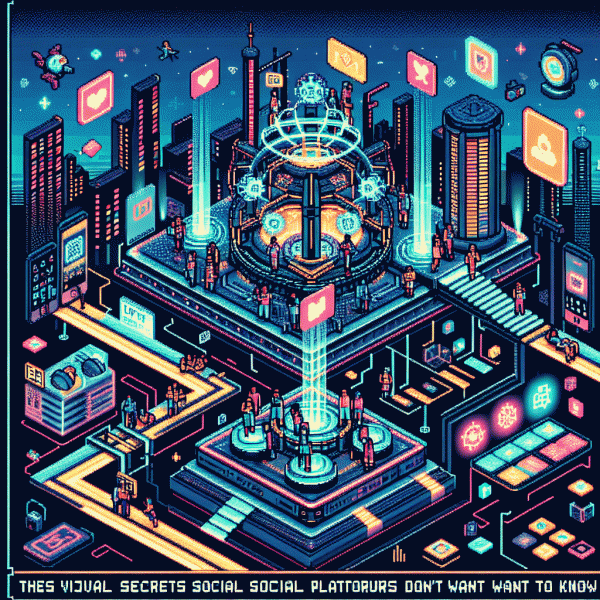
Visual Trends in 2026: The Viral Secrets Social Platforms Don't Want You to Know
Blink-and-Share Motion: Micro-Animations That Stop the Scroll
Micro-animations are the social equivalent of a wink: tiny, fast, and designed to pull a thumb off the feed. Aim for gestures under 1.5 seconds with a crisp on/off, like a sticker that pulses, a copy that slides in, or a micro-bounce on the CTA—subtle contrast is the secret sauce.
Keep motion purposeful and minimal: avoid full-screen choreography and use motion to clarify, not confuse. Favor vector Lottie for scalable icons, APNG for sharp loops, and short MP4s for video-first channels. Test exports at several resolutions because the prettiest animation can be wrecked by platform compression.
Design inclusively: respect reduced-motion settings, provide a static fallback frame, and always pair motion with clear, concise copy. Micro-animations should amplify meaning—think of them as animated punctuation that guides the eye toward the next tap or share rather than replacing context.
Measure like a growth hacker: run quick A/B tests of moving versus static thumbnails, track CTR, share rate and completion, and iterate. If motion improves clicks but hurts watch time, shorten the intro, adjust easing to an ease-out or gentle spring, or trim loops. Tiny timing tweaks move metrics more than big redesigns.
Ship faster with a lean workflow: prototype in After Effects + Bodymovin for Lottie or a lightweight animator, export minimal keyframes, compress ruthlessly and test on-device. Keep files lean (aim for sub-200KB on socials), document the single intent for reuse, and repurpose the clip as a sticker, story accent or thumbnail to multiply impact.
Color That Clicks: Neon vs Pastel - Which Palette Wins in 2026?
In a feed where attention is currency, color is your fastest coin. Neon slaps—electric hues cut through scroll-fatigue and make eyeballs pause; pastels whisper, inviting longer, softer engagement. Think of neon as a headline and pastel as the supporting paragraph: each earns different kinds of attention, and 2026 rewards brands that pick the right tone for the right moment.
Use neon when you need immediate, thumbnail-piercing impact: short-form video covers, promo banners, and CTAs on platforms built for rapid swipes. Pastel wins for lifestyle storytelling, product grids, and long-form pins where mood and trust matter. On TikTok and Reels, test a neon accent on the first frame; on Pinterest and product pages, let pastels set the emotional context.
Pairing is your superpower. Keep backgrounds muted and let neon act as an accent color for buttons, animated strokes, or progress bars. For pastels, introduce micro-contrast with a darker neutral for text to meet legibility standards. Always check contrast ratios and test motion: neon combined with strobe-like effects can tire viewers, while subtle pastel motion soothes.
Production-wise, control saturation and lightness in HSL rather than blindly upping RGB values; export in sRGB for platform consistency. Create a compact palette of 4–6 colors: 1 neon, 2 neutrals, 2 pastels, 1 shadow. Run quick A/B tests across ads and thumbnails for at least two weeks, tracking click-through, view-through, and engagement to see which palette actually moves metrics.
Start small: swap a hero gradient, update a CTA accent, and measure. If you want a fast win, prioritize contrast and motion over trend-chasing. In short: let neon win the skirmishes that demand clicks and pastels win the campaigns that build loyalty—then iterate until the data and your brand both glow. Try a 14-day palette sprint and treat the results like creative currency.
Real Faces, Real Fast: Lo-Fi Storytelling That Builds Instant Trust
Nobody needs glitzy polish to believe someone's voice—people buy faces, not filters. Start with a tight close-up, natural light and a stray hair or two; those details signal honesty. Keep clips short: 4–12 seconds of candid speech or reaction beats translate into immediate relatability and double-down on shareability. Think of it as a visual handshake.
Make it a habit: open with a micro-hook, tell a 15-second mini-story, close with a tiny surprise. Try this: speak like you would to a friend, show an error or blooper, then flip it into a quick lesson. Imperfection is the new premium—let it live on screen, and skip perfect lighting when it hurts the vibe.
Metrics matter: if viewers stick past the 3–4 second mark, your trust signal is firing. Encourage micro-interaction—ask a single simple question, pause for the reply, and add captions so the mute-scrollers stay in. Track watch-through and reply rates more than vanity likes; over time these tiny wins build social proof much faster than high-end polish.
Adjust the finish for each platform: vertical motion and face framing for short-form, steady two-shot cuts for feed posts, and a raw voiceover for longer stories. Keep production under five minutes; authentic edits and honest sound design beat studio sheen when the goal is connection. A two-second reveal before you speak hooks better than a scripted opener.
Treat lo-fi storytelling as an experiment: A/B your openers, reuse the same take for posts and shorts, and watch which expressions get saved or messaged about. If a clip gets comments, double down—film a follow-up in the same room. Start now with your phone and two minutes of candid footage; small, repeatable plays win attention and turn strangers into fans.
Template Gold: Memeable Formats You Can Remix in Minutes
Think of template formats as visual duct tape: cheap, sticky, and impossible to ignore when you slap the right caption on. Start with a bite-size skeleton—three to six panels, a punchy beat, and one clear hook—and you can remix for any niche in minutes. The trick isn't invention; it's iteration: clone the template, swap the asset that carries emotion (face, sound, text), and publish across formats to catch trends in real time.
Design templates with toggleable layers—background, subject, headline, sticker—and export presets for 9:16, 1:1, and story crops so one edit becomes three native posts. Add a micro-copy playbook with two caption moods (tease and payoff), three headline lengths, and a default reaction sticker. Name files with quick labels like hook_v1_aud1 to speed retrieval; these tiny rules turn indecision into momentum.
Below are three remix-ready formats that scale without drama:
- 🆓 Template: 3-frame reaction — setup, twist, reaction. Swap faces and audio to fit any niche and the emotion lands every time.
- 🔥 Template: Before/After Slide — measurable reveal with a bold stat overlay for credibility; perfect for product demos and transformations.
- 🤖 Template: Caption Challenge — one image, multiple caption lines; prompt followers to finish the joke or share their take to boost comments.
Test two variants for 24 hours, measure CTR and average watch time, then double down on the winner and file top performers in a tagged vault (emotion, tempo, format). Automate swaps for music and stickers, teach your team to remix not reinvent, and iterate with thumbnail and timing tweaks. Do this and you'll have a feed that feels fresh every day—without burning the creative studio.
Hook, Caption, CTA: 3-Second Scripts That Drive Saves and Shares
Your first three seconds are a tiny billboard: a flash of motion, a baffling detail, or a line that makes people stop mid-scroll. Treat the hook like a sprint—smash curiosity, then step back. Try a surprising stat, an odd prop, or a slow reveal that begs an answer. In 2026 attention is currency; give viewers a short question they want to answer and you will earn the extra beat needed for a save or share.
Captions are not footnotes; they are the backstage whisper that converts a glance into action. Keep it under ten words for ultra-fast feeds, or use one crisp sentence that reframes the clip as a tiny win. Lean on micro stories: one line for the problem, one for the payoff. Use a bold verb to start and a single clarifying phrase to remove friction.
CTAs in three seconds should feel like a friendly nudge, not an order. Swap bland asks for context: instead of generic praise, say save this shortcut for your next shoot or tag a friend who needs to try this. Make shareability social, useful, or prideable. Pair a visual cue like an animated arrow or quick text pop with the spoken line so muted viewers still know what to do.
Turn this into a lab: film three hooks, match each with a tight caption and one CTA, then push, measure saves and shares, and scale the winner. Celebrate micro wins and iterate fast. If you want an initial visibility boost to test creative combos, check out buy likes to seed reach, then optimize until organic actions carry the post.