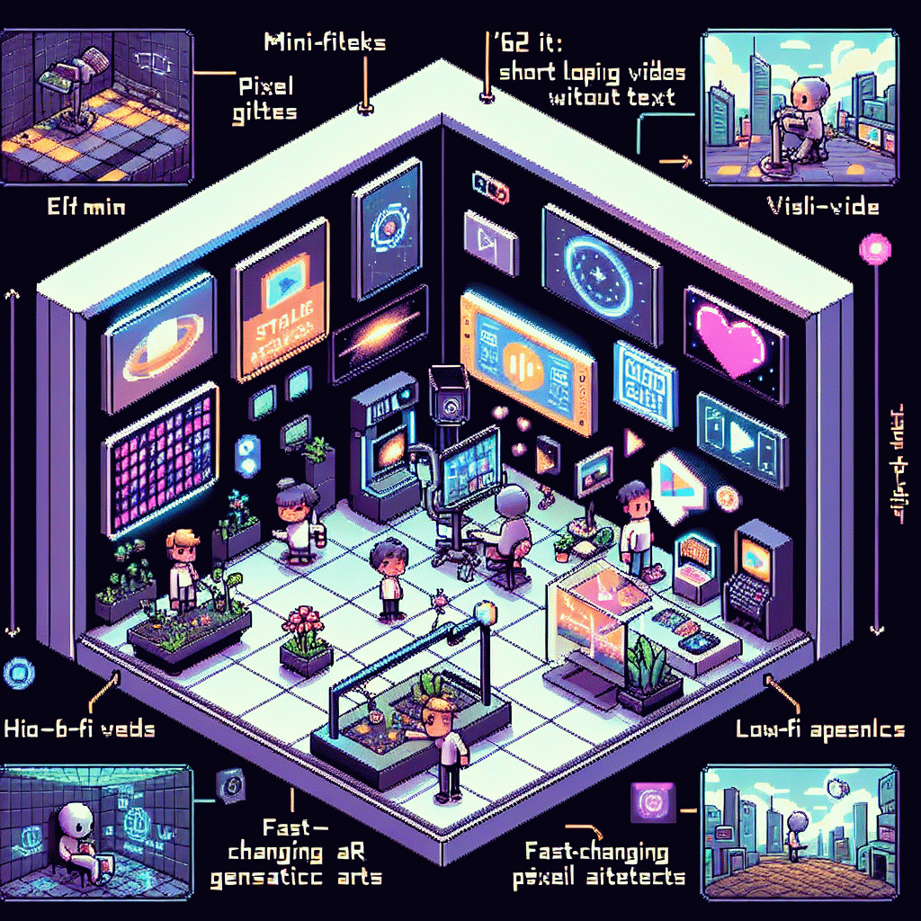
Visual Trends in 2025: What Goes Viral on Social Platforms Right Now (And How to Copy It)
Swipe-Stopping Color Palettes: Neon Pops, Cozy Pastels, High-Contrast Hooks
Color direction is the first scroll stopper. Think of palettes as personalities: neon for clickbait energy, pastels for pause-and-play coziness, and stark contrast for immediate legibility. Start every frame with a dominant tone and two supporting accents; that trio keeps feeds from looking flat, creates hierarchy, and gives creators a repeatable visual system to scale.
For neon pops, choose one saturated hue and drop it into otherwise muted scenes. Use neon for key elements only: CTA buttons, motion trails, emoji highlights, or product edges. Keep text outlines thin and place neon against dark or desaturated backgrounds so legibility survives compression. Subtle glow animation amplifies shares but avoid overuse so eyes do not tire.
Cozy pastels work when you layer warmth and texture. Pair a soft base with one slightly warmer accent and a deep neutral for contrast, and add grain, paper creases or hand drawn doodles to avoid feeling sterile. Try combinations like blush, mint and charcoal for modern comfort, and use selective sharpening to guide attention to product details or key copy.
High contrast is your fast stop mechanic: black on white, white on color, or complementary hues at high saturation. For accessibility aim for at least 4.5:1 contrast on text and test on small screens and in motion. Quick checklist: pick a hero color, assign roles (background, accent, CTA), test with motion, then A/B a neon versus pastel variant to see what actually converts.
Lo-Fi Beats Polished: The Raw Video Aesthetic That Feels Like a DM
Think of videos that land like a direct message to a friend: unvarnished, tactile, and tuned so the sound feels like a vibe rather than a soundtrack. The sweet spot is lo fi beats polished enough to feel intentional, while visuals keep handheld frames, slight color shifts, and real interruptions. That contrast makes content feel human.
Shoot tight and intimate. Use a 50 or 35mm equivalent on phone mode, move with small micro pans, and embrace small focus pulls. Let background light flare, keep shadows imperfect, and resist over stabilizing. Edit with fast jump cuts and a slow opacity fade on transitions to mimic message thread jumps. Save a raw master file for repurposing.
Audio carries the DM illusion. Start with a lo fi loop under natural room ambience, duck music under speech by 6 10 dB, and add subtle tape hiss to glue layers. Trim beats to 7 9 second loops for infinite scroll hooks. Caption aggressively so sound is optional and the vibe survives muted playback.
Frame captions as replies, pull a 3 second teaser for cover clips, and publish natively across short form platforms with vertical crops. Encourage story replies and save best DMs as highlights to build community proof. Run two creatives with slight tonal shifts to learn which level of polish converts, then double down on the winning formula.
Caption Magic: On-screen Text Formulas That Drive Saves and Shares
On-screen captions are the silent salesman of social video: they hook scrollers, translate sound-off viewers, and give folks a quick visual reason to save or tag a friend. The trick isn't shouting louder; it's structuring text like a tiny storytelling engine — immediate intrigue, clear benefit, and a micro-conclusion that begs a repeat. Nail that three-act beat and your content gets clipped, shared, and saved.
Use compact formulas that creators can copy. Try: 🪝 Hook: one shocking word or stat in 1–3 seconds; 💡 Value: two-line “here's how” or demo; 🔁 Cue: an explicit social nudge — “Save this” or “Tag someone who needs this.” Another high-conversion variant: Problem → Quick Fix → Proof → CTA. Repeatable, skimmable, and designed to survive a muted autoplay.
Design for speed: bold the most shareable phrase, keep lines to 30–40 characters, and place text where eyes naturally rest (lower third or center depending on shot). Use motion on the text—subtle slide or pop—to guide attention, but avoid heavy animation that fights readability. Always mirror captions with the voiceover timing so someone watching muted still experiences the story.
Treat captions like templates: rotate three headline hooks across a week, measure saves and shares, and double down on winners. If you want plug-and-play options, create five caption masters (Question, Stat, How-to, Surprise, Promise) and slot them into new clips quickly. Small caption experiments produce the biggest uplift in engagement—so test fast, copy what works, and watch the save counts climb.
Carousel Comeback: Frame-by-Frame Storytelling That Climbs the Algorithm
Carousels are back because they do something short videos cannot: force a gentle, scroll-stopping tempo. Each swipe becomes a micro-commitment that boosts dwell time and tells a layered story—tease, reveal, reward. Think of each card as a beat in a joke; if the setup and payoff land, the algorithm rewards you with extra distribution.
Use a simple five-step formula: hook, context, conflict, solution, payoff. Keep copy to a single sentence per card, use big type, and make sure the first frame is legible without sound. Pace matters: 300–600 milliseconds on image transitions feels snappy, while a slightly slower cadence helps complex ideas breathe.
Design tricks that lift performance: introduce a consistent visual motif across cards, add tiny motion on the second and fourth slides to create expectancy, and use a bold thumbnail that promises value. Stagger reveals so that each card nudges the eye to the next—masking, layered crop, or a partial object that completes on the following slide works wonders.
If you want a quick boost to test creative variants, try the resource get free instagram followers, likes and views to seed early engagement and validate which thumbnail or hook wins before you double down on a wider campaign.
Final checklist before publish: strong cover, first-line hook, clear single CTA on the last slide (save, share, comment), and a caption that expands the story without repeating it. Track saves and forwards as your signal metrics, iterate weekly, and treat each carousel like a serialized short story that earns attention card by card.
AI Looks That Land: Templates, Prompts, and Tools for Fast Visuals
AI-driven templates are the shortcut from idea to viral visual. Instead of designing from scratch, pick a layout, swap in a prompt and a color palette, and export a version that feels hand-crafted but was made in minutes — ideal for rapid A/B testing and to maintain brand consistency across formats.
Start with a proven template: hero portrait, motion loop, or product close-up. Pair it with a tight prompt like "neon retro portrait, soft grain, shallow depth, cinematic lighting" and run it through tools such as Midjourney, Stable Diffusion, or Runway. Add quick color grading presets to lock in a signature look fast.
When visuals are ready, promote them smart: tag niche accounts, run a targeted micro campaign, use engagement stickers and concise CTAs, and consider services like get free instagram followers, likes and views to kickstart discovery and gather the first wave of social proof.
- 🆓 Free: use open templates and community prompts to prototype without spend.
- 🐢 Slow: fine tune high-res renders overnight for premium stills.
- 🚀 Fast: batch generate short loops for Reels and TikTok to test hooks.
Pro tip: save prompt variations as named presets, standardize aspect ratios per platform, and track which prompt traits (lighting, mood, caption tone) correlate with shares. That small process turns AI novelty into repeatable reach and measurable ROI.