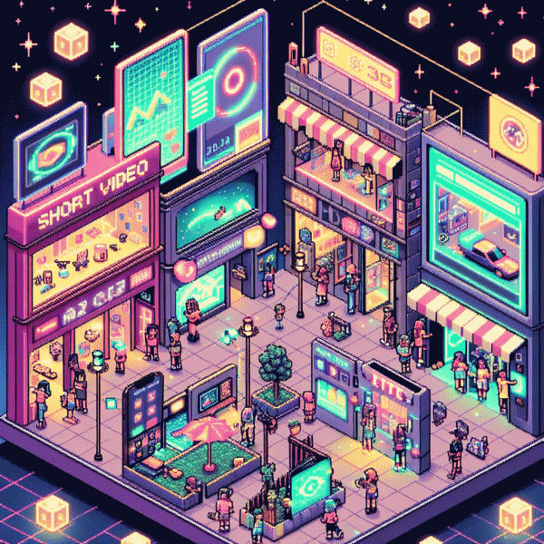
Visual Trends in 2025: What Actually Goes Viral on Social Platforms (Steal These Looks!)
Lo-fi is the new wow: imperfect visuals that outpull polish
People are tired of glossy perfection. Little flaws signal life, not ad spend. A jittery frame, a stray shadow, or a slightly off color tells viewers that a real person made this, and brains reward that with attention. Authenticity hooks faster than flawless lighting, so treat polish as seasoning not the main course.
Quick recipe to make lo fi work without losing craft: keep a clear focal point, embrace texture, and let motion be a feature. Use pragmatic tools to add life without looking lazy:
- 🆓 Raw: Use natural light, slight exposure shifts, and an overlay of grain to signal honesty.
- 💁 Human: Show hands, laughs, small mistakes, or voice cracks to build rapport.
- 🚀 Fast: Edit for rhythm not perfection; jump cuts and audio pops create momentum.
Match the level of imperfection to the platform. Short video formats reward handheld energy, while static posts benefit from controlled grain and imperfect framing. Stories and ephemeral formats want immediacy; feeds allow a little more craft. Keep brand guardrails simple so authenticity can breathe.
Practical checklist: hook in the first two seconds, write captions that finish the thought, pick a thumbnail with one deliberate flaw, and reuse winning imperfections across formats. Do not overthink it. Test small, iterate fast, and let human moments pull more views than a showroom photo ever could.
Color that clicks: neon pastels, earthy neutrals, and the 3 second scroll test
Think of your feed as a high speed gallery where the eye decides in three seconds. Start with a pairing that feels like a small surprise: neon pastels for the focal point layered over earthy neutrals as a visual anchor. The neon does the grabbing, the neutrals do the breathing room; together they read as modern and human rather than gimmicky.
Make contrast your best friend. Keep backgrounds in warm clay, moss, or sand tones and let neon pastels—mint, bubblegum, electric lavender—sit on top with crisp edges or soft glow. Avoid washing out text by applying subtle shadow or a low opacity overlay to maintain legibility for quick skimmers. This is not maximalist color chaos, it is refined volume.
Movement amplifies color. A micro animation that nudges a pastel element for 300 to 600 milliseconds will steer attention without annoying repeat viewers. Use gradients that tip from neutral to neon at an angle that follows the focal line of the composition. For portrait formats allow neon pops near faces or hands so the human element and color work together.
Run the three second scroll test like a pro: first frame clarity, second frame color tension, third frame call to action. If the message is fuzzy by the third beat, dial back texture, increase contrast, or isolate a single neon detail. Measure by impressions and dropoff, then iterate.
Color that clicks is about decision parts: bold choice, tempered context, and ruthless trimming. Swap a muted backdrop for a warmer neutral and watch the neon sing more. Ship small experiments, keep what stops the thumb, and have fun bending rules until they break in your favor.
Text on video that converts: captions, kinetic type, and bold hooks
Text on screen is the secret viral accelerant: captions rescue viewers watching with sound off, kinetic type gives personality, and bold hooks force a double tap. Treat on video text as both headline and stage direction — state the benefit fast, then show it. Prioritize readability over flair: if your copy cannot be scanned in one glance you lose viewers before the story begins. Make every word pull weight.
Captions should be native, not raw transcripts. Compress dialogue into bite sized claims and action cues, keep lines short and sync them to natural speech beats so eyes can follow. Use high contrast bars or subtle drop shadows to preserve legibility on tiny screens. Turn long sentences into two lines with a meaningful break and place the keyword where skimmers will see it first.
Kinetic type is motion with a job. Use simple transforms — slide, pop, scale — timed to cuts or audio so movement feels earned. Animate 3 to 4 word chunks rather than whole sentences to increase comprehension and rhythm. Avoid ornamental fonts in motion; pick a bold neutral face and animate position or weight. Microdelays and easing make text feel human; reserve abrupt snaps for real emphasis.
Hooks live in the first 1.5 seconds: start with a problem, a number, or a contradiction, for example Stop scrolling — 3 fixes for dry hair or You are doing X wrong. End each video with an obvious next step: watch till the end, save this, or tap for more. Test variants fast — color, placement, opening line — and double down on what moves retention and shares.
Face time beats faceless: human led stories that spark shares
People crave faces because faces make feelings contagious. Swap generic overlays for a human narrator, micro reactions, and a single scene that invites mimicry and duet culture. Close up micro expressions trigger mirror neurons and signal trust faster than slick graphics. Use tiny pauses and tics as punctuation to make the human feel alive; these small edits turn scrolling into engagement.
Pair those clips with platform plays: punchy first two seconds, natural lighting, captions for sound off, and a clear emotional arc in under 20 seconds. Then A/B test three hooks and two thumbnails to find the magnet. For platform-specific boosts try tiktok promotion booster to accelerate reach while you iterate. Authenticity plus distribution equals predictable virality.
- 🆓 Confessional: 10-20s selfie take that ends with a tiny reveal and a caption prompt for rewatch
- 🔥 Reaction: quick cut to someone reacting to a trend with a clear emotional spike and a second rewind
- 👥 Sidekick: duet or friend cameo to multiply relatability and create easy remix paths
Film five takes, keep clips under 25 seconds, prioritize eye contact and varied close ups, and edit to a three beat rhythm. Measure retention at 3 and 10 seconds and double down on the highest held shot. Budget a small paid push for the top performer and iterate weekly. Human led stories are not free luck; they are repeatable plays when craft meets a tiny distribution plan.
The remix era: templates, remakes, and reaction formats that hack reach
The internet now rewards clever recycling. Templates, remakes, and reaction formats are not lazy shortcuts; they are repeatable reach machines. When creators reuse a familiar scaffold viewers bring context and attention instantly, so the algorithm does half the work. Think of templates as choreography: everyone knows the steps, you just add a new move.
To convert a template into performance, do three things: pick a high velocity format (duet, stitch, voiceover punchline), inject a crisp brand twist in the first 2–3 seconds, and trim to the core idea so the loop is irresistible. Replace heavy exposition with a single visual surprise and a short caption that primes sharing.
Reaction formats scale emotion and relatability. Use genuine micro reactions, opposite framing, or a rapid escalation structure to keep retention high. Remix trends by swapping the sound or prop for something on brand, then test two micro variants — one safe, one bold — and let engagement decide which you double down on.
Measure reach with view to share ratios and retention curves rather than vanity likes. When a template shows consistent spikes, create a five video batch with tiny variations and repurpose native versions across platforms for crossfeed. The result: steady compound growth where familiarity breeds virality.