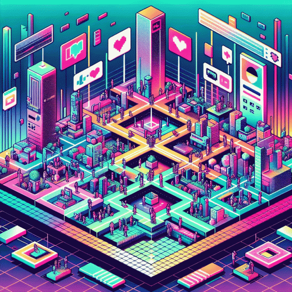
Visual Trends in 2025: The Viral Playbook Social Platforms Cannot Ignore
Hook in 3 Seconds: Patterns that freeze the scroll
Three seconds is generous on most feeds. The trick is to graft a readable surprise into that window: a high-contrast shape, a face making direct eye contact, or a micro-motion that contradicts the scene. Small, bold cues beat pretty panoramas when attention is fleeing.
Build micro-patterns, not mini-epics. Use oversized type that breaks the frame, an eye line that points to your value, and one repeating motion anchor — a looped gesture or a sudden color flash. When mute is the default, sub in captions and visual beats that tell the story without sound.
- 💥 Surprise: an odd object or cutaway in the first 0.6s that creates cognitive friction and curiosity.
- 👥 Human: close-up eyes, candid smiles, or a quick interaction that signals emotion instantly.
- 🚀 Motion: a tiny, repeated action or parallax that reads even on small screens.
Practical checklist for creators: shoot vertical, frame a 1:3 headline zone, plan the first 0.8 seconds as a standalone story, and batch variations with small timing tweaks. Test 3-second cuts and iterate — attention is the new currency, and these patterns are the deposit slips.
Bold vibes win: Maximal color, jumbo type, and in your face texture
Think loud, not complicated. Go for maximal color ramps, type that feels like a headline from a billboard, and textures that practically stick to the viewer's thumb as they scroll. A tight palette of two saturated hues plus a punch accent will hold attention; oversized letterforms establish hierarchy instantly. Use contrast like a neon highlighter: it guides the eye and makes your message legible even when someone sees a thumbnail for half a second.
Practical rules, not rules you will feel bad about breaking: choose a display face with strong counter shapes and open apertures so jumbo letters do not close up on small screens. For social thumbnails and short-form video covers, treat type as imagery — aim for big, bold, and centered but always leave breathing space. Pair heavy headlines with a minimal body texture so the message reads at a glance and the composition does not become a visual fight.
Texture is the secret sauce. Subtle grain, embossing, fabric weaves, or halftone overlays add tactile cues that translate to perceived authenticity and memorability. Combine a tactile layer with micro-motion — a gentle shimmer or parallax displacement — to make static posts feel alive. When using texture, drop a semi-opaque band behind type or increase track/line spacing to preserve clarity; texture should amplify, not mask, your words.
Make it repeatable: craft a few bold templates, A/B test color ramps and type scales, and measure CTR and save rates instead of just likes. Keep assets modular so you can swap colors or textures without redesigning everything. Do this and you will build a visual language that stops thumbs, communicates in one beat, and scales across platforms with minimal effort.
Short video still reigns: Cuts, captions, and loops that boost watch time
Micro-edits are the secret sauce of modern short video: jump cuts that skip the fluff, reaction clips that punctuate a point, and rhythm edits that match the voice or beat. Trim to intent — every frame should either inform, surprise, or entertain, and create platform-native micro-moments.
Captions aren't subtitles, they're a second camera. Use short lines, punchy verbs, and bold contrast so eyes don't hunt on small screens; prefer line breaks that land with the spoken cadence for instant comprehension.
Design loops with a purpose: hint an unresolved motion near the end, reverse a tiny action, or repeat a signature movement so the brain nudges viewers to press play again. Test 2–3 second resets and watch completion rates climb while micro-CTAs surface replays.
- 🚀 Hook: Lead with a visual oddity or promise in the first 0–2 seconds.
- 💥 Edit: Cut to beats — swap shots on transients for instant energy and clarity.
- 👍 Loop: End where viewers want to restart: motion, sound, or a question that begs an answer.
Measure obsessively: a 10–20% bump in average view duration is common after tightening cuts, caption timing, and loop points. Keep experiments tiny, iterate weekly, track micro-metrics, and celebrate the weird hacks that get people watching twice.
AI plus human touch: Visual mashups that feel real not robotic
AI plus human touch is the secret sauce for visuals that read as lived-in, not assembled-by-robot. Let the generator handle composition and unexpected ideas, then bring in the human eye to anchor reality: micro-imperfections, plausible lighting, and emotional micro-expressions that signal authenticity instead of eeriness. This combo keeps the creative spark alive while preventing uncanny flatness.
Try a hybrid workflow: start with a high-resolution source photo or 3D render, run multiple AI generations to explore variants, then mask and composite in an editor. Emphasize texture and grain, reintroduce natural shadows, and nudge skin tones with subtle color grading. Use dodge/burn, frequency separation, and displacement maps sparingly to sell depth. Small details—loose threads, reflections, breath—make a huge credibility jump.
When prompting, be specific about material, lens, and atmosphere, and use negative prompts to eliminate telltale artifacts. Iterate fast: generate, critique, modify prompts, and then refine pixels by hand. Keep a prompt log and A/B test variants to learn which human tweaks move engagement metrics. For motion, keep consistent light direction and edge softness across frames so the brain reads continuity rather than glitch.
Brands that mix algorithmic speed with human taste get more clicks and fewer 'something's off' scrolls. Start one test where every AI image gets a human pass: you'll instantly boost trust and engagement. Think of it as scalable craftsmanship—modern, measurable, and oddly human.
Go native or go nowhere: Why Instagram rewards lo fi over glossy in 2025
Think polished ads and then think again: Instagram in 2025 rewards the snackable, slightly messy clip more than the cinematic commercial. Native-feel visuals trigger more saves, shares, and replies because they lower friction — viewers accept a real face, an awkward cut, and a raw soundtrack far faster than a staged tableau. Creators and brands that sound human win.
The reason is both human and machine. Authentic clips keep attention, spark DMs, generate rewatches, and create micro-conversations; algorithms amplify those signals. That means studio-grade assets can underperform unless they mimic the lo fi grammar: handheld framing, honest captions, on-camera audio, and visible mistakes that invite reaction. Native features like stickers, polls, and pinned replies amplify the effect.
Try immediate swaps: Shoot Raw: use your phone vertical and let slight shake communicate presence. Keep Cuts: favor jump edits and fast POV moments over long, polished sequences. Sound Native: use ambient or original audio and layer concise on-screen text instead of heavy narration. Test 15–30 second Reels first and remix user clips to boost credibility.
Measure by responses, not perfection: track saves, shares, comments, reply rate, and loop count. Run small A/B experiments and move creative budget toward formats that spark conversation. The win is not a prettier feed but a straighter line to attention — and in 2025, attention builds brands faster than polish ever could.