Visual Trends in 2025: The Swipe Stopping Secrets Behind What Goes Viral
Go Lo Fi: Raw, Real, and Unpolished Visuals Audiences Trust
Lo fi visuals cut through glossy noise because they read as human work rather than agency output. Grain, crooked framing, clipped audio, and washed out highlights signal that something was made in a real moment, not in a suite. That rawness builds trust quickly because audiences learn to expect honesty, not crafted perfection.
Skip the production checklist and swap in simple, repeatable moves that scale. Shoot with your phone on a steady hand or small stabilizer, favor window light over ring lights, let background sound live, and add a whisper of grain or vignette in the edit. Make captions conversational and lead with the why behind the clip so context travels even with sound off.
Format strategy matters as much as footage. Turn a ten second candid into a vertical loop, a thirty second story edit, and a short post with slightly different hooks to test which tone wins. Measure reach and interactions across a two week window, then double down on the variations that create genuine comments and saves rather than passive views.
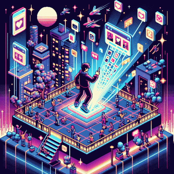
If you want to accelerate a real experiment without losing authenticity, consider a low friction proof boost to seed social proof while you iterate on creative. For a quick, practical option try get instagram followers instantly to jumpstart feedback and see which unpolished moments actually stop the swipe.
Plug In AI: Remix, Upscale, and Co Create at Speed
Think of AI like a plug in power tool for visual creative work: not a magic wand but a serious accelerant that lets you iterate at human friendly speed. Use generative models to remix raw clips and images, an upscaler to sharpen winners, and co creation features to collaborate with other makers or brief contractors without losing momentum. Tap browser plugins and API hooks to stitch these capabilities straight into your editor so the creative flow never stalls.
Start simple and make repeatability your secret weapon. Feed a single master asset, spin three variations with light prompt shifts, and tag each output with what changed. Maintain a prompt library and naming convention so teammates can reproduce results. Pick the two best variations, run them through an upscale pass, then add micro edits for narrative, cadence, or timing before export.
Balance speed with guardrails to protect brand and context. Build short constraints like a color palette, safe margins for faces and logos, and a max text threshold so visuals remain legible at a glance. Use model seeds and style tokens to keep brand signals consistent while allowing playful divergence, and pair automated QA checks with one human pass to catch nuance that models miss.
Treat every run as an experiment: log prompts, outcomes, and engagement signals, iterate weekly, and store golden iterations in a vault for future remixes. With a handful of disciplined habits, remixing, upscaling, and co creating stops being random hype and becomes the engine behind swipe stopping visuals that scale.
Make It Move: Kinetic Type and Bold Color That Stop the Scroll
Motion works like visual caffeine: even a subtle slide or bounce can interrupt autopilot scrolling. Use kinetic type that follows a clear rhythm — snap to a beat, drift in with purpose, or punch in like a headline. Combine movement with a fearless palette: high contrast hues, one neon accent, and a grounding neutral so the color pop reads as deliberate rather than noisy. That pairing makes viewers linger.
Make every frame earn its place. Animate only what communicates, not what decorates. Use weight changes, scale shifts, or staggered letter timing to build hierarchy inside a single line. Keep durations tight: 200 to 500 milliseconds feels human and fast. Favor cubic bezier easing that mimics physical motion. And always preview on a phone to confirm legibility at native scale.
Match motion to platform behavior. Short loops and bold single-frame hooks work for vertical video feeds; micro motions and bright overlays win thumbnails and story tiles. Respect accessibility: provide high contrast color combos and a static fallback for users who prefer reduced motion. Test colorblind-safe palettes and avoid relying solely on hue to convey meaning.
Turn these ideas into experiments. Build three quick variants: one with playful scale, two with rapid type beats, and three with a loud color switch. Measure attention with clickthroughs, swipe rate, and view time. Iterate on the winner, keep the motion honest, and let bold color do the heavy lifting for immediate scroll stopping power.
Own the Short: Instagram Reels That Drive Clicks and Saves
Hook the thumb: open with a visual surprise in the first half second and place a clear focal subject in the center. Movement, contrast and a readable overlay beat dead pixels. Add bold color grading and a thumbnail frame that promises value. Vertical first framing keeps composition safe and immediate.
Edit for rhythm: favor 1 to 3 second shots, fast enough to energize but slow enough to land meaning. Use jump cuts, match cuts and repeating motifs to build a loopable pattern. Add punchy captions timed to the beat so viewers on mute still feel the cadence and message.
Make sound work: trending audio is discoverability fuel while original voice bytes build identity. Layer a short signature sound early to trigger recognition and invite remixes. Keep subtitles tight and readable. When audio reinforces the visual punch you get more rewatches, higher completion and more saves.
Design for utility and saves: teach one clear thing per Reel. A single hack, a micro checklist, before and after, or a template people will want to reference. Use on screen steps, timers and a final card that prompts Save this for later. Practicality creates bookmarks.
Test, iterate and treat each Reel like an experiment: swap thumbnail text, shift the opening 0.5 seconds, try different stems and measure saves and clicks. Use micro experiments with one hypothesis at a time. Small bets and fast learning beat perfect production when chasing true attention.
Be Meme Native: Borrow the Format, Keep the Voice
Memes are not a permission slip to abandon style; they are a design brief for brevity, timing, and shared language. Think of formats as public infrastructure: the jump cut, the format template, the punchline rhythm. Borrow the scaffold, then drape your own voice over it so people recognize the brand before they even read the caption.
Start by mapping the mechanics of the meme you want to use. Where is the reveal? What role does sound play? Which frame gets the laugh? Then apply three practical lenses to adapt it to your brand identity:
- 💥 Trend: Spot a format that matches your customer mood and map a simple twist that aligns with what you sell.
- 🤖 Tone: Match the cadence and attitude but translate sarcasm, sincerity, or silliness into your brand vocabulary.
- 💁 Template: Keep editing patterns and timings intact so the meme feels native on sight.
Execution matters more than originality here. Use existing assets—customer reactions, behind the scenes, product shots—and reframe them in the meme layout. Test multiple captions and sounds in small batches, measure completion and share rates, then double down on variants that look organic. Micro-experiments win because virality is not magic, it is repeatable behavior tuned by quick feedback loops.
Finally, commit to a voice-first rule: if a format forces you to act out of character, skip it. The best meme-native campaigns are those that feel inevitable for the brand, not forced for trends. Iterate fast, fail cheap, and scale the versions that make people pause, laugh, and hit share.