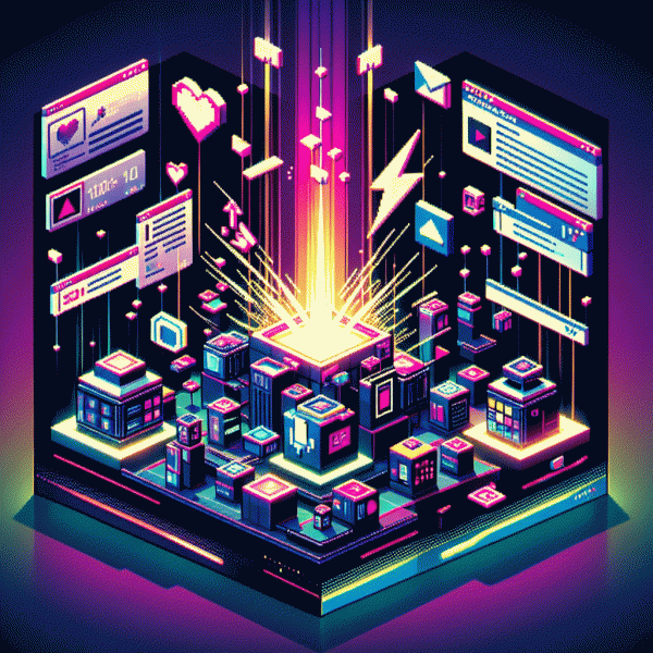
Visual Trends in 2025: Swipe-Stopping Secrets Behind What Actually Goes Viral
Lo-Fi Wins: Why unpolished, real visuals beat glossy perfection
Forget polish for a second: people pause for the imperfect. A slightly shaky frame, a phone-panned reveal, or a hastily-timed laugh feels like a human hand reaching through the screen — and that hand is magnetic. Lo-fi visuals cut through glossy fatigue because they promise something real, immediate, and easy to mimic. When someone sees a clip they think they could shoot themselves, they don't just like it; they share it, remix it, and try it.
On the psychology side, rough edges lower the barrier to empathy. Perfection creates distance; authenticity invites participation. Algorithms reward signals that come from engagement — comments, saves, duets — and unpolished content is often the spark for those behaviors because it asks viewers to fill in the missing pieces. Surprise beats spectacle when everyone's already staging a spectacle.
Want to lean into lo-fi without looking lazy? Keep these micro-rules in your pocket: Be candid: film like you're telling a friend one quick idea; Embrace textures: grain, voiceover breaths, and real lighting add character; Make it repeatable: create a 7–12 second format others can copy; Invite participation: end with a tiny, genuine ask — mimic this, add your caption, or duet this — instead of a polished CTA.
Try a two-week experiment: swap one produced post for a raw takeaway and measure saves and shares. If numbers climb, double down; if not, iterate until the voice sounds human rather than staged. The secret isn't low budget — it's low distance: visuals that feel like people, not productions, are the ones worth swiping for.
Text on Video That Converts: Fonts, captions, and placements that hook in 3 seconds
First 3 seconds decide if viewers stay. Choose a bold sans serif for primary copy and a neutral secondary for context. Make headline height big enough to read at a thumb scroll, roughly 9 to 12 percent of vertical height. High contrast wins; avoid hairline scripts and novelty fonts that kill retention.
Captions are not subtitles. They are hooks. Keep lines short, four to six words max, and surface the value proposition in frame zero. Time captions to match beats so the eye lands on the promise within three seconds. For rapid growth tools and services visit real and fast social growth.
Placement matters more than ornament. Use top third for attention grabbing headlines to avoid platform UI. Bottom third can hold captions but nudge them above progress bars and action buttons. Keep critical text outside 10 percent safety margins and avoid covering faces and gestures that drive emotional connection.
Motion makes text alive but not dizzy. Animate with quick slide or scale in 150 to 300 ms, then hold long enough to read. Use subtle easing and avoid long floaty fades. Localize captions and upload SRT files so international viewers convert even when sound is off.
Ship fast, test faster. A/B one variable at a time: font family, size, or placement. Measure retention at 1, 3 and 7 seconds and iterate on the winner. Quick checklist: one bold font, short leading, high contrast, top headline, caption above controls. Then repeat until feed stops scrolling and celebrate tiny wins.
Color That Clicks: The 2025 palette driving saves and shares
Color is the fastest way to stop a thumb. In 2025 the palettes that earn saves and shares pair confident pops with grounded neutrals—think hyper-saturated coral beside warm clay, or electric teal softened by beige. Those pairings create instant curiosity in crowded feeds when you use clear negative space and a single focal accent that points to your call-to-action.
Testable rules beat trends. Use a simple 3-color system and treat the accent like a button: change it, do not redesign. Keep typography high-contrast, and prefer layered flat gradients rather than noisy textures so visuals read at 1:1 and 9:16 equally.
- 🔥 Hierarchy: Use one dominant hue, one supporting, one accent to guide the eye and CTA.
- 💁 Contrast: Ensure legibility at thumbnail size with bold overlays and 4.5:1 contrast where possible.
- ⭐ Mood: Choose temperature-first: warm palettes spark nostalgia, cool palettes signal calm or tech.
Actionable next steps: create two thumbnails that differ only by accent color and A/B for 24–48 hours, lock winning combos into templates, and keep an accessible-hex swap file. Color is not decoration—it is a conversion engine. Swap one color in your next post and see which audiences hit save.
AI With Taste: Filters, templates, and prompts that still feel human
Think of AI as your sous-chef for visuals: it plates ideas fast, but you still choose the seasoning. Filters, templates, and prompts that taste human don't scream 'generated' — they respect mood, context, and the tiny imperfections that make people pause and relate.
Start simple: pick a single emotional cue (warmth, humor, curiosity), lock a short palette, and apply one subtle texture or grain. Generate three quick variations, run a tiny A/B test on a micro-audience, then edit the best for real-world lighting and facial micro-expressions before scaling.
- 🆓 Constraint: Fewer choices spark distinct, brand-aligned results — set limits and watch creativity bloom.
- ⚙️ Template: Build modular frames for captions, crops, and overlays so every creative keeps the same human tone.
- 🤖 Prompt: Lead with mood + concrete detail (angle, prop, feeling) and add a negative line to ban AI clichés.
Use negative prompts to strip out artifice, add real-world props and minor asymmetry, and write directions like a director: mood, camera angle, and a single relatable detail. Keep a handful of signature templates and microcopy so iterations stay fast without losing the brand's human fingerprint.
Swap one filter, tweak one prompt, and watch which posts actually stop thumbs. Want a shortcut? Try curated prompt packs and ready templates that put taste first — they behave like a creative teammate, not a robot, and get you viral-ready faster.
Hook, Hold, Reward: Story arcs that keep vertical watch time sky high
Think of each short as a promise you make and either keep or break. The Hook is the visual bet: a kinetic motion, an odd detail, or a compositional lie that pulls eyes in during the first second. Pair that first-frame stunt with thumbnail-first-frame choreography so fast scrollers get an immediate grammar of your story — color, motion, and a touch of mystery.
Keeping viewers is choreography. The Hold is built from micro-questions, mid-video pivots, and smart pacing: answer part of the question, then raise the stakes with a tactile detail or a surprising cut. Captions should comment, not transcribe. Use sound cues sparingly — intro, tension, payoff — and design your edits to invite loopability so the ending nudges viewers back to the top for a second watch.
Payoffs must be honest and fast. The Reward lands in the final 10–20% with a how-to reveal, satisfying twist, or emotional catharsis that makes the clip worth saving and sharing. Make the value extractable: a single line to screenshot, a crisp before/after, or a visual gag that resolves. If someone can explain your short in one sentence, they're far likelier to save it or send it onward.
Run three tight experiments: swap two 3-second hooks, test a mid-video pivot versus a straight path, and compare an explicit payoff with a more mysterious ending. Measure average watch time, rewatch rate, and completion lift, then bake the winning arc into a reusable vertical template. Repeatability beats novelty alone — scale the story arc and watch vertical watch time climb.