Visual Trends in 2025: Steal These Viral Looks Taking Over Social Platforms
Thumb-Stopping Color: Neon pops, moody monos, and the return of pastel power
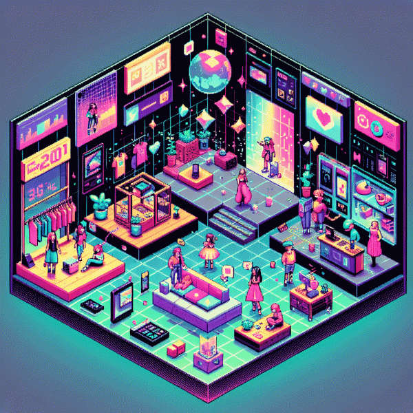
Color in 2025 is not subtle; it is a weapon for creators who want pause, not just likes. Neon pops slice through endless scrolls, moody monos deliver cinematic breath, and pastel palettes quietly reclaim attention with a tactile, premium feel. Play with scale: tiny neon trims on a massive muted canvas, or a pastel backdrop with one saturated focal point. Quick test: change one dominant color on three thumbnails and measure watch time.
For neon: treat it like a highlighter not a wallpaper. Deploy neon for CTAs, animated glows, rim light, and frame accents; place it against deep charcoals, rich navy, or near black to maximize perceived brightness without blowing out skin tones. A recipe to copy: neon pink + deep blue + soft warm gray equals bold yet readable. If you want fast engagement boosts try get instagram followers fast while you refine visuals and test placement.
Moody monochrome is more than grayscale; it is a layered study in tone and texture. Build depth with ink blacks, soot grays, and faint highlights, then introduce film grain, subtle vignettes, or a single warm or cool color cast to steer emotion. Actionable trick: desaturate the whole frame except one element at 10 to 20 percent saturation, boost midtone contrast, and keep text large and airy to maintain legibility on tiny screens.
Pastel power comes back modern by increasing intentionality. Ramp up midtone saturation, pair pastels with stark geometric shapes or bold typography, and add tiny neon bites to avoid appearing washed out. For product photography, use pale backdrops that let shadows read and employ one midtone as a scene director to guide the eye. Final tip: run weekly thumbnail A/B tests across platforms, track CTR and watch time, then iterate on the winning palette.
Face Time Wins: Candid close-ups, micro-expressions, and perfectly imperfect authenticity
Close-ups are the new currency: candid faces, micro-expressions and perfectly imperfect authenticity stop the thumb. A raw smile, a blink, a tiny furrow—small moves deliver big trust signals. For anyone building visual momentum on social, lean into the face; it creates instant connection and tells stories faster than product shots.
Practical moves: frame tight—eyes should take about one third of the vertical space. Shoot at eye level, use soft natural light, and favor a 35–50mm equivalent for flattering proximity. Capture reaction, not pose: ask a surprise question, hand over an object, or cue a memory. Keep the camera rolling; micro-expressions live between beats.
Edit for texture, not perfection. Preserve pores, stray hairs, and tiny flaws to sell authenticity. Use quick trims that respect timing, nudge contrast, and apply minimal color grading. Replace heavy filters with subtle exposure work and a touch of grain for cinematic warmth that still feels human.
Brand playbook: spotlight customers and employees in close-up sequences. Pair a short on-screen quote with a lingering face for credibility. Show hands and product interactions near the face to communicate function and feeling in one frame. Optimize for vertical feeds and mute-first viewing by adding concise captions and clear context.
Quick action checklist: Frame: tighter crops, Prompt: provoke real reaction, Edit: minimal touch-ups, Publish: vertical + captions, Measure: engagement spikes on views and comments. Swap one staged post for a candid close-up this week and test which micro-expression sparks the biggest lift.
Text-on-Video That Converts: Big fonts, kinetic captions, zero-fluff hooks
If your video does not stop the scroll within a second, the message never gets a chance. Treat type like a sonic boom: loud, fast, and impossible to ignore. Use oversized, no-nonsense sans-serif fonts and high-contrast backgrounds so text reads on small vertical screens without squinting. Make the first frame act like a billboard for your idea.
Practical design constraints that actually convert: keep lines to 2–4 words, use roughly 36–60% of screen width for legibility, and aim for 1.5–2 seconds on screen per short phrase. Swap weight for size by bolding keywords and keeping supporting copy light. Prefer system-safe or variable fonts for consistency across devices and to avoid awkward fallbacks.
Kinetic captions are the secret weapon. Animate copy with simple moves — subtle pop, slide on the beat, or gentle scale — and sync each motion to audio accents or visual cuts. Favor smooth easing, limit simultaneous effects, and always test captions at 50% volume because many viewers watch muted. Also include clear closed captions for accessibility and retention.
Hooks must be zero-fluff: open with a promise, a number, or an eyebrow-raising fact in the first frame. Try formats like Save $200 in 7 days or Stop wasting hours — direct, urgent, curiosity-pulling. Run curiosity-based versus benefit-based hooks to see which drives higher clicks and better watch-through rates.
Quick playbook: test three font sizes, two animation styles, and two hook openers per major post; track CTR and watch-through rate, not vanity impressions. Sync thumbnail, first frame, and caption so the same idea lands everywhere. Small experiments beat perfect theory: iterate fast and let the data pick the winner.
Lo-Fi Is the New Hi-Fi: Raw edits, jump cuts, and 9:16 that doesn't try too hard
Forget glossy polish: audiences are flocking to clips that feel lived-in, not produced. The charm is in the quick breaths, the unstitched beats, and a 9:16 crop that looks like a friend filming you from the couch. That rawness lowers the barrier to entry and raises watch-time — viewers forgive glitches, they don't forgive boredom.
Shoot on your phone, hold it vertically, and lean into imperfect framing. Natural window light, a messy desk, or a noisy cafe become assets when they tell a story. Keep takes short: record 10–20 second moments and let the edit do the heavy lifting.
Edit with jump cuts and a sense of rhythm — chop the fat, keep the core. Skip overlong transitions and heavy color grading; instead use punchy audio hits, subtle speed ramps, and text overlays that move with the frame. Speed and personality beat polish every time.
Formats that work: micro-tutorials that show three quick steps, honest blooper reels, behind-the-scenes micro-docs, or POV moments with tight captions. These aren't polished ads; they're snackable experiences people share because they feel real.
Try a three-post experiment: Day 1, a raw how-to; Day 2, a mistake montage; Day 3, a candid reaction. Track retention and iterate — you'll find that the new high fidelity is emotion, not resolution.
Trend Recipe: Hook in 1 second, payoff by 5, save-worthy tip by 10
You have roughly ten seconds to turn a casual scroller into a repeat watcher — treat it like speed dating for attention. Hook in the first beat, deliver a satisfying payoff by the five-second mark, and drop a save-worthy nugget before the ten-second bell. Below is a compact playbook you can copy-paste into any vertical video or short-form edit.
Hook (0–1s): start mid-action, use a bold visual, or lead with a tiny mystery line that makes people stop. Think jump-cut to the climax, a rapid close-up, or a one-line tease: 'You won't believe this trick' or 'Stop scrolling—try this.' Big motion, high-contrast color, or a loud sound at frame one wins clicks.
Payoff (by 5s): resolve the tease fast. Show the result, a before/after, or the key reveal with a tight match cut and a clear caption. If it's a how-to, show one tiny step that proves the method works; if it's a punchline, land it and let the visual breathe for a beat. Keep edits snappy and the narrative arc obvious.
Save-worthy (by 10s): give a reusable takeaway that viewers want to revisit—think a micro-template, a 3-step checklist, or a hack they can apply immediately. End with a soft CTA like 'save this for later' and a visual cue pointing to the save icon. Quick template ideas:
- 🆓 Free: One-line swipe caption people can copy — '3 words that stop thumbs.'
- 🔥 Fast: 3-step checklist to recreate the shot in under a minute.
- 🚀 Boost: Hook+Payoff script: 'Lead with shock → show fix → show result.'