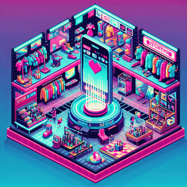
Visual Trends 2025: The Viral Looks Social Media Cannot Resist
From Micro Memes to Macro Moments: Image formats that turbocharge reach
Short, sharable images win attention in the feed while bigger formats convert that attention into memory. Think of micro memes as the snackable dopamine hit — stickers, reaction GIF loops, and 1:1 animated thumbnails that trigger clicks. Macro moments live on the other end: immersive carousels, vertical video covers, and cinematic story sequences that maximize watch time and saves.
Choose formats with purpose. For discovery, favor square and portrait previews that pop on mixed feeds: 1:1 for grid cohesion, 4:5 or 9:16 for portrait-first platforms. For deep engagement, use multi-frame carousels or stitched Reels that build narrative arcs. Always set a frame for the thumbnail so your micro meme looks like a promise of a macro payoff.
Repurpose with surgical precision. Slice long clips into 3 to 10 second micro reels, extract stills as branded stickers, and combine them into a carousel that teases the full story. Small looping motion on the first card will stop the scroll; the following cards deliver context and a reason to save or share. Use consistent color anchors and a single typographic voice for faster visual recognition.
Measure like a designer and iterate like a comedian. Track completion rates, share velocity, and saves, then double down on the formats that turn shares into follows. If you want to accelerate experimentation on Instagram, try get free instagram followers, likes and views to test which visual hooks scale with real audiences.
Quick checklist to start today: pick a hero frame, craft a 3-second loop for the first view, design one carousel cover that teases a story, and schedule A/B tests across two formats. Small memes spark interest; big moments seal the relationship. Repeat fast and keep the visuals hungry.
Color That Clicks: 2025 palettes that stop the scroll
Color is the first impression and the last nudge. In 2025 that nudge needs clarity plus a wink: high-contrast palettes that read instantly on tiny screens, mixed with a human touch that stops people mid-scroll. Think of color as choreography—lead with one dominant hue, support with a complementary accent, and give the eye a calm neutral to rest on.
Trendwatch picks for platforms this year are practical, not precious. Neon trims on soft pastels create motion in stills; biotech greens and iridescent teals add trustworthy futurism for wellness and tech brands; cozy clay and milk-chocolate neutrals make product shots feel tangible. Actionable rule: limit to three core colors, check contrast for legibility at thumbnail scale, and apply a single consistent highlight color for CTAs.
Want quick recipes to swipe? Try these simple formulas and adapt by audience:
- 💥 Vivid: Punchy neon accent + clean white background for product focus; great for fashion drops and limited offers.
- 🤖 Futuristic: Biotech green + muted slate + holo gradient for tech demos and AR previews.
- 🔥 Terracotta: Warm clay + soft beige + deep chocolate for lifestyle and food content that perks up the feed.
Finish by testing: create three 1:1 thumbnails with one palette each, run a 24-hour engagement test, and keep the winner. Small tweaks in saturation and overlay opacity can double click rates, so treat color like conversion copy. Play, measure, and then make that palette your brand anthem.
Lo Fi to Wow Fi: Low lift video tactics that hook attention in seconds
Make short, raw feeling video that looks effortless but signals craft. Start with a striking first second: a color pop, a quick movement toward the camera, or a sound cue that makes the thumb stop. Use vertical framing, natural window light, and one stable focal point so viewers can decode the message instantly. Keep clips short — 1 to 3 seconds each — and let rhythm do the heavy lifting.
Use micro‑formulas that scale: open with a curiosity hook; show the change or reveal; close with a tiny, repeatable action. Edit with jump cuts, fast zooms, and a single animated caption style so every clip reads as part of a series. Swap music tracks until the beat locks with your cuts; sound is the fastest attention converter.
Batch content with low setup: three angles, three micro-ideas, one light source. Turn each take into multiple cuts for reels, stories, and shorts. If you want a quick nudge in reach, try this small growth move: get free instagram followers, likes and views — it amplifies early momentum so your Lo Fi edits hit Wow Fi distribution.
Keep templates lean and branding subtle. The goal is a thumb‑stop in seconds and a memory in minutes. Start with one tactic this week, measure plays to watch time, and scale what lifts engagement. Low lift, big surprise: that is the new Wow Fi.
Face, Text, Motion: The trifecta behind share worthy carousels and short video
Think of the feed as a stage: a face hooks attention, a line of text keeps curiosity, and motion seals the memory. When those three elements align, carousels and shorts stop the scroll and invite taps, saves, and shares. This trifecta is less about flashy effects and more about human cues — eye contact, a surprising microcopy twist, and movement that feels inevitable rather than gratuitous.
Start every asset with a face that reads the camera: close framed, expressive, and readable even at thumb size. Layer bold microcopy—one punchline per card or a single caption that earns the next swipe. Add motion that amplifies the idea: parallax to imply depth, a tiny gesture to sell emotion, or a controlled reveal that rewards attention. Build quick test matrices: swap the face, trim the copy, tweak motion timing, and measure card by card.
Try these three shareable combos:
- 🆓 Free: Close up smile + one line hook + subtle head nod
- 🚀 Fast: Mid action shot + urgent microcopy + whip pan reveal
- 🔥 Slow: Slow motion detail + poetic caption + lingering beat
Make these formulas part of your production checklist so editors can swap faces, copy blocks, and motion presets in minutes. The payoff compounds: a small lift in card retention multiplies organic reach. Run a weeklong A B loop, scale the winner, and let humans, not gimmicks, drive virality.
Steal This Template: Repeatable visual systems that build brand memory
Want a visual system people recognize before they read the logo? Treat design like a recipe: predictable, remixable, and delicious. Start by deciding what never changes — the signal — and what can play. That signal might be a punchy color stripe, a cropped portrait, or a micro-illustration stamp. Repeat one identifiable device across formats and followers stop reading for meaning and start spotting you in the scroll blur.
Build the template with strict constraints: Palette: three hues (one anchor, one accent, one neutral). Type: two fonts max — one headline, one body. Layout: a 12-column grid with fixed margins and a signature safe zone. Treatment: a consistent photo filter, border, or icon overlay. Those limits make remixing fast and keep memory cues consistent across posts.
Operationalize it: create five modular masters — cover, quote, list, product, CTA — then batch-produce with placeholders for copy and image. Save export presets for each platform size so assets look native from tiktok to pinterest without manual fiddling. Train one teammate to be the template guardian: a single quick tweak there propagates across everything and keeps the system coherent.
Measure what matters: track recognition signals like saves and returning viewers, plus conversion lift. Run small A/Bs that swap only one element (stripe color, photo crop) to see what flips attention. Refresh the system only when your recall metrics fade; otherwise repetition compounds memory. Constraint breeds creativity — steal the structure, then make it unmistakably yours.