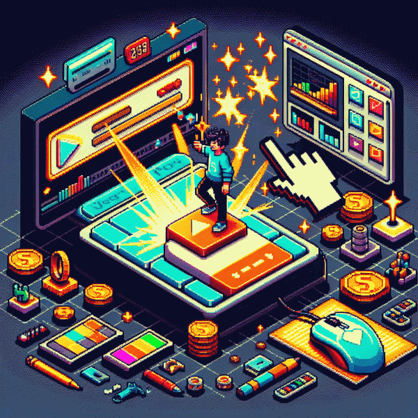
This One Thumbnail Fix Blew Up My YouTube Clicks
Why Thumbnails Beat Titles Every Time on YouTube
Thumbnails are the visual handshake before anyone reads a single word; they land in a feed and decide whether someone pauses or keeps scrolling. A punchy image communicates emotion, context and immediate value in a glance. While a title explains, the thumbnail is the first impression that either opens the door or closes it. That is also why micro-improvements matter: a small crop or color tweak changes behavior.
Humans are fast scanners. On mobile you get milliseconds to make an impact, and faces, color contrast and clear focal points win that race. A smiling or shocked face, bold contrast and a readable overlay cut through noise. When attention is the scarce resource, visuals beat text because the brain processes images far quicker than written language. Neurology favors pictures — visuals shortcut interpretation.
Make thumbnails do the heavy lifting: use high contrast, a single strong subject, and big readable text that reinforces, not repeats, the title. Crop tight on faces, push emotion, and remove clutter so the thumbnail reads at thumb-size. Also keep a consistent brand element so viewers recognize you in a crowded feed. Treat thumbnails like quick experiments — change one element at a time and measure CTR and view duration.
The title still matters, but think of it as backup vocals: it supports the hook your thumbnail sings. Align promise and delivery so the click converts into watch time, not a bounce. Track CTR, average view duration and retention curves, then iterate — small thumbnail wins compound into big channel growth. Over weeks, catalog-level changes shift viewer expectations and subscriptions follow.
Stop the Scroll — Make the First Pixel Count
Imagine the first pixel as a speed dating handshake: you have a split second to convince a stranger to keep looking. Start by choosing one clear focal point — a face, a product, or a bold icon — and remove distractions. High contrast and tight crops force attention, while a slight vignette or outline separates subject from busy backgrounds. Text should be a whisper, not a lecture: one short phrase, very large. Consider rule of thirds or a centered crop depending on the subject and platform.
Color is your secret weapon. Pick a dominant hue that pops on mobile and pair it with a neutral so the eye does not wander. Boost saturation for thumbnails that will shrink to postage size and increase contrast between foreground and background by at least 20 percent. Scale up the primary subject 20 to 30 percent to improve legibility at low resolutions, use a heavy type weight for instant readability, and keep logo placement consistent for channel recognition. Subtle drop shadow or edge highlight can separate subject from clutter without adding noise.
Want to validate which micro changes actually move the needle? Run two thumbnails against each other in a short test and feed them a little external traffic to speed up statistically significant results. If small samples are too slow, a controlled boost can help reveal winners faster: buy youtube views. Set the test to a few hundred views per variant, track CTR, and treat the result as directional input for the next iteration.
Track the first 48 hours for CTR and the first minute for retention. If CTR is low, iterate quickly: adjust crop, tweak the headline, swap the color, or simplify the composition. When a winner emerges, roll it out across playlists and cards. Tiny, repeatable thumbnail wins compound into major channel growth when the first pixel finally earns its keep.
The 3 Second Test — Would You Tap It
Three seconds is not dramatic hyperbole; it is the real-world stopwatch for a scrolling eyeball. In that snap viewers are asking three silent questions: who is this for, what will I get, and do I feel anything? Make the answers instant. Swap tiny clutter for a clear face or object, amplify one emotion, and shrink text until it reads at a glance — then run the test again.
Run the 3 Second Test like a lab: show the thumbnail on a phone, count to three, and note whether someone taps. Repeat with strangers, teammates, or even your cat if you have to. Use this quick checklist to judge fast:
- 🆓 Clear: Can you identify the subject in one glance without reading?
- 💥 Emotional: Does the image trigger curiosity, surprise, joy, or outrage?
- 🚀 Action: Is there a clear reason to tap now rather than later?
If you need signal fast, a small controlled boost can validate winners before you rework a dozen thumbnails. For quick, testable reach try buy instant real youtube views to gather early CTR data and stop guessing which version wins. Use paid data sparingly as a probe, not a crutch.
End-game hacks: punch up contrast, crop tighter on the face or object, keep text under three words, and make the facial expression legible at 10% size. Track CTR per variation, iterate two at a time, and commit to the one that clears the 3 Second Test consistently. Small tweaks here compound into big click gains.
Faces, Eyes, Big Text — Human Cues That Pull Clicks
Faces are like neon signs for the brain: we lock on them before we read anything else. Use a clear, well-lit close up with a single expressive face to give viewers an instant emotional anchor. Crop tightly so the face fills roughly a third to half of the frame; that scale reads as intimacy on a tiny phone screen and forces attention in feeds.
Eyes act as built-in pointers. Have the subject look toward the thumbnail text or the action you want people to click on — gaze direction creates a visual arrow. If the subject looks at the camera, you get connection and trust; if they look off-frame, you suggest motion and curiosity. Frame the eyes with contrast and sharpening so they survive compression and small thumbnails.
Big text should be brutally efficient: three words max, bold type, high contrast, and one dominant color accent. Think of it as a headline billboard for a palm-sized screen. Pair short verbs or emotional hooks with the face so the eye travels naturally from expression to message. Avoid ornate fonts and thin strokes that vanish at low resolution.
Emotion is a multiplier. Exaggerated but authentic expressions—surprise, delight, outrage—make people pause. Boost saturation subtly and keep background clutter minimal so the emotional read is instant. Always export thumbnails at the largest required size and preview at 320px wide to confirm legibility.
Action checklist: choose one face, pick an eye direction that points to your copy, use 1–3 strong words, test two expressions, and preview on mobile. Small tweaks to these human cues often produce the biggest click lifts.
Steal This Simple Thumbnail A B Testing Loop
Think of this as a tiny laboratory for thumbnails: pick one obvious winning tweak (bigger face, brighter background, bolder text), create two clear variants, and let data tell you which one earns clicks. The magic isn't in secret design hacks — it's in a repeatable loop you can steal, automate, and scale so every upload learns from the last.
Run the loop like a scientist: create Variant A and B, split impressions, measure CTR + short-term watch time, declare a winner, then iterate with a new variable. You don't need a huge budget to get reliable signals — you need consistency. Want a simple way to decide pacing? Pick one below based on how fast you want results:
- 🆓 Free: use organic traffic only; run each test until you have ~1–2k impressions over ~48–72 hours.
- 🐢 Slow: boost impressions with a tiny paid promo; collect cleaner data in ~24–48 hours.
- 🚀 Fast: run a modest paid split test for immediate volume and faster statistical confidence.
When you analyze, focus on CTR lift first, then short-term retention — a bigger thumbnail CTR that tanks watch time isn't a win. Test one variable at a time, keep titles consistent, and favor high-contrast, emotional faces, short punchy words, and a single focal point. Ship tests every upload, stash winners as templates, and you'll compound small uplifts into real click growth. Try this loop on your next video and watch what a single consistent process does to your numbers.