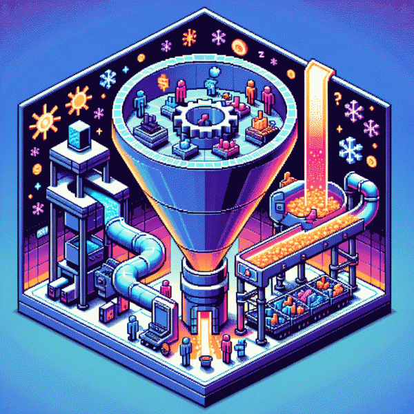
This One Funnel Turns Cold Social Traffic into Hot Buyers (Copy It)
Stop the Scroll: Hooks and Creatives That Spark Instant Curiosity
Stop hoping a pretty image will do the heavy lifting; your creative needs a jab to the curiosity nerve. Lead with a single clean puzzle: show a surprising visual, pair it with a one-line tease, then let the first two seconds of motion answer just enough to make people keep watching. Think of it as bait that rewards attention immediately—the faster the promise is implied, the quicker cold scrollers become qualified viewers.
Use three repeatable formulas that scale: 1) Curiosity Gap — open with an odd detail then promise the reveal (e.g., "Why this $5 trick saved my ad budget"). 2) Contrast + Benefit — present a common mistaken belief, then flip it with a clear upside. 3) Micro-Story — thirty seconds, a relatable character, one pain point, one surprising solution. Swap visuals and verbs, keep the language punchy, and always end each creative with a micro-CTA that hints at the next step.
Frame for thumbs and sound-off feeds: bold text overlays, high-contrast close-ups, and faces angled toward the camera. Optimize the first frame as a headline—if the caption fails, the thumbnail must convert. Layer in audio cues that align with your edit so the ad works whether the viewer has sound on or off. Replace generic stock with one specific prop or reaction to anchor authenticity.
Don't fall in love with one asset—treat each hook like a hypothesis. Run fast A/Bs on headline, first-frame copy, and opening 3 seconds; track CTR, retention at 3–10s, and micro-conversions. When a variant wins, scale it into a short test matrix of audiences and placements. Repeat, prune, and turn those scrolling strangers into warm prospects who actually click your offer.
Warm Them Up: Lead Magnets and Low-Friction Offers That Build Trust
Cold social clicks become buyers when you stop treating them like instant customers and start treating them like curious strangers who need a quick win. Start by offering something that feels like a tiny victory: a one-page cheat sheet, a 3-minute setup video, or a micro-audit that highlights one obvious improvement. That small result builds trust faster than one long sales page.
Design lead magnets with a single outcome in mind. Pick one pain point and solve it completely in 48 hours or less: a caption swipe file that removes writer's block, a checklist that fixes a common profile mistake, or a diagnostic quiz that hands someone a clear next step. Make the value obvious in the headline and deliver instantly via DM or email so curiosity turns to appreciation.
Pair those magnets with low-friction offers that feel like natural next steps. Think $7 tripwires, 7-day trials, or 15-minute mini-sessions. Price low, ask for little information, and make the purchase a tiny commitment that proves value. If the first paid step overdelivers, the path to higher-priced products becomes effortless.
Sequence matters. Opt-in, deliver the value immediately, then follow with two to three gentle touches: a personalized DM or comment reply, a short case study email, and a retargeted creative showing social proof. Keep messaging human, reference the original magnet, and use micro-CTAs like 'Try this for 7 days' rather than hard-sell language.
Measure small signals: open rates, DM replies, and tripwire conversion. A headline change or faster delivery can move the needle more than a new product. Iterate on fulfillment speed and clarity, not on complexity. When trust is earned in tiny steps, cold visitors become engaged prospects who are happy to buy.
- 🆓 Free: instant deliverable that solves one micro-problem within minutes.
- 🚀 Fast: a low-cost tripwire or trial that requires minimal effort to start.
- 💥 Priced: a clear next offer that upsells only after the first value exchange.
Bridge the Gap: Landing Page Flow That Nudges Micro-Yes Decisions
The landing page is not a battleground for a single yes; it is a corridor of tiny agreements that warm a stranger toward a purchase. Design each screen real estate to invite a micro-yes: read a headline, watch a 20 second demo, scroll to features. Each micro-yes lowers resistance and raises curiosity.
Structure the flow like a conversation. Start with a razor clear promise and a single visual cue. Offer a simple interactive choice next — a two option toggle, a short preference chip, or a hover reveal. Then show lightweight social proof: one short quote, one metric, one logo strip. After those wins, ask for a low friction exchange such as a one field email, a free tool, or a 7 day trial.
Use tiny psychological nudges: microcopy that names the next step, progress ticks that reward movement, checkmarks that validate small actions, and prefilled inputs to save effort. Keep the primary CTA visible but deprioritize hard asks until after three micro yeses. Remove distractions: one column, one image, one clear outcome.
Measure each micro yes as its own KPI and iterate. Track scroll depth, interaction rate on the preference chip, opt in rate on the mini form, and time to first CTA click. A landing page that accumulates small wins will convert cold social visitors into hot buyers faster than any hero banner promise ever will.
Seal the Deal: Retargeting Sequences That Convert Without Feeling Pushy
Cold social traffic doesn't have to be icy. Start with micro-commitments: low‑stakes content that asks for tiny actions — watch a 15s clip, tap to learn more, save a tip. Those small gestures give you permission to follow up and let algorithms signal intent without you shouting. Use a soft retargeting window (48–72 hours) to reward early engagement with helpful follow-ups instead of hard sells.
Segment by behavior: clickers, video viewers, carousel swipers and lurkers who scrolled but didn't interact. For each group rotate three creatives and test angles—problem, demo, social proof—and swap underperformers fast. Employ frequency caps to avoid ad fatigue: aim for 3–5 impressions across seven days, and use dynamic creative to mix headlines, visuals and CTAs so audiences feel seen, not stalked.
Map a simple, human sequence: Day 1 — fast value micro-video; Day 3 — user story or UGC montage; Day 6 — low-risk offer or free resource with a tiny deadline. Alternate CTAs between learn more and see proof to lower friction. Sprinkle social proof and let scarcity be gentle. If you want to accelerate trust signals, consider a boost like buy 1000 facebook likes to increase perceived traction before the big pitch.
Measure everything: CTR, view-through rate, sequence drop-off and final ROAS. Run one A/B at a time — subject line vs creative, soft CTA vs hard CTA — and cut what drags. Keep the voice conversational; think helpful DM, not a megaphone. Do that and cold traffic melts into warm, spend-ready buyers.
Scale Smart: The Metrics and Tweaks That Unleash Profitable Growth
Start by treating cold social audiences like ice that needs a specific melt plan: measure the right things and ignore vanity glitter. Track CTR and creative engagement first, then layer in CPA, ROAS, AOV and 30/60-day LTV. Watch frequency and CPM as early warning lights for ad fatigue. Benchmarks vary by niche, but expect cold CTR in the low single digits on good creative, and a cold purchase conversion under 2 percent unless you are pairing a killer lead magnet.
Actionable tweaks that move the needle fast: rotate three distinct hooks per campaign and retire the weakest after 5 days, shorten landing pages to one clear CTA, add social proof above the fold, and cut form fields to the absolute minimum. Test offer framing side by side: discount vs bundled value vs risk reversal. If a creative raises CTR but not conversions, it is a top-of-funnel winner that needs a warmer mid-funnel message before asking for the sale.
When scaling, be surgical. Increase budgets in 15 to 25 percent increments for winning ad sets that keep CPA within target for 72 hours. Clone and test horizontally before doubling anything. Use lookalikes seeded from your highest value customers rather than top spenders only, and switch to value-based bidding once you have reliable LTV data. Cap cold audience frequency at 2 to 3 per week to avoid ad fatigue and widen creatives before widening budgets.
Finally, bake retention into the math. Measure cohort LTV at 7, 30 and 60 days, and run simple AOV lifts like one-click bundles or timed upsells to protect CAC. Set a weekly review with three metrics only: CPA trend, creative CTR, and cohort LTV. Keep experiments small, iterate fast, and let the numbers tell you when to scale so cold traffic becomes reliably hot buyers without burning cash.