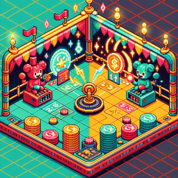
The Clickbait vs Value Showdown: One Tiny Shift That Tripled Our Conversions
Curiosity That Converts: Tease the payoff without breaking trust
Curiosity is the secret handshake that opens inboxes and scroll-stops feeds — but only when it actually leads somewhere useful. Tease a payoff that feels tangible, not mysterious for mystery's sake. The goal is to make the reader think, "I want that outcome," then show them quickly how clicking gets them closer. That tiny promise is what separates clever marketing from annoying clickbait.
Use a compact promise formula to craft teasers: Benefit + Mechanism + Timeframe. For example: "Regain two hours a week using a single calendar tweak — try it today, see effect in 7 days." That structure sets clear expectations (what), hints at how (how), and gives a deadline (when). It converts because it reduces the mental work required to imagine the result.
Keep trust by giving an immediate micro-proof. Add a one-line data point, a short quote from a real user, or a screenshot snippet so the payoff is verifiable before they commit. Language should be specific and humble: no guarantee to "double revenue overnight," but a verifiable improvement like "cut onboarding time by 28% for new users in our beta." The transparent teaser earns the click and primes the reader to follow through.
Make it actionable: A/B test two teasers — one curiosity-led, one explicit — measure CTR and downstream conversion rate, and treat the landing page as part of the tease. If CTR rises but conversions fall, pull back on vagueness. If both climb, you found a winning tone. In short: be provocative enough to hook attention, honest enough to keep trust, and disciplined enough to measure the payoff.
The 4-Point Sniff Test: Hype vs help in 10 seconds
Scan a headline for ten seconds and you will know if it is dressed up hype or real help. Use a tiny mental checklist that forces clarity: can the claim be measured, would a skeptic verify it, does the benefit land with the user rather than the brand, and is the next step frictionless. Treat this as a rapid quality filter, not a deep audit.
Four quick cues to run right away: Measurable — is there a number, time frame, or clear outcome? Credible — are there real signals like specific testimonials or case details? User-first — does the copy explain what the user gains, not what the product does? Friction — how many clicks, fields, or hoops before the promise is delivered? Mark each pass or fail.
Now put the test into action: glance headline for specificity, skim for a credible proof line, open the form to count fields, and imagine the user experience for the first minute after signup. If two or more cues fail, the page is likely clickbait. If three or four pass, the offer is primed to convert and deserves an experiment with goal-based tracking.
- 🆓 Free: Genuine free trials say duration and limits; watch for vague language that hides automatic charges.
- 🐢 Slow: Promises that require long setups or lots of inputs bleed momentum; shorten the path to value.
- 🚀 Fast: Real wins state timing and proof, for example "results in 3 days" plus a brief verified example.
Micro actions that move metrics: add one concrete metric to the headline, swap a flashy adjective for a clear benefit, surface one tiny proof line above the fold, and reduce form fields by one. Run that change against the original for seven days and measure lift. A quick sniff and one small edit is often the tiny shift that turns chatter into conversions.
Steal These 7 Value-First Hooks That Don't Feel Gross
If you hate hollow clickbait as much as your audience does, try these seven value-first hooks you can copy-and-paste without sounding slimy. Each line is built to promise one clear, deliverable benefit — the kind that earns a tiny yes from a skeptic. Use them as subject lines, the first sentence of a post, or the hero headline; pair the hook with one immediate follow-up that proves the claim.
Quick Win: "Fix this one setting in 5 minutes to stop wasting ad spend."; Before/After: "How we shaved 30% off customer churn without a redesign."; Checklist: "3 things every new hire needs on day one."
Common Mistake: "You're tracking the wrong metric — here's the one that actually predicts growth."; Template: "Copy this 3-line outreach that gets replies from cold prospects."; Case Study Teaser: "How a $0 tweak added $3k/mo to a boutique shop's revenue."; Risk-Free Offer: "Try this for 7 days — see results or we'll refund your time."
How to use them: A/B test each hook against your control for headline click rate and next-step conversion, then keep the winner and honor the promise immediately in the lead paragraph or first bullet. Swap specifics (numbers, audience, timeframe) to match your niche, keep language plain, and treat hooks like micro-commitments — small promise, fast delivery. Do that, and your copy will feel less like bait and more like helpful coffee on a rough Monday.
From Click to Keep: Deliver on the promise and bank the signup
Clicks are cheap; trust is expensive. When someone arrives after a flashy headline, what keeps them around is an immediate, believable proof that your promise wasn't a tease. Align headline, hero and CTA so the benefit is obvious, and give a concrete timeframe—if you claim "results fast," show the two-minute checklist or the metric calculator up front.
Deliver a micro-win inside the first minute. Offer a downloadable template, a one-question audit, a 30-second preview video, or an interactive demo that works without passwords. Label CTAs with the exact deliverable—"Get instant audit"—and remove friction with social sign-in or auto-fill so the first interaction feels like a tiny gift, not another bait-and-switch.
Onboarding is a product, not an email stream. Send a welcome note within five minutes, trigger an in-app tour, and present a single, tiny next step. Use contextual tips, progress indicators, and behaviorally triggered nudges—one KPI per message—so each communication helps users experience value, not just consume copy.
Back claims with quick social proof: a short case stat, one real testimonial, visible logos, and a clear guarantee. Make it low-risk to try—transparent pricing, a refund policy, and reachable support reduce churn far more effectively than clever headlines. A visible trust badge and support hours go a long way.
Measure for retention, not vanity. A/B headlines against downstream metrics, run cohort analysis, solicit micro-feedback after the first use, and reward helpful behaviors. Treat every signup as the start of a relationship: deliver value early, iterate fast, and you'll turn casual clicks into customers who stick around—and happily tell their friends.
Prove It: The metrics that separate sizzle from sales
Numbers dont lie, they just sometimes flirt. A soaring clickthrough rate is the digital equivalent of someone laughing at your joke — delightful, but it does not mean they will buy you dinner. To separate sizzle from sales you need a dashboard that shows both the applause (engagement metrics) and the bank deposit (revenue metrics).
Start by tracking CTR, bounce rate, average time on page and micro conversions (email signups, add to carts). Then layer in the heavy hitters: conversion rate, average order value, cost per acquisition and LTV. If CTR is high and conversion rate is low you have headline chemistry without a product promise; if time on page is low you have a mismatch between expectation and delivery.
Keep a tiny cheat sheet visible when reviewing campaigns:
- 🆓 CTR: High CTR means you nailed the hook. If sales lag, your landing page is underpromising or overpromising.
- 🚀 Conversion: This separates sizzle from cash. Aim to move this up before scaling traffic.
- 💥 Engagement: Longer time plus sequential actions means intent. Turn intent into a micro conversion funnel.
Actionable playbook: run headline versus proposition A/B tests, measure micro conversions as early signals, and segment by source so you dont pay for clicks that never intended to buy. Prioritize tactics that lift conversion and AOV before doubling ad spend. That tiny shift from chasing clicks to proving value is what will triple conversions, not a flash of clever copy.