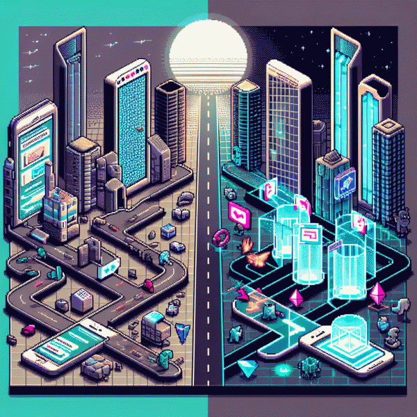
Stop Wasting Clicks: Are Landing Pages Still Necessary in 2026? The Shocking Truth
Homepage vs. Landing Page: The 5-Second Showdown
You literally have five seconds. In that short window a visitor decides whether your site is a treasure trove or a trash heap. Your homepage is great at discovery — it tells your brand story, serves many audiences, and shows everything you do. A landing page? It's a guided tunnel built to get one thing done. The showdown isn't philosophical: it's about clarity, intent, and whether you want clicks or conversions.
Try the 5-second test now: show your page to a stranger for five seconds and ask them three things — What do you get? Who is this for? What do you do next? If answers are fuzzy, you lost the battle. Fixes that work fast: tighten the headline to one benefit, remove navigation that distracts, match messaging to the ad that brought them, and give a single, bold CTA above the fold.
Quick checklist to use on both pages:
- 🚀 Focus: One primary goal per page; if you need multiple outcomes, build multiple pages.
- ⚙️ Speed: Reduce choices and load time; each millisecond and click costs conversions.
- 💬 Proof: Social proof right next to the CTA — testimonials, numbers, or logos that back your claim.
Decision shortcut: paid campaigns almost always win with a tailored landing page; organic channels can funnel to a simplified homepage or a hybrid. Always A/B test headlines and CTAs, track micro-conversions, and use heatmaps to spot where people hesitate. Stop wasting clicks: give visitors a clear door, not a mall directory.
Proof in the Pixels: Data That Still Favors Focused Funnels
Don't let shiny ads and vanity metrics fool you: when you point traffic at a single purpose page, the pixels start whispering secrets instead of shouting noise. Teams that moved from multi-purpose product pages to focused funnels report cleaner attribution and faster decision-making. You'll see fewer clicks-to-goal, clearer event chains and cohort patterns that actually explain what drove the lift — which means less arguing in meetings and more actionable tweaks.
Numbers differ by industry, but the pattern is relentless. Personalized landing pages commonly lift conversion rates 20 to 60 percent versus generic homepage experiences; removing global navigation and external links can halve signup drop-off for some campaigns; compressed paths often lower cost-per-acquisition and improve return-on-ad-spend. The trick isn't unicorn metrics, it's micro-conversions: video plays, form starts, CTA hovers — these reveal where people stall and where your funnel breathes.
If you want proof without preaching, run a focused experiment this week: pick one segment, split it between the current experience and a stripped funnel, and measure CPA, time-to-first-action, form abandon rate and 7-day engagement. Instrument everything — clicks, scroll depth, error events — so you can separate signal from spam. Small sample size mistakes are common, so prioritize statistical power and look for persistent trends, not one-day fireworks.
Here's the bottom line: data still rewards simplicity because it makes measurement honest, optimization faster and budgets more efficient. Treat landing pages like labs: form a tight hypothesis, control variables ruthlessly, iterate quickly. Do that and you'll stop wasting clicks and start turning intention into reliable growth.
Skip the Page? When Direct-to-Checkout Actually Wins
Landing pages are not extinct, but they are not always required either. When intent is high and the path to pay is short, every extra click is a leaky funnel. Direct to checkout shines for low friction buys: one clear offer, one big button, and payment options that remove hesitation. The rule of thumb is simple—if a customer knows what they want, give it to them fast.
Look for scenarios where skipping the page actually improves results, like when three conditions align:
- 🚀 Impulse: Small ticket items or flash deals that rely on emotion and immediacy convert better when the purchase flow is instantaneous.
- 👥 Familiarity: Warm audiences reached by retargeting or repeat buyers already understand value and prefer a shortcut to checkout.
- ⚙️ Simplicity: Products with no options, digital goods, or subscriptions with clear pricing need fewer decision points to win.
For implementation, A/B test direct checkout against a slim landing page on a slice of traffic, enable one click payment methods, prefill known data, and preserve tracking parameters so attribution does not vanish. Keep key trust signals visible in the checkout and layer lightweight post purchase upsells instead of detouring beforehand. Monitor conversion rate, average order value, and return rates closely; if AOV falls or returns spike, reintroduce a short persuasion step. Experiment boldly, measure precisely, and let the data decide which clicks are worth keeping.
AI Assistants, Chatbots, and Instant Forms: Are They Replacing Landing Pages?
Today's visitors expect answers in seconds, not a scroll-and-wait. AI assistants, chatbots and instant forms can pre-qualify leads, answer objections, book meetings and even process payments inside the chat window. That's fewer clicks, less friction, and a happier human on the other side — but also new UX trade-offs you can't ignore.
Use bots for rapid intent capture: short offers, quick demos, or when the value proposition is obvious. Keep static landing pages for SEO, long-form persuasion, high-ticket conversions and complex trust signals like case studies or specs. A smart hybrid often wins — let the bot gather essentials, then deliver a tiny, personalized page or downloadable asset that seals the deal.
Instrument the chat like a funnel: track drop-off steps, completion rate, average time-to-value and conversion per touch. A/B test prompts, button labels and microcopy. If a conversation stalls, fall back to a short form or send a dynamic link to preserve momentum. Segment interactions so automation handles routine asks and humans handle nuance.
Don't ditch pages overnight — experiment. Run a 14-day split test, iterate the bot script weekly, and keep analytics tight. You'll quickly see which clicks were wasted and which ones finally start paying off.
Steal These 2026 Layouts: High-Converting Templates You Can Ship Fast
Stop overthinking and start shipping: these layout blueprints are the fast lane for capturing attention and turning it into measurable action. They are minimal, mobile-first, and tuned for the modern attention span, so you get real conversion signals in hours instead of hypotheses in weeks.
Pick one of three go-to templates and deploy quickly to learn what actually moves the needle:
- 🚀 Hero-to-CTA: Big value headline, single high-contrast CTA, one supporting proof point — perfect for paid traffic with a tight promise.
- 💥 Feature-Stack: Three cards that sell benefits in swipeable order, micro testimonials under each card, and a midpage CTA for longer consideration flows.
- 🆓 Lead-Snag: One-line offer, one required field, privacy microcopy and an immediate reward to reduce friction for top-of-funnel capture.
Build these as modular blocks so you can swap hero, proof, or CTA without redesign. Prioritize load speed, readable microcopy, and a single visual hierarchy. Track one primary KPI and two secondary signals (click-to-CTA, form completion, and time-on-intent) to avoid false positives from vanity metrics.
Ship fast, run a 48-hour smoke test, then iterate: change CTA copy, headline angle, or proof type and measure lift. These templates are your click insurance — not a silver bullet, but the fastest way to stop wasting clicks and start learning what pays.