Stop Scrolling: UGC Off Social Is The Conversion Cheat Code
Turn product pages into proof pages with real customer voice
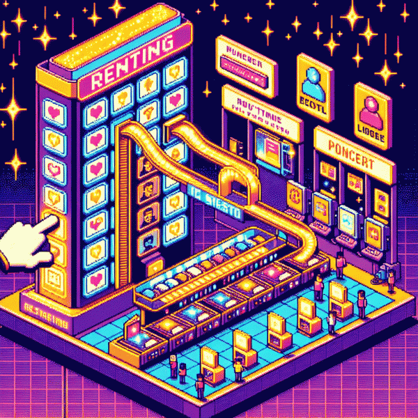
Swap long product copy for short slices of real human voice and watch skepticism melt. Pull bold, specific lines from customer posts and use them as microheadlines, not decoration. A one line quote that names the problem solved will beat a paragraph of features every time because it signals lived experience, not marketing rehearsal.
Harvest UGC off social, trim for clarity, and keep the original cadence so authenticity survives the edit. Place a 6–12 second muted clip above the fold, sprinkle short quotes beside key specs, and show the raw photo next to the zoomed product shot. Label quotes with first name and location, surface the few critical comments and show how you fixed them, and let star summaries live close to the add to cart button.
- 💬 Clips: Short, captioned videos that show the product in real use and loop without sound.
- 🔥 Quotes: One line pulls that highlight specific benefits and contain small details.
- ⭐ Ratings: Aggregated stars plus a recent review snippet for recency proof.
Measure uplift with microtests: swap a spec block for a UGC panel on 10% of traffic and watch conversion and time on page. If you see movement, scale the pattern. Treat the product page like a testimonial playlist and curate ruthlessly; authenticity is the secret seasoning that turns browsers into buyers.
Email that sells itself: plug in UGC and watch clicks climb
In an overcrowded inbox, authentic moments cut through. Plug real customer clips, screenshots and short quotes into your emails to turn skepticism into clicks. UGC does the heavy lifting: it signals proof, trims hesitation, and feels less like an ad and more like a friend recommending a win.
Treat subject lines like headline pulls: try formulas like Real results from real people, See how Jane trimmed 20 minutes off her routine, or People are switching — here is why. Keep preview text specific and tease the UGC asset so readers hit open.
Start the email with a visual: a video thumbnail or candid photo plus a 12–18 word caption and a 5-star nod or metric. Follow with one short quote and a clear link to shop or learn more. Use GIFs or autoplay-off clips to show product in action without sound.
Layer micro proof: initials or first names, city, a before/after stat, and a tiny badge like Verified purchase. Segment emails so new subscribers see welcome UGC and loyal buyers see advanced use cases. Always present one bold CTA and one unobtrusive secondary option.
A/B test thumbnails, quotes and CTA text; automate UGC-heavy flows for cart recovery, onboarding, and post-purchase feedback. Measure CTR, click-to-convert and time-on-page to see what moves the needle. Start with one UGC element per email and scale up to full UGC-driven campaigns as you collect more assets. Use clear attributions and permissions to avoid legal headaches.
Ads people actually believe: remix reviews and creator clips for ROAS
Real people talking about your product beat staged cinematography every time. Remixing candid reviews and short creator clips creates ads that feel earned instead of engineered, which reduces skepticism and nudges people toward purchase. The trick is to preserve the authentic cadence and tiny imperfections while tightening the story so the first three seconds deliver a promise that matches the landing experience.
Start by harvesting a mini-library of clips: reaction shots, micro-demos, and one-line praise. Clip: trim to 10–20 seconds where a benefit is demonstrated. Hook: lead with an unexpected moment or a quick problem statement in the opener. Close: a clear, low-friction CTA or offer line overlaid as captions. Keep edits punchy, captions on, and audio levels normalized to feel like a real conversation, not a voiceover.
Make the creative the testbed, not the campaign. Run 6–8 creative variants with a small testing budget, measure CTR, CPC, CVR and early ROAS, then pause underperformers quickly. When a remix shows a meaningful CVR lift at sustainable CPM, scale incrementally and feed performance learnings back to creators. Swap thumbnails, captions, and first-frame hooks in isolation to learn what converts versus what merely entertains.
Build this system and you will recycle footage into a predictable ROAS machine: iterate on hooks, preserve authenticity, and treat creator clips as modular assets that can be recombined for different audiences. Expect double-digit uplifts when a believable story meets precise targeting, and enjoy the pleasant surprise of ads people actually believe.
IRL wins: put UGC on packaging, receipts, and event screens
People trust what other people look like, say, and post — especially when they can see it outside a tiny screen. Turn every offline touchpoint into a tiny conversion engine by stamping real customer content where it surprises shoppers: the box, the bag, the receipt, and the big LED at your pop-up. This isn’t just decoration; it’s social proof that follows customers home.
On packaging, use bold, candid UGC snippets: a cropped selfie, a five-word quote, or a tiny handle with a clear CTA. Add a scannable QR that opens the exact TikTok/Reel of the moment someone is holding the product. Make the visual feel earned — “real” not staged — and you’ll nudge curiosity into clicks without interrupting the unboxing joy.
Receipts and inserts are underrated: swap the dry return policy for a one-liner from a fan and a discount code for sharing a photo. Micro-incentives (a 10% off on their next buy for tagging you) turn transactional paper into a social prompt. Keep copy punchy and give instructions that work with two taps or less.
At events, use live UGC walls to amplify attendees: show tagged posts in real time, throw spotlight animations on people’s content, and reward sharers with instant perks. Moderate for vibes, not perfection — authenticity converts. Tie the screen to a hashtag and an on-site redemption so social activity becomes immediate ROI.
- 🆓 Free: feature a fan quote on packaging for instant credibility.
- 💥 Quick: receipts with a single-step QR to a highlight reel.
- 🚀 Boost: event screens that spotlight tagged posts and unlock perks.
Trust everywhere: onboarding flows, FAQs, and help centers that convert
First impressions in onboarding are conversion gold. Replace staged hero photos with short 10–15s UGC clips showing real hands, real setup, and real reactions. Add a bold micro-quote like "Saved me 10 minutes" and a tiny freshness note like "Posted 3 days ago" to signal authenticity. Those tiny trust cues reduce hesitation and nudge signups toward action.
Turn your FAQ into a trust engine by pairing answers with user clips or annotated screenshots that demonstrate the fix. Follow each clip with a one-line microtestimony and a clear next step so answers feel practical, not theoretical. Tag FAQs with peer categories (beginner, pro, hardware) so users find the most relevant lived experience fast, cutting friction and support tickets.
Make the help center feel human: surface UGC thumbnails in search results, let the community upvote the clearest walkthroughs, and feature crowd-made demos in tooltips and empty states. Train your chatbot to reference those short clips—"Here is a 20s demo from Alex showing this trick"—so guidance reads like advice from a friend, not a manual.
Measure and iterate: A/B test which UGC formats lift completion rates, enforce simple freshness rules so content stays relevant, and reward creators to keep the stream flowing. Do this and onboarding, FAQs, and help become a continuous loop of social proof—low effort, high trust, clear conversions.