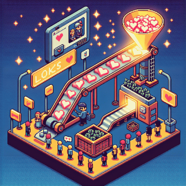
Stop Chasing Likes: The No Social Funnel That Converts Like Crazy
Traffic That Buys: Search, Affiliates, and Partnerships That Deliver
Want traffic that actually buys? Start with channels where intent is visible and actionable. Optimize for high converting keywords and seasonal queries, use negative keywords to block tire kickers, and create landing pages that mirror search copy and solve the user need within seconds. Paid search is great for speed, but the landing experience must seal the deal.
Affiliates let you scale reach while keeping risk low. Recruit partners whose audience maps to your buyer personas, pay on performance, and give them conversion ready kits: swipe copy, tested creatives, deep links, and promo calendars. Track EPCs and conversion quality, set clear payout windows, and run small pilots to weed out fraud before scale.
Partnerships are bespoke amplification. Propose co marketed bundles, joint webinars, or exclusive email swaps that introduce your offer to warm audiences. Structure a short pilot with shared KPIs and revenue share, co create hero content, and carve exclusivity windows so partners feel rewarded. Treat each partner like a mini growth channel and iterate creatives together.
Measure and optimize relentlessly: UTMs, server side events, conversion pixels, and cohort LTVs are non negotiable. A B test headlines, offers, and checkout flows, then compare CAC to true lifetime value before increasing spend. When search, affiliates, and partnerships are tuned for purchase intent and margin, you stop buying attention and start buying customers who stick.
Hook and Hold: Lead Magnet Ideas That Make Opt-ins a No Brainer
Stop chasing vanity metrics and create lead magnets that do the heavy lifting: hook attention in five seconds and hold interest long enough to capture an email. Think micro wins, not textbooks. A single, highly specific promise beats a generic ebook every time because it converts curiosity into action.
Ideas that actually work: a one page Checklist that fixes one frequent pain point; a swipe file of high-converting captions or subject lines you can steal and tweak; a ready-to-use Template Pack for pitches, DMs, or post frameworks. Each should be consumable in under ten minutes and immediately usable.
Build each magnet like a tiny funnel. Start with a clear outcome, include a short how-to or fillable template, and finish with the next micro-commitment — a 3-step checklist, a one-question quiz, or an editable file. Deliver as a PDF or simple Google Doc so it feels real and actionable.
If you want faster signal testing, amplify your reach while you refine offers with targeted promos such as instagram boosting service. More eyeballs means quicker feedback on which magnet hooks best and which headline turns visitors into subscribers.
Finally, test subject lines, placement, and delivery cadence. Track opt-in rate, immediate engagement, and the follow up click rate. Pick one magnet, iterate three times, and you will turn casual scrollers into leads without begging for likes.
One Page to Win: Landing Page Layout That Cuts Friction and Doubles Signups
Think of the page as a short, friendly conversation — not a billboard. Start with a focused headline that answers what's in it for me in one line, then a tiny subhead that removes doubt. Keep navigation off the page, show one clear action, and make the hero visual reinforce the promise so visitors don't have to decode your value.
Button copy beats pretty design: swap generic labels for Get my cheat sheet or Start free and watch conversions climb. Place the primary CTA above the fold and repeat it once near the bottom; each button should read like a single, obvious next step. Use tiny, human microcopy under the form to reduce anxiety — delivery timing, price promise, or a plain privacy line work wonders.
Replace long, intimidating forms with progressive micro-commitments: ask for email first, then request details after trust is earned. Offer social login or one-click options so busy visitors can convert in a heartbeat. Sprinkle social proof sparingly — a tight testimonial, a measurable stat, or a few compact logos — and avoid walls of badges that blur focus.
Speed and clarity are the tidy secret weapons: trim images, cut scripts, and build mobile-first. A/B test one variable at a time — headline, CTA color, or proof placement — and track clicks as events so every change teaches you something. Treat this page like a magnet, not a museum piece: lean, tested, and obsessed with turning curiosity into signups.
Nurture to Yes: A 5 Email Sequence That Warms and Sells
Think of this five-email drip as a tiny, persuasive relationship: each message reduces friction and nudges toward a yes without the sleaze. Start by mapping the emotional arc — curiosity, value, proof, urgency, and an easy next step — then assign one email to each beat. Segment by behavior (clicked? opened? ignored?) so you can nudge with relevance rather than shouting at everyone.
Email 1 should be a warm welcome that rewards attention with a quick, useful resource or micro-win. Email 2 delivers real value — actionable tips, a mini-template, or a short how-it-was-done story — so you earn trust. Email 3 showcases social proof with a compact story and a specific result. Email 4 handles objections in a friendly FAQ-style micro-letter. Email 5 is the clear offer: low-friction CTA plus a small, time-limited incentive.
Copy tactics matter: lead with a one-line hook, keep two short paragraphs max, and have a single bolded action. Use P.S. lines to restate the offer — they get read. Personalize with name and recent behavior, and use simple tokens (first name, last clicked topic). Cadence: test daily or every-other-day early on, then space out later messages based on reply and open patterns.
Measure what matters: opens show curiosity, clicks show intent, conversions show alignment — but don't forget revenue per recipient and unsubscribe rate. Run tiny A/Bs on subject lines and CTAs, promote winners into your automation, and remove underperformers. When you draft this sequence, aim for human voice, micro-commitments, and one unambiguous next step per email — that's the recipe that converts like crazy.
Seal the Deal: Offers, Guarantees, and Checkout Tweaks for Higher AOV
Likes are applause; purchases are standing ovations. Convert the noise into real revenue by packaging offers that feel like tiny, irresistible bets instead of big, scary commitments. Think micro-yeses that build to a macro-sale—tripwires, time-limited bundles, and a clear next step after checkout.
Design three simple offer tiers so decision fatigue disappears. Keep descriptions short, benefits loud, and prices anchored. Use a compact list on product pages to make choices obvious:
- 🆓 Free: low-friction sample or trial that proves value fast.
- 🐢 Slow: entry bundle for careful buyers with a soft payment plan.
- 🚀 Fast: premium upsell with expedited delivery and bonus content.
Guarantees are your secret sauce. A clear refund policy, a 30-day happiness promise, or a simple replace-if-not-satisfied line reduces friction dramatically. Label guarantees boldly and repeat them at checkout so doubt has nowhere to hide.
Checkout is the last mile; shave off friction. Remove unnecessary fields, offer one-click checkout, show shipping and taxes up front, and add a progress bar. Small trust signals—secure badge, real customer snippet—lift conversions and AOV.
Finally, test like a scientist. A/B the bundle names, try a decoy price to push customers to the higher tier, and measure not just conversion rate but revenue per visitor. Tweak weekly, celebrate small wins, and watch average order value climb without begging for more likes.