Stop Chasing Likes: The Funnel That Prints Sales Without Social
Map the Money Path: From First Click to Paid, No Feeds Required
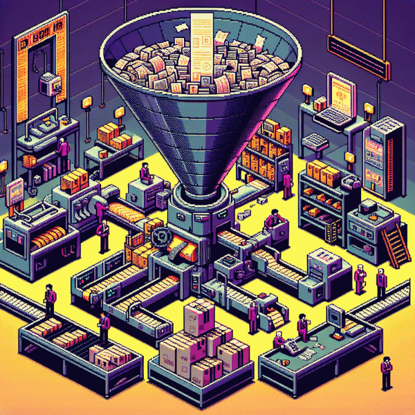
Think of your funnel as a treasure map: each click is a step closer to the chest, not a vote for your vanity metric. Start by sketching the path visitors take — where they land, what value they see first, and the exact moment you ask for money. Designing that route deliberately removes guesswork and makes every touchpoint earn its keep.
Break the journey into clear stages and give each one a job. Traffic: match the ad or link promise. Landing: one bold offer, one CTA. Lead magnet: immediate value to trade for an email. Tripwire: low-friction purchase that primes for the main sale. Checkout: simple, fast, with an order bump. Post-purchase: delight and invite repeat buys. Treat each stage like a mini-campaign with its own goal.
Track the rates that matter: click-through, opt-in %, tripwire conversion, checkout conversion, average order value and revenue per visitor. If a stage underperforms, fix the micro-conversion (headline, form length, payment steps) before throwing more traffic at it. Small lifts compound into big revenue.
Automate the handoffs: a 7-day welcome sequence that delivers value, social proof and a soft ask, plus cart-abandon reminders and a one-click upsell in checkout. Use simple tags and triggers so communications stay relevant and move people down the map, not back to your feed.
Final step — test and repeat. Run A/Bs on headlines, measure micro-conversions, and optimize for revenue per visitor. When every element has a job and a metric, you stop chasing likes and start following a reproducible path from first click to paid.
Traffic You Control: SEO, Affiliates, and Newsletter Swaps That Convert
Own the runway: when you control the doors people enter through, conversions stop being a fluke and start being a process. Build search assets that keep paying rent, partner with publishers who already warm up buyers, and treat your newsletter like a VIP list — not a spam machine. Small habits, big compounding.
Start with SEO basics that actually move revenue: target buyer-intent keywords, build 10–20 cluster pages around a product, and earn links from niche sites. If you need a rapid demonstration of a high-converting landing or partner page, check get free instagram followers, likes and views as an example of concise offers and clear CTAs that affiliates can sell.
Design affiliates like mini-sales teams: set a clear commission, provide swipe copy, sample creatives, and pre-built tracking links. Use short cookie windows for impulse buys, longer ones for high-ticket items, and treat each affiliate as a marketer — give them analytics dashboards so they can iterate.
- 🆓 Free: guest posts and resource pages — low cost, slow burn for steady organic traffic.
- 🐢 Slow: newsletter swaps and content partnerships — higher intent, predictable cadence.
- 🚀 Fast: paid publisher placements and affiliate launches — immediate spikes you can scale.
Put this into a 90-day plan: audit current sources, pick one SEO cluster, recruit 3 affiliates, schedule 2 swaps, and add UTM tracking for every link. Measure revenue per visit, double down on winners, and remember: repeatable control beats viral luck every time.
Lead Magnet Alchemy: Irresistible Offers That Turn Visitors Into Email Subscribers
Think of a lead magnet as a tiny alchemical device that turns anonymous visitors into hungry email subscribers without begging for attention. The magic is not in complexity but in clarity: promise a single, useful outcome, deliver it fast, and make the exchange feel like an obvious no brainer. Small wins build trust and open wallets later.
Craft offers that match where people are in their journey. Newcomers want quick clarity, shoppers want tools they can test, and near buyers want proof. Keep friction minimal: one click to opt in, a five minute read, or a paste ready template. Add a two question form to segment intent so your follow up emails do the heavy lifting.
Pick a format that converts for your audience and make it unavoidable on high intent pages. Examples that work across niches:
- 🆓 Checklist: a step by step list that delivers a fast win and gets opened tomorrow morning.
- 🐢 Mini-course: a short drip that builds competence and trust over days without spamming.
- 🚀 Template: plug and play assets that save time and show immediate ROI.
Launch with a razor sharp headline, obvious CTA, and a clear next step. Drive a few targeted visitors to the highest intent page, then optimize the return path. If you need a quick boost to test conversions, try buy instagram followers cheap to validate proof of social traction before scaling paid creative.
Measure open rates, click rates, and downstream purchases; then iterate. Turn the best performing magnet into a paid tripwire and build a sequence that guides subscribers from curious to committed. Keep it nimble, keep it generous, and stop trading time for vanity metrics.
Email Engine: Nurture Sequences That Sell While You Sleep
Imagine waking to a sale you did not chase. An email engine turns curious visitors into buyers by telling a tiny, consistent story across moments they care about. Start by mapping the journey from hello to checkout so every message has a clear job and purpose.
Segment hard and personalize softer: behavioral tags like opened welcome or viewed pricing unlock very specific flows. Use triggers instead of calendar schedules so emails land when interest spikes, not when a calendar says send. Timing beats frequency when attention matters.
Write short thematically linked copy that earns attention. Test subject lines for curiosity, preheaders for clarity, and the first sentence for momentum. Make the offer obvious and low friction: a clear next step converts far better than a complicated grand pitch.
Automate three core sequences: welcome, value drip, and cart or re engagement. Keep each sequence focused on one goal and measure opens, clicks, and revenue per message. Iterate weekly with one small change so you can see what actually moves the needle.
Once live, scale by cloning winning sequences for new audiences and swapping creative, not structure. Treat your inbox like a passive salesperson that runs 24/7, and you will stop trading time for attention while predictable sales keep printing.
Plug the Leaks: Copy, Proof, and Checkout Tweaks for Instant Lift
Every funnel leaks — and when you are not riding the algorithm, those drips are your revenue. Start with a microscopic audit: read your headline aloud, scan the first fold on mobile, and ask a stranger if your value is obvious in five seconds. Small clarity wins cascade into immediate conversions right now.
Tweak copy like a scientist. Swap feature lists for crisp benefits, turn vague adjectives into measurable outcomes, and shorten CTAs to a single, concrete promise: Get my plan beats Learn more about our industry-leading solution. Use microcopy to remove doubt and add urgency cues: shipping windows, return policies, and what happens after someone clicks Buy.
Proof is a trust architecture, not decorative flair. Sprinkle short testimonials with photos near your primary CTA, show recent purchase counts, and surface real-time activity or low-stock alerts. Replace generic logos with credible outlet mentions and badges that answer buyer fears — Secure checkout, 30-day returns, and clear guarantees that matter.
Fix checkout friction ruthlessly. Offer guest checkout, minimize required fields, enable address auto-fill and popular wallets, and push total cost early so there are no surprises. Add a tiny persistent order summary and a progress indicator; people dislike uncertainty more than extra clicks. Prioritize a mobile-first experience and make every button obvious.
Measure each tweak for a short sprint, then iterate: one headline swap, one testimonial update, one field removed. Expect instant lifts — often 5–30% — and compounding gains when winners are stacked. Treat your funnel like plumbing: patch one leak at a time, validate, then run a longer test to lock in bigger wins.