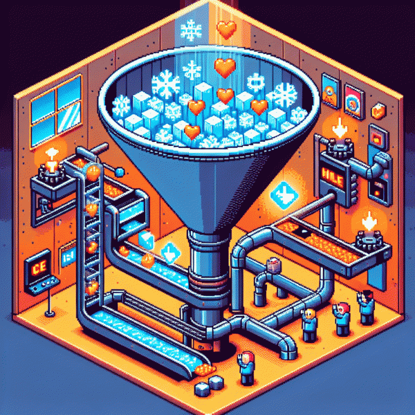
Steal This Sneaky Funnel That Turns Ice-Cold Social Clicks Into Hot Buyers
Stop Boosting Posts: Start Building a Click-to-Customer Path
Stop pouring money into lifeless boosts and start thinking like a shopkeeper: every click should get nudged, not ignored. Treat social traffic as auditioning customers — design tiny wins (a quick value hit, a click-friendly promise, a low-friction next step) that lead naturally toward purchase.
Swap shotgun boosting for a simple path: attention → micro-commitment → offer. Use a single, focused landing moment (one CTA, one target outcome) so your creative and copy don't compete. Test two creatives, two CTAs, and keep the winning combo visible to more cold clicks.
Add retargeting and micro-conversions to warm strangers into buyers. Capture an email, offer a tiny discount or guide, and show social proof fast. Each follow-up should shorten decision time — fewer choices, clearer benefits, and proof that others bought and loved it.
Track the small metrics that compound: click-to-lead rate, lead-to-customer rate, and cost per customer. If leads flow but purchases stall, tighten the post-click pitch or add a killer one-time offer. If acquisition costs are high, reduce friction or raise perceived value.
Here's a tiny checklist to implement today: sharpen one CTA, create a single-purpose landing spot, build a 3-step retargeting loop, and measure the conversion ladder. Do this and you'll stop boosting noise and start building a real click-to-customer system that sells.
Hook, Warm, Convert: The Three-Step Sequence That Wins
Start every sequence with a hook that is impossible to ignore. Lead with one clear promise, a tiny data point, or a weird image that creates a curiosity gap. Use a single sentence that tells the scroller what they will gain in 3 seconds flat. Swap generic claims for a crisp outcome and a micro commitment like "watch 10 seconds" to turn an anonymous click into a curious visitor.
Once they click, warm them with fast value and social proof. Send a two step nurture: short education plus a relatable proof nugget. Deliver a snackable video, a one page checklist, or a testimonial carousel that maps benefits to a known pain. Personalize messages by behavior, not by broad demographics, and ask for tiny actions like saving a tip or replying with a yes to boost engagement.
When you convert, make the path stupidly simple. Replace vague CTAs with binary choices, reduce form fields, and offer a low risk guarantee or trial. Use contrast pricing and a clear next step button above the fold. Turn hesitation into momentum with micro conversions first: cart add, email capture, then full purchase. Remove friction, highlight social proof at checkout, and ritualize urgency that feels honest.
Finally, treat the whole flow like a laboratory. A B test hooks, warm sequences, and CTAs every week. Track CTR, nurture engagement, conversion rate, average order value, and one week LTV. Small iterative wins compound fast, so run tight experiments, keep winners, and let the sequence do the heavy lifting that converts ice cold social clicks into hot buyers.
The Thumb-Stopping Ad That Sets Up the Sale
The ad that actually sets up a sale does one thing first: stops the thumb. That means the opening frame must deliver a visual jolt, a clear benefit, and a tiny cognitive puzzle that makes the viewer want to resolve it. Think bold contrast, a single big promise line, and an image that forces a second look rather than a casual scroll past.
3-second script: lead with the surprise, follow with the payoff, end with a micro-ask. For example, open on the problem in a human moment, cut to a quick proof or before and after, then invite one low-friction action like tap to learn one trick. Keep on-screen text to three words or less and make every second earn its place.
Production choices matter more than polish. Use vertical framing, captions, and first-frame branding that does not feel like an ad. Test three hooks: shock, curiosity, and utility. Swap thumbnails, mute audio variations, and run short 24-hour tests to see which hook wins attention before you scale. Social proof should feel native and specific, not headline bragging.
Finally, design the ad to preframe the landing experience so expectations match reality. Deliver a micro-commitment in the ad, then retarget viewers who engaged but did not convert with a tighter offer. Try two CTAs to start, for example Learn More and Get Sample, and iterate until the bridge between click and checkout stops leaking.
Landing Pages That Melt Resistance in Under 8 Seconds
First impression wins. Design your landing to answer one question in under eight seconds: what is this and why should I care? Lead with a bold benefit line, a supporting one-liner, and a single clear button. Remove links that create detours and watch bounce shrink.
- 🆓 Free: Use a risk-free trial or money-back signal so cold traffic relaxes.
- 🚀 Fast: Streamline the form to one field or a single click to convert indecisive visitors.
- 💥 Boost: Add a compact proof strip: avatars, a 5-star snippet, and one short quote.
Test microcopy that reduces friction: change CTA from Submit to Get X now, swap the hero image to a real person, and use urgency sparingly. If social proof is missing, plug in authentic signals instantly via order instagram boosting to seed credibility.
Run A/B tests that flip only one element at a time: headline, image, CTA color, or proof. Measure clicks, microconversions, then scale winners. Small tweaks in that eight second window turn trickles into a steady stream of hot buyers.
Follow-Up That Feels Like a Friend, Not a Funnel
Stop acting like every click is a lamb to the slaughter and start treating follow-ups like a friendly nudge from someone who remembers your coffee order. Your goal isn't to shove an offer down their throat; it's to warm them up. Use one-liners that sound human, sprinkle in a specific detail from their original action, and skip the corporate lingo—people buy from people, not from bots with a budget.
Cadence beats complexity. A tight, predictable rhythm builds trust without being creepy. Try a light opener, a value nudge, then a social proof piece spaced over days—not hours. Here are three simple follow-ups you can run in any funnel:
- 🆓 Welcome: A short thank-you with a tiny freebie or tip that feels personal.
- 🐢 Slow: A helpful case study or user quote that shows the outcome, sent two days later.
- 🚀 Fast: A scarcity/offer reminder for those who clicked but didn't buy, sent on day five.
Make the copy sound like you're texting a colleague: use first names, reference their action, and keep it under 40 words when possible. Example starters: 'Hey Sam — loved that you checked out the guide, quick tip inside…' or 'Saw you peeked at X; if you want, I can walk you through one quick use case.' Drop emojis sparingly, punctuation intentionally, and always end with an easy next step.
Automate the bones, humanize the flesh: set rules to pause sequences when someone replies, send a voice note after a second touch, and A/B your subject lines. Track reply rate, click-to-buy, and time-to-conversion. Small tweaks to tone and timing turn ice-cold clicks into warm, willing buyers—without ever sounding like a funnel.