Steal This One Thing That Makes YouTube Clicks Skyrocket
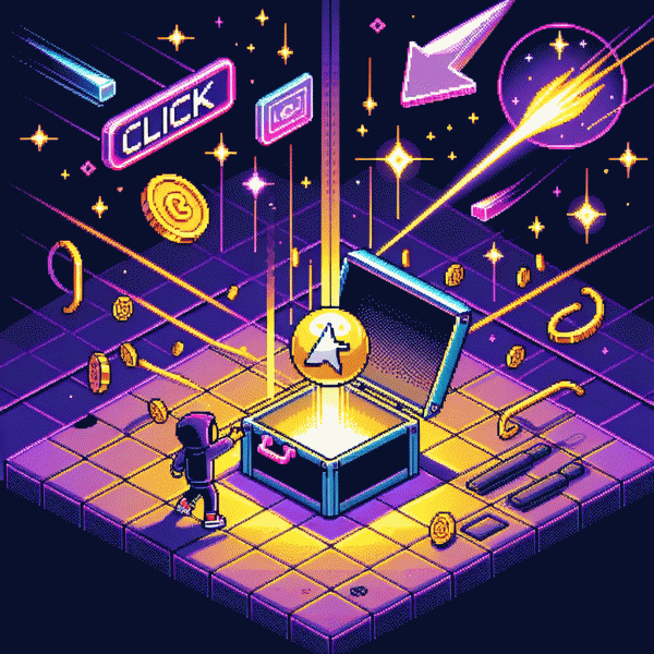
Meet the Real MVP of YouTube CTR The Thumbnail
Think of your thumbnail as a tiny billboard that has to shout your video's promise at a glance. It's not decoration; it's the headline that convinces a scroller to stop and commit a second to look. Nail one clear message — curiosity, value, or emotion — and the CTR will follow. Clarity beats cleverness every time.
The visual ingredients are simple but non-negotiable: high contrast, bold readable text, a single expressive face or distinct object, and clean composition. Use color to create instant separation from competitors, outline the subject for clarity, and favor warm skin tones against cooler backgrounds. If viewers can't read it at thumb-size, it won't pull clicks no matter how clever the title.
Production rules you can use immediately: build a reusable template, export at 1280×720 (16:9) with sharp edges, keep important elements inside a safe area, and save as a high-quality PNG or JPG under platform limits. Don't rely on tiny overlays or crowded layouts — make the subject occupy most of the frame so the emotion reads even on small screens.
Make thumbnails a testable process: A/B two versions for 48–72 hours, compare CTR and audience retention, then iterate on winners. Track where the clicks come from (search, recommendations, shares) and tweak accordingly. Treat thumbnails like conversion copy for video — feed the MVP well and the clicks that matter will follow.
Hook the Brain in 50 Milliseconds Color Contrast Faces and Curiosity
In the blink of an eye — roughly 50 milliseconds — a thumbnail either clutches attention or slides into oblivion. That tiny window is all about a visceral, immediate read: color that pops, a human face you can parse even at small sizes, and just enough mystery to make the brain click. Think surgical, not splashy.
Color contrast is the oxygen of thumbnails. Use complementary hues—teal vs orange, purple vs yellow—so foreground subjects pop against a simplified background. Bump saturation and reduce midtone clutter so shapes read at thumb-size. Pair a bold outline or subtle drop shadow to separate subject from background; test a dark overlay under text to keep legibility.
Faces are clickable magnets. Close-ups on expressive faces telegraph emotion instantly; eyes and gaze direction guide visual flow and trigger curiosity. Aim for 40-60% of frame occupied by the face, crop tight, and favor high-contrast lighting on the eyes. Slight asymmetry and a raised eyebrow beat neutral smiles for fast engagement.
Curiosity is the lever that turns attention into a click. Create a gap—an odd object, a cut-off scene, or a bold number—and let the thumbnail promise an answer. Keep on-image text to two words max and use a provocative verb or question. Need a quick nudge for traction? Check this guide on how to get youtube views for fast exposure.
Quick actionable checklist: pick a dominant color pair, feature a tight face with clear eye contact, add one curious visual clue, and minimize text. A/B test two variations for 24–48 hours and measure click-through lift. Small visual swaps often beat script rewrites when the first impression is the one that must win.
Title plus Thumbnail The Duo That Wins but the Thumbnail Leads
Think of the thumbnail as the carnival barker for your video: it must stop fast scrolling and make a promise that the title then keeps. Because the thumbnail arrives first it sets expectation, sparks curiosity, and makes the click feel natural instead of accidental. Design with intention so the image does the heavy lifting and the title simply confirms the payoff.
Practical rules make that intention reliable. Choose a single readable focal point, crop tight, and use high contrast so the subject jumps at tiny sizes. Faces with exaggerated emotion and clear eye direction outperform neutral shots. Add short, bold overlay words only when they clarify the value. Keep a consistent visual style across uploads so subscribers learn to trust your look while new viewers get a clear offer.
Quick checklist for high impact thumbnails:
- 💥 Composition: One focal point, tight crop, rule of thirds to guide the gaze.
- 🚀 Contrast: Strong color pop, legible overlays, simple background for instant readability.
- 👥 Emotion: Clear expression, eye contact or reaction, no ambiguous faces.
Let the title be the closer rather than the opener. Use specificity plus curiosity: a number, a benefit, or a twist that matches the thumbnail promise. Keep the most important words up front for mobile, avoid clickbait that backfires on watch time, and test pairings. Track CTR and average view duration together and iterate fast; small thumbnail tweaks with a confirming title often flip both metrics and scale views.
Five Swipe Stopping Thumbnail Formulas to Copy Today
Think of thumbnails like storefront windows: one clear visual hook pulls people off the scroll. The five swipe‑stopping formulas are repeatable recipes, not art‑school exams — Contrast Close‑Up, Big Text Tease, Before/After Split, Mystery Object, and Reaction + Prop. Follow the tiny, tactical rules below and you can swap a winning thumbnail onto any video in minutes to test what lifts CTR.
Contrast Close‑Up + Big Text Tease works when you make the face 30–60% of the frame, amplify expression, and create 2–3 stops of separation from the background. Drop a three‑word bold headline in the negative space using a chunky sans at ~28–38% of canvas height, add a 2–4px outline, and choose colors with high contrast so the copy reads instantly on mobile.
For Before/After Split, use a 50/50 or diagonal divide to dramatize change; Mystery Object benefits from a silhouette, glow, or blur that teases but doesn't explain; Reaction + Prop pairs an extreme expression with a clear object or arrow pointing at the value. Always declutter: remove busy backgrounds, boost saturation a touch, and keep the focal point centered where the eye lands.
Want swipe files and a fast way to validate what converts? Grab ready templates and run clean A/Bs with identical titles and metadata from safe youtube boosting service — isolate thumbnail impact, steal the winner, and scale it like a lab experiment.
A B Testing Made Easy A Quick Checklist to Double Clicks
Think of A/B testing like a tiny science lab for attention: swap one thing, watch the clicks behave, then keep what works. Start with a razor‑sharp hypothesis (e.g., "a warmer thumbnail background will lift CTR by 20%") and limit each experiment to one variable. Keep tests short, measure signal over noise, and treat every result as ammo for the next thumbnail or title tweak.
Use this quick checklist to run clean, fast experiments:
- 🆓 Headline: test 3 variants — curiosity, benefit, and specificity — and run for 3–5 days to find a winner.
- 🐢 Thumbnail: change one element only: face size, color pop, or bold text; compare CTR and watch retention.
- 🚀 Targeting: try two different audience hooks or playlists; different placements reveal different behavior.
Want to speed up significance? Pair smart tests with a tiny boost so your experiment reaches real viewers faster — try the best youtube boosting service to reduce time-to-result without cheating the analytics. Track CTR, watch time, and early retention; if headline wins but retention tanks, iterate on both.
Final actionable rules: run one variable at a time, collect enough impressions (think hundreds, not thousands), and let winners stay long enough to matter. Commit to a weekly test rhythm, log results, and ruthlessly copy winning combos. Do this consistently and you will steal attention like a pro — more clicks, more views, and that coveted algorithmary momentum.