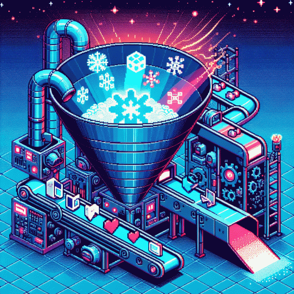
Steal This Funnel: Turn Ice-Cold Social Clicks Into Red-Hot Customers Fast
The Cold-to-Gold Blueprint: Hook, Warm, Trust, Convert
Think of this as a fast-food menu for cold traffic: one irresistible Hook, a warming course, some trust seasoning, and a quick checkout. Start with a tiny, high-value promise that requires almost no commitment — a 30-second quiz, a swipeable carousel tip, or a “one weird trick” video. That little win is the handhold you need.
Next up is Warm: drip targeted value that maps to the first win. Sequence content so each touch adds context — quick how-to emails, follow-up micro-videos, and retargeting that references the quiz result or the carousel card they liked. Aim for three meaningful nudges over seven days rather than blasting noise for a month.
Build Trust by stacking proof: social posts with customer snippets, a two-line case study, and a visible refund or guarantee. Encourage micro-commitments like a comment, a saved post, or a 5-minute discovery call to convert engagement into intent. When you need a tool to jumpstart that social proof testing, try boost your instagram account for free to validate which proof formats actually move the needle.
Conversion is about removing friction and creating an easy yes. Use one-click checkout, a single clear CTA, and an obvious next step after purchase (onboarding message + quick wins). Layer scarcity that feels real — limited seats in a beta, a bonus that expires in 48 hours — and make refunds painless so buying becomes low-risk.
Execution checklist: A/B test two hooks, warm with three value touches, publish one trust asset per week, streamline checkout, and measure CPA by cohort. Iterate weekly: keep what shortens time-to-first-value and kill what pads the funnel. The cold-to-gold loop is simple: hook hard, warm smart, prove fast, convert smoother.
Stop the Scroll: Ad Angles and Pattern Interrupts That Actually Get Clicks
If your creative looks like every other ad in the feed, it will behave like every other ad in the feed. The trick is not to shout louder but to break the scroll pattern with one crisp surprise in the first second. Try a visual or copy twist that forces a double take: an unexpected motion, an odd color block, or a headline that feels like a typo but resolves into a promise. Make that moment so clear that the thumb stops and the brain says, I must know more.
Work with tight ad angles that map to a single emotion and one action. Use the contrarian angle to flip expectations, the micro-testimonial to build trust in five seconds, or the scarcity angle with a concrete deadline. Micro scripts help: "Stop wasting money on ads that do not convert" can become "Why most ads fail: one fix inside." Or lead with a bold number, then deliver a quick how. Keep language specific, benefit driven, and slightly weird.
Visuals must do heavy lifting. Faces that look off camera, sudden scale shifts, or a very bright color punch in the top third will outperform safe compositions. For video, plan a 1.5 to 2 second pattern interrupt, a 3 to 7 second idea core, and an immediate visual cue for the CTA. Add concise captions for mute viewers and treat sound as an enhancer, not the backbone. Test stills and short loops side by side to see which interrupt wins attention.
Finish with a ruthless testing plan: three micro experiments in 48 hours, each changing only one variable. Track CTR, CPC, and landing bounce rate as your north stars. When a winner emerges, scale incrementally and keep the creative fresh by rotating a new interrupt every 72 hours. Small, consistent shocks beat occasional genius every time.
Landing Page That Warms on Contact: Curiosity, Clarity, and One Obvious Next Step
First impressions on that cold-click landing page are tiny experiments: a bold visual, one short headline, and a believable nugget that makes the visitor tilt their head and read on. Treat the first fold like a spy movie opener — tease enough to hook curiosity, not an info dump.
Clarity wins when curiosity is guided. Use a one-line benefit headline, a subline that explains the what/how in 10–12 words, and a micro-proof (a stat, logo, or 3-word testimonial). If a visitor reaches for the exit, your subline should whisper "wait" with an obvious reason to stay.
Use curiosity sparingly: a counterintuitive stat, a micro-story, or a question that reframes the problem. Swap fluffy adjectives for concrete outcomes — tell them what they will see within 60 seconds. Run quick A/Bs: tease-first versus explain-first; the winner tells you where your audience lives.
Make the next step unavoidable: one CTA, one color that contrasts, and one short action verb. Remove header links, keep the form to one field or use a one-click modal. Try CTA copy like "Show my 60-second plan" or "Get my quick fix" and watch friction drop.
Close the warmup with an instant reward: a thank-you message that delivers the promised micro-value and asks for a tiny second action. Track CTA click-through and post-signup engagement; iterate headlines weekly. Small, obvious optimizations compound faster than grand redesigns.
Micro-Yes Magic: Lead Magnets and Low-Friction Opt-ins That Build Momentum
Cold social clicks are attention-lite: they skim, scroll and leave. Your job is to win a tiny yes—a micro-commitment that feels like grabbing free caffeine rather than buying a car. Offer something that delivers an obvious result in 10–30 seconds: a checklist, a one-sentence calculator, or a single-screenshot swipe file. These tiny wins create momentum, trust, and a reason to come back, and pairing the asset with a one-line social proof multiplies the effect.
Ideas that work fast: a one-page cheat sheet that fixes one common mistake, a 60-second video demo, a copy-and-paste email template, or a micro audit that flags one quick win. Package each asset with a bold promise and a clear CTA: instant download, DM the word, or click to claim. Keep the headline outcome-focused and the delivery immediate—no inbox waiting—and include a single-choice question to segment responses for smarter follow-ups.
Reduce friction like a conversion surgeon: single-field opt-ins, prefilled messenger replies, one-click link-in-bio modals, or native platform features (save, swipe, DM). Add a tiny privacy note and a trust cue—no spam, unsubscribe anytime. Test button copy: "Get the 60-sec fix" vs "Download" and track micro-yes rate. Optimize for mobile load time, remove extra taps, and measure each tiny tweak so you know what actually moves the needle.
Turn micro-yeses into revenue by sequencing: deliver value → send a short nurture message → present a low-priced tripwire → escalate to the core offer. Track two numbers: micro-yes conversion and tripwire take rate, and aim to improve them weekly. Even small lifts compound: bump micro-yes from 20% to 30% and a 3–7% tripwire take rate suddenly becomes a reliable revenue stream. Start small, iterate fast, and bottle those little wins.
Follow-Up That Feels Human: 5-Message Sequence to Turn Interest Into Income
Think of follow up as the secret handshake between a cold social click and a real customer. A five-message cadence that feels human wins more than a single blast of promos. Keep each touch short, useful, and clearly aimed at helping the lead take one small next step toward buying.
Structure each message with purpose and timing: 1) Immediate friendly hello and quick value (0–1 hour). 2) Helpful asset or social proof (24 hours). 3) Curiosity question that invites a reply (3 days). 4) Case study or low-risk offer (7 days). 5) Polite close with a clear next step and an easy out (14 days). Use first names, mention the content they clicked, and keep the tone conversational.
- 🆓 Hook: Open with a tiny gift or insight that proves value in one line.
- 🤖 Nurture: Share a quick example or screenshot that shows results without sounding like a brochure.
- 🚀 Close: Make the ask small and specific, like a 15 minute call or a trial link.
Practical rules: make each message 1–3 short sentences, include a single personalized detail, avoid heavy attachments, and always state the next action. Subject lines should tease value, not hype. If no reply, vary the angle rather than repeat the same pitch.
Example micro copy: "Saw you checked X — quick tip inside" or "Two ways to get Y in one week." Test subject lines, sending times, and CTAs, then double down on what moves numbers. This sequence turns ice cold clicks into warm conversations that convert.