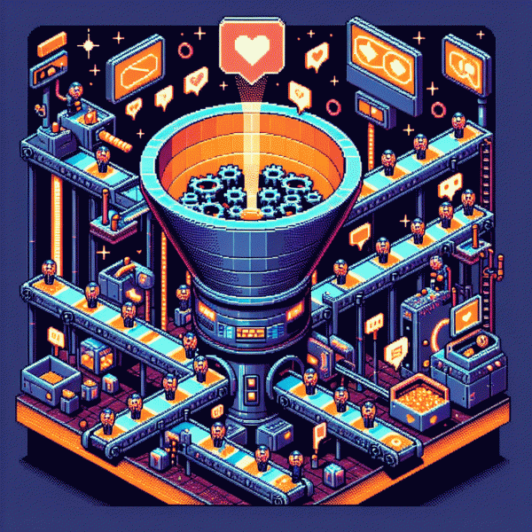
Steal This Funnel: The Weirdly Simple Strategy Turning Cold Social Traffic into Hot Buyers
Hook, Warm, Convert: The 3-step path from first glance to checkout
Start by treating that first scroll pause as a tiny heist: grab attention fast and leave them wanting more. Your micro-hook must pass the three second test: a visual that stops the thumb, a headline that sparks curiosity, and a promise of value. Try an open-loop headline plus a tiny counterintuitive detail to break expectations.
Then warm without being clingy. Replace boilerplate emails with micro-commitments: a 30 second quiz, a one-slide demo, or a short user clip that delivers an instant tiny win. Layer social proof naturally with UGC snippets, one-line results, or a short case highlight. Aim for two to three low friction touches before you pitch a product.
Conversion is simply removing everything that stands between desire and checkout. Strip fields, prefill where possible, show price anchoring and a simple guarantee, and place a compact testimonial beside the CTA. Add one frictionless payment option and a one click upsell. Use this compact CTA formula: benefit + low risk + time saving.
Turn those three moves into a repeatable playbook: pick one hook, one warming asset, one conversion tweak and test. Track CTR, time on asset, and conversion rate by cohort. Run the test for seven days, steal the highest performer, and rinse. Small iterative thefts win more sales than big heroic changes.
The Thumb-Stopper Ad: Copy and creative that spark the first click
Make your ad an actual stop sign for thumbs: one disruptive visual, a micro-story, and a headline that reads like a private invite. Cold social audiences bail in 1.5 seconds, so the first frame must contradict expectation — color, angle, pose, or copy. Lead with a strong verb, a surprising fact, or a question that zips the scroll into a double-take.
Pair that frame with a tight copy formula: hook + proof + tiny CTA. Hook in 5-7 words promising an outcome or pain relief. Proof is a single line of social proof, a number, or a micro guarantee. Tiny CTA is a non-threatening nudge like "peek inside" or "two-second look." Keep the voice human, a little salty if the crowd tolerates it, and always leave a gap the user wants to close — that's how cold viewers become clickers.
Refine your creative by testing contrast, faces, and motion in the first 0.5–1s. Don't overexplain; give an emotional cue plus a clear visual path for the eye. Use captions that act as mini-hooks for sound-off viewers and make the thumbnail tell the tiny story that the caption completes.
- 🆓 Free: Offer a micro-value inside the click (a checklist, 3 tips) — no commitment, big curiosity.
- 🐢 Slow: Use a slow-burn visual or countdown so they linger long enough to absorb the hook.
- 🚀 Fast: Flip to a bold, number-driven benefit that rewards the quick click.
Run 3 creatives at once, swap one element per test, and double down on combos that lift CTR, not just impressions. Remember: the aim isn't to sell in the scroll, it's to make them hungry enough to click. Nail the first click, and the funnel does the heavy lifting.
Micro-Yes Momentum: Landing page elements that build trust fast
Think of micro-yes momentum as a tiny applause track for strangers who land from scrollers and skimmers. Each element on the page should ask for a small, affirmative nod: a readable headline, a one-line value punch, then a whisper of proof. These mini commitments stack so visitors move from curious to invested without feeling sold to. The trick is to make every choice so simple that saying yes feels automatic.
Start with visual hierarchy that guides the eye in three seconds: bold headline, one-sentence benefit, hero image showing the result, and a single action that costs nothing. Use short trust cues—one logo strip, a 5-word testimonial, a tiny stat—right above the fold. Add microcopy beneath the button to remove friction: explain what happens after a click in plain language. Tiny clarity equals big conversion gains.
When social traffic is cold, sequence those micro-yeses like a gentle ladder. Lead with curiosity, then social validation, then an ultra-low friction offer (a one-click preview or a micro-demo). If you run platform-specific campaigns, plug the final step into a targeted service—example: instagram boosting service—so the landing page feels bespoke and immediate. Small, relevant proof beats loud, generic promises every time.
One simple experiment to start: pick one micro-yes (testimonial, stat, or clearer CTA), change its position, and measure the bump over three days. Keep changes atomic and run one test at a time. Repeat the winner and add the next micro-yes. In weeks you will have a chain of tiny agreements that turns cold social clicks into hot buyers without sleaze, only smart sequencing.
Nurture on Autopilot: Email and retargeting sequences that seal the deal
Treat a cold social click like a miner's pick: you need small, repeated strikes to reveal value. Automate a short, strategic nurture that converts curiosity into trust without hand holding. Focus on immediate value, quick wins, and a sequence that feels human even when it runs by itself.
Start with a 5-email skeleton: Day 0 a warm welcome with the promised lead magnet and clear next step; Day 2 deliver quick actionable value; Day 4 show social proof or a mini case study; Day 7 present a low friction offer; Day 14 send a final recap with urgency. Use simple subject lines like "Welcome — Here is something useful" and "See how X solved this problem".
Pair that email rhythm with retargeting: capture pixel events, create custom audiences for engaged clicks and email openers, then serve layered creative — educational ads to cold clickers, testimonial ads to email openers, and discount ads to cart abandoners. Exclude buyers from all nurture ads, rotate creatives, and sync audience windows so frequency stays friendly not furious.
- 🆓 Free: soft nurture for list builders — educational emails and mild retargeting to build trust.
- 🐢 Slow: long nurture for high ticket buyers — drip value, deep social proof, webinars.
- 🚀 Fast: quick convert path for low friction offers — aggressive retargeting and timed discounts.
Finish with tweaks: personalize subject lines with first name tokens, test two CTAs per email, add dynamic countdown timers for scarcity, and measure both email-to-ad overlap and conversion lag. Small, consistent experiments will reveal the version that actually seals the deal.
Fix the Leaks: Metrics and quick wins to patch drop-offs fast
Start by treating your funnel like a leaky bucket: measure micro-conversions, not just final sales. Track headline CTR, landing-page bounce, opt‑in rate, add‑to‑cart and checkout completion — those five are your diagnostic panel. Segment by source (ads vs organic vs socials), cohort by traffic date, and capture heatmap sessions to spot the exact scroll or click where people bail. Don't rely on vanity metrics like impressions; they're noise.
Quick wins should be surgical: simplify the above‑the‑fold message, cut the form to its bare minimum, enable autofill and one‑click where possible, use a sticky CTA on mobile, and remove competing links that distract. Compress images and cache assets so pages load under 2s. Add microcopy to reduce friction (shipping, returns, privacy) and test a progress bar for multi‑step flows — run one change at a time over 48 hours so you can actually see which tweak moves the needle.
If visible activity or credibility is the missing bolt, inject social proof fast — seed testimonials, fresh UGC, or small boosts to posts so first‑time visitors don't see a tumbleweed. For a ready shortcut you can use while fixing UX, check buy instagram SMM service to create the appearance of momentum and speed trust signals.
- 🆓 Free: tweak headline and CTA — big lift, zero budget.
- 🐢 Slow: run multi‑day A/B tests on pricing and copy.
- 🚀 Fast: retarget 24–72h drop‑offs with urgency ads.
Measure impact by the minute: watch opt‑in velocity, micro‑conversion lift and CPA decline. Log every change, roll back losers and double down on winners. Set 48‑hour checkpoints, tie each experiment to a single metric, and make patching leaks part of your weekly sprint — small, repeatable fixes are how cold social traffic turns hot.