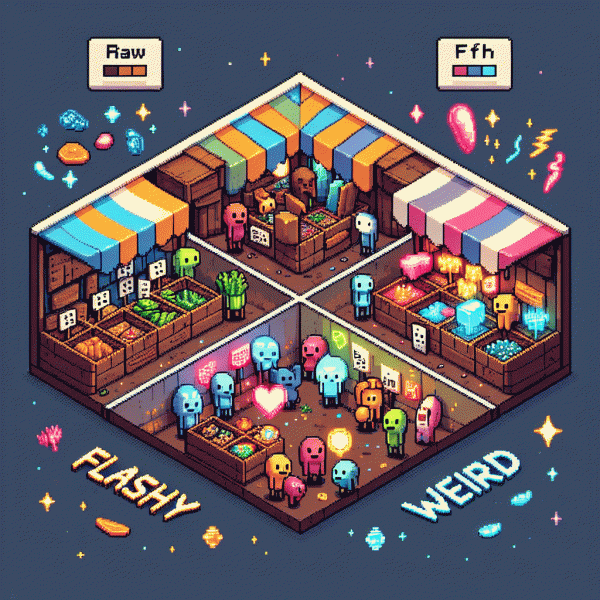
Raw vs. Flashy vs. Weird: You Won't Believe Which Creative Style Actually Converts
Raw: The scrappy, unfiltered vibe that builds trust fast
Raw creative is the short, unpolished video or image that feels like a note from a friend rather than a polished commercial. It leans into small imperfections, candid tone, and human detail to shortcut skepticism. When viewers see something that could have been filmed on a lunch break, they stop decoding marketing speak and start relating to a real person.
Use raw to open the funnel with trust: a shaky behind the scenes clip, a clipped testimonial without a script, or a voice memo turned caption. Keep length tight, emotion high, and edits honest. Quick action step: test a 15 to 30 second raw clip against a glossy spot and measure watch time and replies, not just vanity reach.
- 🆓 Format: 15 30s phone shot with natural light and ambient sound, no fancy graphics.
- 💥 Feeling: Confessional energy, small flaw callouts, laugh or minor complaint included.
- 👥 CTA: Soft invitation like "Tell us your take" or "Which would you try?" to spark comments.
To scale, keep a simple KPI loop: raw creative for trust, short follow up for offer, and a clear micro conversion like a comment or DM. Run three variants per week and pause the quiet performers. The result is a lower cost per lead and higher quality interest, because people trust the messy human more than the perfect pitch.
Flashy: High-gloss hooks that stop the scroll on Instagram
Flashy Instagram creatives are the high-gloss billboards of the feed: hyper-visual, fast, and slightly loud. They stop thumbs with color, motion and a promise, then hand off to a single, irresistible idea that is both brand-forward and instantly scannable.
Treat every frame like a billboard: huge contrast, saturated palettes, bold typography and motion that reads even with sound off. Closeups of faces with exaggerated expression perform especially well when combined with a clean overlay line and a decisive focal point.
Copy is tiny but mighty. Lead with benefit-first language, use curiosity gaps without falling into clickbait, and keep hooks under five words. Swap jargon for plain outcomes so viewers immediately know what they will get.
Use platform-first formats: Reels for swipe-stopping motion, Stories for urgency and interactive stickers, and paid carousels to expand a thumbnail hook. Optimize the cover frame so the feed image itself sells the click and the first second seals attention.
- 💥 Attention: 1–2 second visual shock — color pop or motion snap.
- 🤖 Curiosity: One puzzling line that makes viewers ask how.
- 🚀 Reward: Fast payoff — demo, reveal or benefit within three seconds.
Always test with a tight hypothesis: change one element per test, scale winners quickly and kill losers fast. Track view-through, swipe rate, click-through and cost per action, then iterate—flashy only wins when it converts.
Weird: Delightfully odd angles that get remembered (and shared)
Oddball creative is not a gimmick — it is a memory hack. When people see something delightfully off-kilter, they stop scrolling, laugh, and tag a friend. Weirdness creates social currency: your ad becomes a conversation starter, not just another interruption.
Start small: introduce one unexpected element — a mismatched prop, a surprising sound, or an absurdly specific line of copy — and let it sit against otherwise clear messaging. The contrast makes the message legible and the oddity memorable, without confusing your main offer.
Use three quick formulas: juxtapose two unrelated ideas, personify an object, or tell an ultra-specific micro-story in five to seven seconds. Keep visuals simple, but let one weird detail pop. That single eyebrow-raising moment is what viewers will screenshot and share.
Measure differently: track shares and saves as primary KPIs alongside CTR. A slightly lower immediate conversion can pay off if weird creatives increase organic reach and lift brand recall. An overperforming oddball can reduce CPAs over time when creativity fuels word of mouth.
Quick checklist: (1) pick one odd element, (2) keep the core offer crystal clear, (3) test at low spend, (4) double down on social-friendly cuts. Embrace a little risk — when done smartly, delightful oddness turns forgettable ads into fan-fueled momentum.
Test like a pro: Simple A/B plays to pick a winner
Treat creative testing like science: change one thing at a time and your winners will actually mean something. Pick the single variable you care about—visual tone: raw, flashy, or weird—hold headline, offer and audience steady, then run equal-weight splits. Example hypothesis: raw creatives will boost watch-time while flashy creatives lift CTR.
Run simple plays: Variant A = your current best-performing creative; Variant B = a flashy treatment; Variant C = the weird idea that made the team laugh. Start by testing the thumbnail/frame and the first three seconds for video, or the hero image for statics. Keep copy and CTA identical so any lift is attributable to the visual style alone, and use platform-native split-tests when possible.
Do not call a winner too fast. Aim for either 1,000+ clicks per variant or a 7–14 day run (whichever comes later), then look for ~90%+ confidence on CTR and conversion lift. Always check both engagement and downstream CPA—flashy may get clicks, but raw could convert cheaper. Never change creative and targeting at the same time.
When you have a winner, scale it and run two follow-ups: one iterative tweak and one bold experiment that flips the style. Rotate winners into retargeting pools to squeeze more ROAS, and keep a short backlog of 8–12 test ideas so you never run out of next plays.
The hybrid playbook: Blend styles for reach, recall, and ROI
Think of your creatives like a dinner party: you want warm conversation, flashy appetizers, and one weird showpiece that people text about. The hybrid playbook is about sequencing those flavors—use raw moments to build trust, glossy spectacle to pull eyeballs, and tasteful oddities to make your spot memorable. The trick is not to pick one, it's to choreograph them.
Start by mapping formats to funnel tasks: short, bright hooks for reach; longer, authentic cutaways for mid-funnel recall; and conversion-focused variants that borrow the best of both at the bottom. Set hypothesis-driven splits, run 3–4 creatives per population, and let metrics (CTR, watch-through, CPA) decide which tone gets budget. Bonus: rotate weirdness as a novelty spike, not a permanent soundtrack.
- 🚀 Top: 1–3 second flash or visual stunt to earn impressions and scale CPM-friendly reach.
- 👥 Middle: 15–30s raw testimonials or behind-the-scenes that boost recall and engagement.
- ⚙️ Bottom: Direct CTAs using recognizable faces or motifs from higher-funnel ads to lift conversion.
Operationalize: build a creative calendar where every week pairs a flashy test, a raw follow-up, and a single weird experiment. Tag assets by tone and performance, automate traffic rules that push winners, and keep a lightweight creative brief so editors reuse visual DNA. Need inspiration or quick buys? Check smm panel for fast scaling tools.
Final cheat-sheet: budget 60/30/10 (reach/recall/experiment), run tests 7–14 days, celebrate learnings that move CPA, and stop what doesn't improve lift. Blend like a cocktail—not a smoothie—so each sip hits reach, recall, and ROI. Then rinse, repeat, and let the weirdness do the heavy lifting.