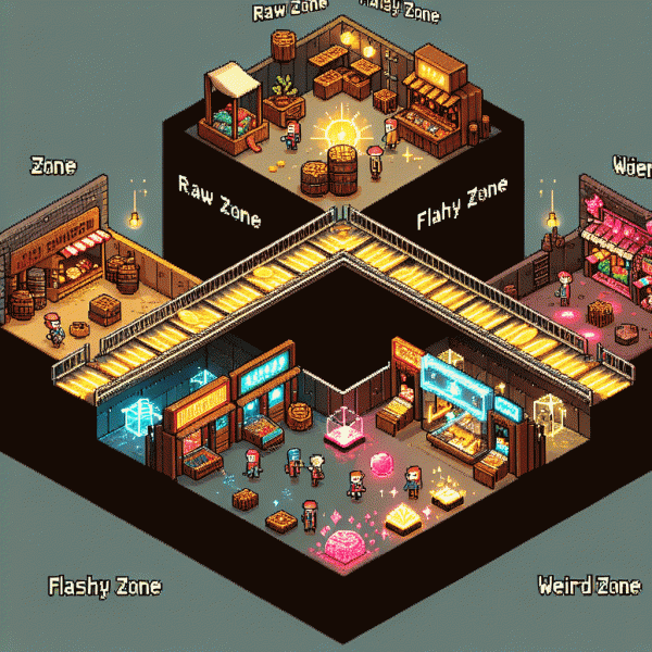
Raw vs Flashy vs Weird: You Will Not Believe Which Style Converts
The quick showdown: test results, examples, and the surprise twist
We ran a fast, messy series of split tests across ads and landing pages to see which vibe actually sold: raw, flashy, or weird. The headline takeaway: context rules. In category-agnostic pools raw creatives often nudged conversion +14% vs control, flashy around +8%, and weird sat near +12% — but those averages mask where each style shines.
Concrete examples: an indie coffee brand leaned hard into raw storytelling and saw newsletter signups double; a limited-edition sneaker drop leaned flashy with motion and high-impact imagery and tripled immediate purchases; and a niche gaming peripheral used weird microcopy and earned 3x social shares, unlocking organic traffic that paid for the campaign.
How to run your own quick showdown: pick one core metric, test three variants simultaneously, and segment by channel. Run each cell long enough to beat randomness, prioritize micro-conversions, and keep creative changes atomic so you know what moved the needle. Don't skip qualitative feedback — heatmaps and a few user interviews cut noise.
The surprise twist? The winners were hybrids. The top performers married a raw headline with a flashy hero and a sprinkle of weird microcopy. Translation: stop betting on tribes — mix elements, iterate fast, and let statistically significant lifts decide your brand's personality. Strong tip: start small, scale what wins.
Raw power: scrappy charm, speed to publish, and when imperfection sells
Some campaigns win because they look like a studio shot; others win because they feel like a friend texting. The advantage of the scrappy play is speed: you test ideas the day they arrive, iterate before the trend cools, and harvest attention while competitors polish. Imperfection is not a bug — it is a permission slip for people to engage. Fast, human moments cut through ad fatigue better than another glossy montage. It is not about sloppiness; it is about prioritizing resonance over sheen.
Why does roughness convert? First, it signals honesty: a quick clip or off-kilter caption reduces skepticism. Second, it lowers production cost so you can run dozens of micro experiments and learn which hooks stick. Third, it creates relatability — viewers see a real human, not a brand facade, and that sparks comments, shares, and direct messages. Numbers favor quantity plus quality feedback loops over waiting for perfection.
Make it actionable: start with a 48 hour sprint to capture three types of assets — a raw selfie video, a quick product in use shot, and a candid challenge or question. Post them within one feed cycle, track which hook gets the best click through or comment rate, then double down. Use simple editing: trim, add one caption, keep audio loud. Prioritize speed: if a piece takes more than a day to publish, ask whether you optimized for pride instead of performance.
Treat scrappy content as a laboratory. Set a KPI such as ten comments per one thousand views, run small bets, and stop the ones that do not move the needle. When imperfection sells, you win by learning faster, spending less, and sounding human. Stop waiting for the perfect shoot — publish, learn, tweak, and let authenticity do the heavy lifting.
Flashy factor: cinematic polish, brand heat, and the hidden costs
Flashy creative grabs the eyeballs: cinematic polish, bold color grading, and a hero shot that reads like a movie poster. That heat can lift engagement quickly and create a premium halo for products that thrive on desire. But attention is not the same as conversion, so treat shine as a tool, not a promise.
Behind the gloss are real costs: higher production budgets, longer timelines, and creative churn that forces constant asset refreshes. Platforms penalize stale sparkle with rising CPMs and ad fatigue, and brand mismatch can erode trust faster than a clever edit can build it. Think of flashy as a high‑yield instrument with maintenance fees.
Be tactical. Run a measured lift test before full scale: A/B raw versus polished creative, track CTR, CVR, CPA, and view‑through metrics, and calculate incremental revenue per creative cycle. Use strong targeting layers so cinematic spots land on audiences that value aspiration. If the polished version does not improve conversion rate, stop spending more on polish.
Operationally, amortize cost by batching shoots, building modular templates, and repurposing long cuts into short verticals. Keep a lean library of raw cuts for retargeting and reserve full polish for campaigns where LTV justifies the spend. In short, let the shine serve strategy, not replace it.
Embrace the weird: pattern breaks that stop the scroll and spark memory
Want attention? Replace polite predictability with strange but strategic moves. A pattern break is anything that violates the feed rhythm: a silent vertical video in a noisy carousel, a hand drawn diagram in a sea of glossy product photos, or a CTA that trades fear for a wink. Those jolts stop the thumb and lodge an image in memory. The trick is to be intentionally odd, not random.
Start small with three playbooks: sensory jolt, format twist, and timing surprise. Sensory jolt uses contrasting colors, sudden motion, or an unexpected pause in audio. Format twist reuses platform norms but flips them, like a long screenshot presented as a native asset. Timing surprise posts when competitors sleep or publishes follow ups at odd minutes. Test one variable at a time and write down what causes a double take.
Measure with the usual suspects but do not stop at clicks. Track scroll depth, replay rates, view completion, and second day recall in quick surveys. Run A B tests that compare standard creative against the weird version, and measure lift in micro conversions such as saves, shares, and time on asset. Small wins add up: a ten percent bump in saves can turn into a meaningful organic reach lift.
If brand safety worries you, cage weirdness with familiar cues: a consistent color, logo placement, or signature line. That keeps recognition while letting the idea do the heavy lifting. Commit to a weekly experiment, iterate fast, and treat failure as data. The feed rewards movement, and a well placed oddball is often the shortest path from scroll to memory.
Your 60 second chooser: a simple decision tree to pick the winner
Start a 60‑second timer and treat this like design speed dating: no overthinking, just a few smart questions that collapse months of debate into one decisive pick. This is not a manifesto — it's a practical shortcut. You will end the minute knowing which creative flavor to commit to for your next ad or post.
First, who are you talking to? If your crowd eats honesty and behind‑the‑scenes, lean Raw: candid shots, simple copy, real voices. If they crave lust and polish, go Flashy: big visuals, bold hooks, glossy edits. If you want talkability and surprise, pick Weird: odd hooks, playful risk, meme energy. Choose the label that most often matches past wins and move on.
Next, think product and trust. High‑consideration, expensive, or technical offerings usually need Raw confidence to build credibility. Fast, impulse, or fashion items get a lift from Flashy glamour. Niche communities and culture bets reward Weird experimentation. This is your 30‑second sanity check: match style to the buying friction.
Now match the platform. Short scroll feeds reward quick emotion — Flashy and Weird shine on TikTok and Instagram; longer reads, testimonials and demo videos favor Raw on YouTube or email destinations. Crosspost, but don't flat‑paste: native edits win.
Testing is nonnegotiable. Create three 15‑second variations (one Raw, one Flashy, one Weird), run a 48–72 hour microtest, and compare CTR and conversion rate rather than vanity likes. Kill the loser, iterate the winner, then scale with confidence.
You've spent a minute. Now spend an hour launching the winner. Set the timer, pick the style that passed those checks, run the small test, and repeat. Quick chooser mentality turns indecision into data — and into growth. Try it, iterate, and let the market tell you which voice converts.