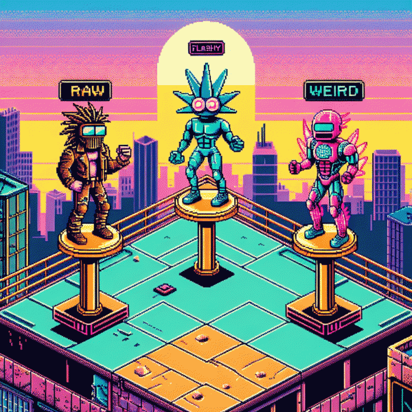
Raw vs. Flashy vs. Weird: The Viral Showdown Your Brand Can't Ignore
Why Raw Feels Real—and Converts Like Crazy
People are starving for something that feels human — not a superhero-shot, caption-checked ad that looks like it was crafted by a committee. Raw content signals honesty: uneven lighting, off-script laughs, a genuine mistake. Those imperfections tell viewers this wasn't made to impress a focus group; it was made for them. That authenticity lowers resistance and nudges people from passive scrolling to real engagement.
Why does that convert? Because trust trumps polish. When your brand looks reachable, customers imagine using your product in their messy, beautiful lives. Raw formats also compress attention: a candid clip earns curiosity faster than a glossy long-form pitch. Actionable tip: swap one planned, polished post per week with a 30–60 second behind-the-scenes or customer clip. Keep the CTA tiny — a single, friendly instruction like "try this" or "tell us what you think" — and watch micro-conversions stack up.
- 🆓 Free: quick demo from a real user — no script, just results.
- 🐢 Slow: low-effort behind-the-scenes — slow reveal builds curiosity.
- 🚀 Fast: single-take clip with one bold claim and one simple CTA.
Measure what matters: lift in comments, share rate, and click-throughs from raw posts versus polished ones. A simple A/B test over two weeks will tell you if raw is just a trend for your audience or the new baseline for conversion. Don't overcook it — treat raw as a strategic flavor, not a full menu rewrite. When done right, candid content converts like crazy because it feels like a recommendation from a friend, not an ad. Try it, iterate, and keep the humans in the loop.
Flashy: When High-Gloss Sizzles (and When It Flops)
Glossy creative is the neon sign on crowded feeds: bold motion, slick color grading, and sound design that commands attention. When it works, it accelerates discovery, raises click through rates, and turns product reveals into shareable moments. High production can manufacture cultural impact quickly, which makes it perfect for launches, hero campaigns, and seasonal pushes that need to feel unmissable.
But shine can hide weak strategy. Flashy content flops when it does not match audience expectations or platform norms. You may see high impressions with shallow engagement, low watch time despite many views, or a stream of comments that call out inauthenticity. Typical pitfalls include overbranding, miscast talent, and skipping the small tests that would reveal tone mismatch before full spend.
Use a simple playbook to decide when to go high gloss and when to hold back:
- 💥 Launch: Reserve premium polish for hero moments where visual wow can move users from awareness to action.
- 🚀 Target: Pair cinematic edits with narrow audience segments and native format tweaks to avoid feeling out of place.
- 👍 Test: Pilot multiple cuts, measure watch time and conversion, then scale the top performing creative.
Treat high gloss as a lever not a default. Always pair polished assets with clear CTAs, authentic proof points, and hard metrics like retention and cost per acquisition. Set guardrails, run A/B tests on thumbnails and sound choices, and be ready to swap shine for scrappy authenticity if the data calls for it. The smartest marketers balance gloss with grit and a touch of weird to keep work both clickable and credible.
Weird Works: The Science of Standing Out Without Scaring Off
Oddball ideas act like neon signs in a sea of beige: they interrupt autopilot and trigger curiosity. In feed science that interruption is golden — viewers pause because something violates expectation. The trick is to invite a look, not a recoil; pique without puzzling so much that users click away. Done smart, it becomes your highest-return shortcut to attention.
From a neuroscience angle, novelty and mild prediction error boost memory and sharing. Too much incongruity, though, maps to threat and confusion. That means the same element that creates buzz can also erode trust unless it is bounded by clear cues about what the viewer can expect next. Combine novelty with social proof to soften resistance.
Practical rules: anchor your weird with a familiar frame, like a known product shot or a clear benefit line; dial the eccentricity up slowly across creative variations; and signal intent with tone and visual hierarchy so people know you mean playful, not puzzling. Small, repeatable deviations win more often than one-off stunts.
Creative experiments should be surgical. A quirky headline plus a plain subhead often outperforms extremes because it gives curiosity a safe landing spot. Measure pause rate, click-through, and post-click retention, and monitor sentiment to catch any slip from charming to off-putting. Also track time-on-page and share rate to spot contagious formats.
Make weird work by treating it like a spice: sparing use, the right pairing, and a recipe you can replicate. Keep a reusable template that balances a single disruptive element with one clear offer. Small brands and big ones alike use calibrated oddness to carve a memorable lane. When in doubt, test smaller bets, iterate fast, and let the data tell you how far you can push the eccentricity.
A/B Test Playbook: Find Your Winner in 7 Days
Think of this as a weekend war room: pick three short cuts for the same message — authentic behind the scenes (raw), polished hook first (flashy), and oddball risk taker (weird). Set identical targeting and daily budgets, and treat creative as the only variable. The goal is to reveal which tone sparks attention fastest so you can double down before creative fatigue sets in.
Day 1 is launch: upload all assets, assign equal bids and placements, and turn on tracking. Days 2 and 3 are watch and tweak sessions: let the platform surface early signals but pull variants that underperform by roughly 30 percent in CTR to stop waste. Days 4 and 5 are scale experiments: boost spend 25 to 50 percent on top performers and introduce a single micro change, such as a new thumbnail or caption, to isolate impact.
Measure the right signals: CTR for initial attention, view through rate or average watch time for engagement, and conversion rate for business impact. Aim for about 1,000 impressions per variant and look for a clear lift of 10 to 20 percent before declaring a winner. If results are noisy, extend the run by 48 hours rather than guessing.
When a winner emerges, scale quickly but thoughtfully: duplicate the ad, broaden targeting cohorts, and refresh creative elements every two weeks to avoid fatigue. Keep a tiny dashboard, iterate fast, and let data decide whether raw charisma, flashy polish, or weird novelty deserves the bigger budget.
Creator Checklist: Mix Raw, Flashy, and Weird Without Chaos
Think of your content strategy as a mixtape: raw verses that feel real, flashy hooks that stop thumbs, and weird bridges that make people remember you. Start each idea with a single objective—emotion to trigger, action to take, or metric to move—and let that objective decide which flavor leads and which ones spice the mix.
Mixing is easier with rules. Here are three quick roles to assign before you hit record:
- 🆓 Raw: keep it under 30 seconds, use natural sound, show a flaw or behind the scenes moment so viewers trust the person behind the brand.
- 💥 Flashy: add one visual stunt, a punchy hook, or a bold caption treatment to arrest attention in the first 2 seconds.
- 🤖 Weird: introduce one oddity—a prop, angle, or metaphor—that makes people stop scrolling and tag a friend.
Want a fast way to validate which combo works on TikTok? Try buy tiktok boosting service to get initial view signals, then double down on the variant that drives retention. Use paid spikes only for testing, not as a crutch.
Final checklist before upload: hook under 3 seconds, memorable visual at 15 percent, weird moment between 60 and 80 percent, caption with one clear CTA, and a test cell to track retention and shares. Iterate every 3 posts so your raw, flashy, and weird elements learn to sing together instead of shouting over each other.