Raw vs Flashy vs Weird: The Shocking Winner Marketers Never See Coming
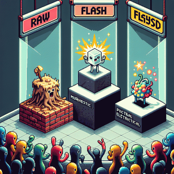
The Psychology: Why Raw Feels Real, Flashy Pops, and Weird Sticks
People don't just like raw, flashy, or weird — their brains react to them in predictably different ways. Raw taps into authenticity: unpolished language and real faces trigger empathy and trust because our brains assume less filtering and more honesty. Flashy hijacks attention with contrast, speed and sensory overload, giving immediate dopamine hits. Weird, meanwhile, breaks schemas and forces deeper processing, which means it's more likely to be remembered and shared.
- 🆓 Authentic: raw content feels human — candid shots, small flaws, and direct language that make followers lean in.
- 💥 Attention: flashy formats use color, motion and rhythm to stop the scroll and create immediate engagement.
- 🤖 Sticky: weird ideas violate expectations, spark curiosity, and live longer in memory and conversation.
Want to run a quick experiment without guessing? Try a four-day split test and promote each style to small, matched audiences — then measure watch time, shares and comments. For a fast start, you can get free instagram followers, likes and views to seed realistic exposure and see which emotional hook actually moves people.
Actionable tip: start raw to build trust, sprinkle in flashy moments to grab attention, and plant weird hooks that invite sharing. Track retention and conversion, not vanity metrics, and iterate weekly. Mix the three like a recipe: base of raw, seasoning of flashy, and the occasional weird garnish — that's where surprises become repeatable wins.
Swipe File Showdown: Real Ads and Posts Where Each Style Crushed It
Treat this as your quick-action swipe file: a compact drawer of real ads and posts that hit hard. Each paragraph below walks through one winning example type, why it landed, and the exact micro-test you can run in 7 days. Use structure, not copy, and steal the mechanic behind the win.
Raw: think handheld customer clips, off-the-cuff testimonials, and single-frame proof (before/after screenshots, receipts). Why it works: authenticity breeds trust and drops friction in under 8 seconds. Test this week: swap any polished hero creative for a 15s raw clip with a real quote caption, keep the same CTA, and compare CPM and add-to-cart rate.
Flashy: big motion, bold color, clean overlays that scream benefit in the first 1.5 seconds. Common winners: neon carousels that reveal a transformation, countdown overlays for scarcity, and kinetic text that emphasizes hard numbers. Quick test: take a top-performing static post and turn it into a 6s flashy loop with a numeric headline and animated CTA to measure lift in click-through.
Weird: absurd props, odd cuts, or a mascot doing something unexpected. These split-test great for virality and comments, not always direct conversion. Run a micro-experiment with 2 creatives: one safe, one weird, at a tiny budget. Measure CTR, comments, and CPConversion to decide if the weirdness scales.
Build your file by tagging wins by KPI, creative mechanic, and audience segment. Run weekly 1:1s to translate a viral comment into a test hypothesis. Keep the format simple: Hook, Proof, CTA. Repeat, measure, and let surprising winners overturn your assumptions.
When to Go Gritty: Moments Where Raw Outperforms Gloss
Not every brand benefits from high-gloss polish. When emotion, trust, or raw human moments carry the message, rough edges are an advantage — they feel real. Customers smell overproduction; in those moments simplicity beats special effects. Think uncut testimonials, livestreams that wobble, and blog posts that read like a candid note from a founder — authenticity often translates into conversion.
Choose gritty when authenticity is currency: crisis responses that need immediacy, early-stage launches where founders sell belief more than features, intimate communities that prize relatability, or campaigns designed to spark user-generated content. Raw also outperforms flashy in niche or technical categories where showing process and failures builds credibility faster than slick product shots ever could, and even customer support wins.
How to make gritty work: keep sound and framing honest, highlight tiny imperfections with a purpose, and center the human reaction. Pair raw footage with clear context — captions, timestamps, short annotations — so viewers know why it matters. If you want to seed authentic social proof and boost organic reach, get free instagram followers, likes and views.
Flip back to polished when scale, aspirational positioning, or premium pricing demand perfection; grit is a bridge, not a permanent identity for every touchpoint. Final rule: test creative in low-risk channels, measure resonance via retention, comments, and shares, and double down when people finish an imperfect story and ask for more. Mix raw and polish in the same campaign when it makes sense.
Shine Without the Eye Roll: Using Flash to Dazzle and Still Build Trust
Flash is not a sin; it is attention currency that can be spent wisely. Use bold color, motion and glossy shots as signposts, not as replacements for substance. Let a single visual shout so your copy can whisper credibility. If the first five seconds deliver delight and context, you have permission to dazzle — provided the next thirty seconds earn trust.
Pair every dazzle with trust anchors. Show the real face behind the brand, a quick statistic or customer quote, and a clear outcome. Use honest microcopy like \"No spam, just results\" or \"Try 7 days free\" to set expectations. Keep CTAs factual and low friction; flashy buttons should lead to transparent, simple next steps.
Technical polish is the quiet cousin of glam. Prioritize fast load, responsive scaling, and accessible captions so the sparkle is visible to everyone. Choose short animations (under 600ms), avoid autoplay audio, and provide pause controls. A flashy asset that breaks on mobile kills trust faster than bland design ever could. Measure bounce and trust signals after each experiment.
Start one bold experiment: a short animated hero + a visible trust badge + one literal benefit line. Run it for a week, then compare conversion and retention to the plain version. You will learn whether the world smiles or scoffs. Either way, you leave with data and a strategy to shine without the eye roll.
Make It Lovably Odd: A Simple Playbook for Weird That Converts
Want your brand to be remembered for the right kind of weird? Start by making oddness feel like a warm handshake, not a prank. Pick one small, repeatable eccentricity — a tone, a visual quirk, a timing trick — and commit to it across one channel. Consistency turns curiosity into recognition; recognition turns clicks into conversions.
Set boundaries for your weird: it should be personal, simple, and serve a concrete goal. Personal means it aligns with your audience's private jokes or frustrations. Simple means someone can explain it in a sentence. And goal-oriented means every odd touch nudges a viewer toward a single action — subscribe, cart, or share. When weird has an agenda, it stops being random and starts being strategic.
Use these three quick templates to prototype lovable oddity fast:
- 🆓 Free: give away a tiny, pleasantly strange artifact — a wallpaper, micro-saga, or micro-guide that showcases your voice.
- 🐢 Slow: build a recurring micro-ritual people can anticipate — a weekly oddball newsletter stanza or a quirky loading animation.
- 🚀 Fast: launch a short, bizarre test: unusual subject line A/B vs normal headline — measure clicks and retention.
Make execution effortless: design one master asset, repurpose five ways, and automate touchpoints so the weird repeats without extra creative debt. Keep the visual system clean so the odd element reads clearly — contrast, scale, and a single unexpected motion are enough.
Track conversions like a scientist: pick two KPIs, run a 2-week test, then double down on winners and kill the rest. Weird that converts is weird that's repeatable, measurable, and relentlessly kind to the audience — strange enough to be sticky, safe enough to feel like a wink.