Raw vs. Flashy vs. Weird: The Creative Style Showdown You Can't Ignore
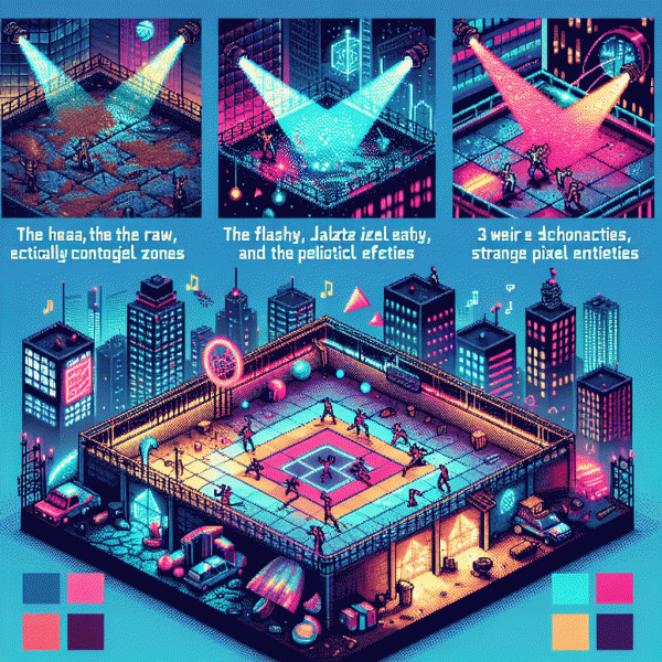
Raw and unfiltered: when imperfections outsell polish
Think of imperfection as a creative superpower. Rough edges, visible edits, a dropped prop or a muttered aside convert passive scrolling into a human moment. When work feels made by a person and not by a perfection machine, audiences relax, lean in, and begin to trust. That trust shows up as comments, saves, and unexpected shares—small production value can become a signal of sincerity that polished content rarely matches.
Start small and intentional: film on a phone, narrate a mistake, or show a behind the scenes fix. Do not confuse raw with sloppy; raw is chosen constraint. Try formats that celebrate process over polish and use quick rituals to keep clarity. A simple checklist helps: frame steady, pick one clear idea, and be generous with context so the imperfection reads like honesty.
Play with three easy approaches to test what your audience prefers:
- 🆓 Humanity: share a short moment of doubt or a commentary on a small failure to invite empathy.
- 🔥 Process: record an unedited clip of how a piece is made so the craft becomes the hook.
- 💁 Bite-size: post a 15 to 45 second take with one pivot from problem to solution to reward attention.
Measure wins by engagement velocity rather than pure reach: more replies, time watched, and saves often predict better loyalty than a single viral spike. Run a two week A/B with raw and glossy siblings to see what converts to subscribers or repeat buyers. Keep a slim production standard for audio and framing so authenticity does not become unreadable. If you want a fast experiment, publish one honest, imperfect post this week and watch the conversations appear.
Flashy that converts: sparkle without the gimmicks
Make things shiny with purpose. Sparkle that converts is not decoration; it is a spotlight that guides the eye to the one action you want. Treat visual flair like a pointer: elevate, not distract, and pair it with a measurable goal.
Start with hierarchy: big headline, bolder value, smaller details. Use a limited palette and one accent to make the CTA pop. Skip stock bling for original assets that reflect brand personality and load fast on mobile.
Motion matters when tiny and purposeful. Favor micro interactions and brief reveal effects over heavy autoplay. Keep durations short, reduce motion for accessibility, and test performance: a fancy animation is worthless if it slows the funnel.
Copy must match the shine. Lead with a benefit, not a feature, and make the CTA specific and timebound. Use short sentences and honest numbers for social proof. When people understand value instantly, they pay attention instead of scrolling past.
Measure micro wins and iterate. Track clicks, micro conversion rates, hover engagement, and scroll depth to spot friction. A shiny element that increases visits but reduces conversions is a disguise, so keep experiments small and stop what inflates metrics without moving revenue.
Start with one bright tweak this week: contrast, headline copy, or a single micro animation. Launch with a hypothesis, set a primary metric, and treat sparkle like a conversion lever. If it does not lift the metric, recycle the glitter into something that does.
Get weird, get remembered: the surprising psychology of odd
Odd things stick. When an ad, headline, or product nudges the brain out of autopilot, attention spikes and memory files it away under "unexpected." That is a free shortcut: novelty interrupts prediction, and interruption is the oxygen of recall.
Neuroscience calls this a schema violation; cognitive psychology calls it distinctiveness; marketers call it memorable. The trick is to be surprising without being chaotic. Small violations work best: a playful image, a bizarre metaphor, or a tagline that briefly reframes a common truth.
Use micro-weirdness as a toolkit:
- 💥 Contrast: Insert one thing that does not belong and make it prominent.
- 🤖 Mismatch: Pair two familiar ideas in an unfamiliar way to spark curiosity.
- 💁 Ritual: Repeat a small oddity so it becomes a recognisable signature.
Measure with tiny experiments: A/B test the odd versus the safe version and watch CTR, time on page, and social shares. Collect qualitative feedback to spot whether people smile or grimace. Amplify what creates both attention and positive affiliation, not shock alone.
Final rule: keep the human heartbeat. Weird wins when it amplifies identity and story. Start with one playful gamble, document reactions, iterate fast, and build a discreet library of odd moves you can reuse across campaigns.
Pick by purpose: match each style to awareness, consideration, and conversion
Not every creative mood fits every stage of the funnel. Want eyeballs fast or trust and nuance before you ask for the card? Think of the funnel as a costume party: Flashy arrives in neon at the gate, Raw hangs out and tells the unvarnished story in the kitchen, Weird slips a bold, unforgettable invite into your pocket. Map styles to the metric you care about—reach, engagement, or conversion—and pick with intent.
Flashy — Awareness: Big colors, staccato edits, and impossibly quick hooks. Open with a 1–2 second visual riff, pair with a punchy caption, and aim for shareable surprise. Ideal for TikTok, Reels, and discovery feeds where impressions and grabs matter. Actionable tip: test 3 opening frames, then boost the winner for scale; CTAs here are soft (follow, save, learn more).
Raw — Consideration: Authentic demos, on-camera customers, and honest takes that answer friction points. Show the mess, then the fix; use unpolished sound and human timing to build credibility. Deploy these in stories, longer Shorts, or community channels where people linger and ask questions. Actionable tip: pin a short FAQ in comments and run a Q&A live to reduce hesitation.
Weird — Conversion: Oddball details, playful friction, and surprising micro-interactions that make a click feel like joining a secret club. Great for retargeting, cart pages, and checkout overlays where a little cognitive dissonance speeds decisions. Run small paid tests, measure CPA, then double down on the variant that shortens the path to purchase. Need a fast way to test creative mixes? Try buy instagram followers today and iterate against real engagement data.
Test fast, win faster: quick experiments to crown your champion
Stop treating creative choices like eternal destinies. Run tiny bets that answer one question: which vibe drives action fastest? Start each sprint with a single, razor‑sharp hypothesis (e.g., "a raw, handheld intro will lift CTR by 20% vs a glossy edit") and one primary metric to judge it. Set a tight window — 48–72 hours — and a realistic exposure target (think a few hundred to a few thousand impressions depending on the channel). Keep everything else constant so you're testing the style, not the algorithm luck.
Design three lean variants that map to the contenders: one raw, one flashy, one weird. Make the changes surgical: the same hook, the same caption, different execution. For example, swap a polished B‑roll sequence for a shaky, first‑take 6‑second clip, then try a surreal hook that stops the scroll in the first 1.5 seconds. Don't overcomplicate: one variable per test, three versions, simultaneous launch. That's where clarity meets speed.
Decide stop and scale rules before you hit publish. A practical rule: a winner is any version with a consistent 15–25% lift on your primary metric across two consecutive runs. Kill losers after two underperforming runs and reallocate creative time immediately. Track engagement quality (watch time, comments) not just vanity numbers — weird can win clicks but lose retention, and flashy can glitter without converting.
When a champ emerges, double down smartly: replicate the winning mechanics across formats, create quick templated briefs, and run follow‑ups that tweak only one new element. Log every outcome in a simple playbook so future tests don't reinvent the wheel. Fast experiments don't just pick a winner — they build a map of what your audience responds to, so you can crown, remix, and scale with confidence.