Raw, Flashy, or Weird? You Won't Believe Which Style Converts Like Crazy
The Case for Raw: Imperfect Content That Builds Instant Trust
Think of raw content as a handshake that smells faintly of coffee and real life — it doesn't try to hypnotize you with polish, it simply says I'm human. That low-ceremony vibe collapses skepticism faster than a glossy ad, so people lean in and convert.
Imperfections act as trust signals: shaky frames, unedited captions, off-script laughs and real-time reactions tell viewers you aren't hiding anything. Audiences reward that honesty; they prefer relatable flaws to staged perfection, and that emotional shortcut often shortens the path from curious scroller to paying customer.
Practical plays you can run today: film a thirty-second 'what went wrong' clip, narrate a mistake and the fix, post raw screenshots of real results. Replace one polished monthly video with a week of candid micro-updates and watch friction drop — small admissions spark big commitments.
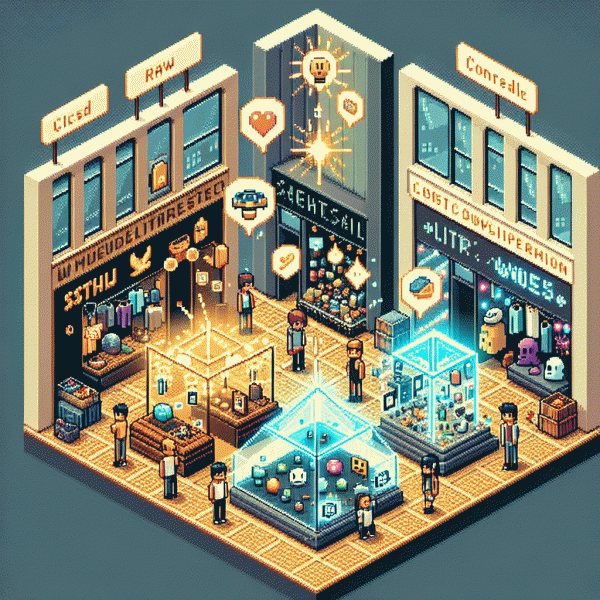
- 🆓 Free: Give a quick tip or tool and show how you use it in real time.
- 💁 Human: Feature a teammate's blooper or an unscripted reaction for instant relatability.
- 🔥 Bold: Cut the polish: jump cuts, honest captions, and a straight-to-ask CTA.
Measure what matters: retention curves, CTA click-throughs, reply rate and DMs, saves and shares. Run simple A/B tests where the message stays the same but the delivery gets scrappier. If conversions climb, double down; if not, iterate on storytelling not slickness.
Treat roughness as an optimization axis: authenticity is a testable tactic, not a branding mood-board. Commit to five raw posts on one channel, collect qualitative feedback, and use those human moments to refine offers. The payoff? Faster trust, better conversion, and content that actually feels alive.
Flashy That Works: Add Sizzle Without Burning Your Budget
Flashy does not mean gaudy. When done with intention, the flashiest parts of a campaign are the parts that guide attention and remove friction, not the parts that scream for attention. Think of a neon sign pointing to the door, not a disco ball covering the whole store. Use color, motion, and contrast to highlight the next step and you will get more clicks without inflating costs.
Start with micro-sizzle: short loops, kinetic headlines, and single-feature focus. A three-second motion that draws the eye to the CTA is worth more than a thirty-second spectacle. Use smartphone clips, cinemagraphs, and animated type to make assets feel premium. Reuse snippets across channels to amplify reach. Small production rules: one visual idea, two formats, zero clutter. This keeps spend low and polish high.
Leverage cheap production hacks: batch shoot on a phone with consistent lighting, swap backgrounds with simple editing, license one hooky track across ads, and use user generated content as social proof. Test thumbnails and first-frame motion to find which micro-sizzles move the needle. Prioritize lift per dollar by running short A/B tests and pausing losers fast. The goal is measurable sizzle that can be multiplied, not a single viral moonshot you cannot replicate.
Measure the tiny wins: CTR, micro-conversions, and cost per desired action. When a treatment improves a micro KPI, scale it. Keep brand signals intact so flash does not feel cheap. In short, add sizzle where it steers behavior, not where it just looks flashy. That is how you convert like crazy without burning through the budget.
Get Weird, Get Remembered: Stand Out Without Scaring Off Buyers
Memorability is earned, not manufactured. Lean into odd details that make people pause, laugh, or say "huh" out loud, then guide that attention toward an obvious benefit. The goal is a quirky breadcrumb trail that leads to a clear value proposition, not a neon sign that scares potential buyers away.
Start by setting soft limits: decide what kind of weird fits your brand voice and where it can live in the funnel. Use playful oddities early to attract attention, then switch to straightforward clarity when you ask for a sign up or a purchase. That contrast turns curiosity into conversions because visitors already know what they are getting into.
Try concrete, low risk experiments. Visual: swap one expected image for a slightly absurd alternative that highlights the product use. Voice: write one subject line or hero line with a wink or odd verb and compare open rate. Offer: attach a tiny, amusing bonus—an unexpected sticker or micro-guide—that adds charm without devaluing the core product.
Measure everything and build guardrails. Put new creative behind A/B tests, segment by new versus returning visitors, and limit frequency so the weird remains a novelty. If a test underperforms, iterate the element that caused the friction instead of abandoning the entire idea.
Actionable checklist: pick one page, run a single micro-oddity, measure lift at 3 and 14 days, and roll the winner wider. Keep experiments small, track the signal, and enjoy the fact that being a little strange can make your brand unforgettable and more profitable.
Test Like a Pro: 7 Quick A/B Experiments to Crown a Champion
Think like a scientist, move like a marketer: run short, decisive A/B tests that force a winner in a week, not a hypothesis that lingers for months. Start with one variable at a time, pick a primary metric up front, and treat each result as fuel for your next experiment.
Experiment 1: Headline tone. Test a raw, blunt headline against a flashy, aspirational one and a weird, curiosity-driven hook. Let the data decide which voice pulls users in more. Keep sample pockets equal and avoid piling changes so you know which tone truly wins.
Experiment 2: Visual treatment. Swap a product photo with a high-contrast illustration or a playful animation. Experiment 3: Social proof placement. Move testimonials from bottom to above the fold or try a compact trust badge near the CTA. Small layout shifts often produce big lifts.
Experiment 4: CTA wording and color. Try action-first language versus benefit-first language and test bold color swaps. Experiment 5: Price framing and urgency. Test full price versus discounted text, and soft versus aggressive urgency messaging. Track conversion rate and average order value together.
Experiment 6: Microcopy and friction removal. Shorten form labels, reduce fields, test inline validation. Experiment 7: Channel-specific creative. What converts on Instagram may flop on TikTok. To explore platform-tailored ideas, check this resource: buy instagram boosting for inspiration on how creators format offers where attention behaves differently.
Finish each cycle with a clear decision: promote the winner, iterate, or kill the idea. Keep a simple tracker, prioritize tests by potential impact, and treat weird experiments as low-cost bets. Run seven focused tests in sequence and you will find the conversion champion faster than you expect.
Channel Fit: Why Raw Rules on Instagram (and When It Doesn't)
On Instagram, rough edges feel like a hand wave from a real person. Shots that show process, snackable mistakes, or off-the-cuff captions cut through glossy noise because people crave relatability. The vertical, short formats reward quick emotional hooks — a smirk, a flub, a real-time voiceover — more than staged perfection.
That makes raw a conversion powerhouse when you pair it with crisp intent: clear CTAs, immediate product demos, and captions that move someone to tap the link. For a fast boost, test organic pushes alongside a safe instagram boosting service to jumpstart reach while you optimize creative.
Raw is not a universal law. If you sell high-end jewelry, complex SaaS, or aspirational luxury, polish builds trust. Likewise, niche audiences may prefer conceptual or highly produced storytelling. The simple play is to segment creatives, run side-by-side tests, and judge by conversions, not by how pretty a grid looks.
Practical checklist: post a behind-the-scenes Reel, place a one-line CTA in the first comment, test two variants (raw vs polished) for a week, and measure swipe-ups or DMs. Keep notes, iterate weekly, and favor small scrappy moves over perfect paralysis — authenticity that converts is deliberate, not accidental.