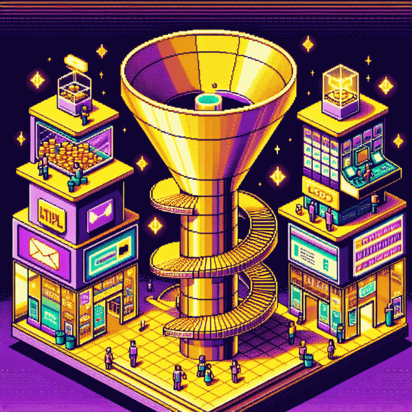
No Likes, All Sales: Build a Funnel That Converts Without Social Media
Your Non-Social Traffic Stack: SEO, Search Ads, Affiliates, and Newsletters
Think of your site, search ads, affiliates and newsletter as four cylinders powering a single engine: a conversion funnel that does not beg for likes. Start by mapping intent — which queries, keywords and newsletter topics lead straight to checkout — then reverse-engineer landing pages that answer the buyer before they ask. Shave friction where you can: prefill fields, surface reviews, shorten checkout steps and make microcopy that removes doubt. Small, fast experiments beat long opinions; iterate weekly.
Treat SEO like a demand magnet: choose three buyer-intent clusters, build one authoritative hub per cluster, and create supporting long-tail posts that funnel visitors to product pages. For search ads, buy the final-click keywords, use tight match types, add negative keywords and ad extensions, and send traffic to focused pages with one clear action. Track revenue per campaign, not just clicks, and increase bids where profitability is proven.
Make affiliates and newsletters your scalable closers. Recruit partners with audience overlap, provide simple creatives and fair commissions, and automate tracking so payments are frictionless. For email, segment by behavior, send value-first onboarding sequences, then time-limited offers to convert intent into orders. Repurpose top-performing content as ad copy, partner assets and newsletter snippets to multiply impact and measure lifetime value by cohort.
- 🆓 SEO: build intent-focused hubs, internal links and product funnels that nudge readers toward purchase.
- 🚀 Ads: buy high-intent keywords, optimize landing pages, test offers and measure ROAS by SKU.
- 🤝 Partners: incentivize affiliates, swap newsletter spots, automate creatives and report performance weekly.
Lead Magnets That Don't Suck: Bribes People Actually Want
Stop giving away forgettable PDFs nobody reads. Great lead magnets solve one tiny, urgent problem in under ten minutes — a clear template, a 3-step swipe file you can copy-paste, or a calculator that spits out a number they actually care about. Make the value obvious in the headline and remove friction: one-click delivery, no multi-page forms, and an instant download link so the user gets the win before they forget why they signed up.
When choosing a format, follow three rules: Specificity: promise one precise outcome; Speed: make it usable in five minutes or less; Proof: include a before/after or a real micro-case. Package it with a short demo or a ready-to-use example and label it something tangible like Starter Kit or Quick Fix to boost perceived value. A single clear CTA beats clever copy every time.
Formats that convert reliably are short video walkthroughs, interactive calculators, plug-and-play templates, and tiny email courses that deliver value over three days. If you want a low-friction way to sanity-check which asset gets attention fast, try the free instagram engagement with real users — use it to validate headlines and lead magnet topics before you pour budget into paid channels.
Finally, build a tiny funnel: single-column landing page, bold benefit, one field (email), instant deliverability, and a short follow-up that asks for one small next action. Track download rate, email open rate, and a 7-day activation metric; then iterate headlines, formats, or delivery method. Ugly design + undeniable utility wins — so obsess over usefulness, not polish.
Landing Page Alchemy: One Promise, One CTA, Zero Distractions
Treat the landing like an alchemist's lab: you transmute one clear promise into cash. Lead with a headline that names the measurable, specific outcome the visitor wants, and place the action button where the eye lands first so there is zero guesswork between interest and action.
Keep the copy tight: a one-sentence subhead that amplifies the promise, three micro-benefits phrased in plain English, and a single hero image that shows the outcome — not a product catalog. Strip header navigation, footer clutter, and social icons because they invite distraction. Limit form fields to the absolute minimum: email or phone only.
- 🆓 Hero: Big benefit + simple visual — no jargon, immediate clarity.
- 🐢 Proof: Short social proof or stat — believable, specific, and scannable.
- 🚀 CTA: Single verb, high-contrast, no alternatives — one action, one path.
Design out tiny annoyances that kill progress: avoid choice paralysis, remove competing CTAs, and do not open exit links in the funnel. Use microcopy to reduce risk (money-back, fast setup) and make your button copy human and decisive — personality converts better than logos.
Measure ruthlessly: pick one conversion metric, run tight A/B tests on promise and CTA, and iterate weekly. The result is straightforward — fewer vanity interactions to report and more real buyers converting silently on a landing page built for one thing: action.
Email That Sells While You Sleep: A 5-Email Nurture That Converts
Email sequences are the slow brewed coffee that wakes your revenue while you sleep. A tight five email nurture moves strangers to buyers without chasing likes or posting every hour. Think of it as a backstage sales rep: polite, personal, and persistent enough to close while you rest.
Structure matters. Send a Day 0 welcome that sets expectations, Day 2 value with quick wins, Day 4 social proof and a micro commit, Day 7 the main offer with a clear benefit first, and Day 10 a last chance or bonus to nudge fence sitters. Use subject lines that promise a benefit or spark curiosity and keep one clear call to action per message.
Write like a human: short sentences, one idea per paragraph, preview text that complements the subject line, and a token or two for personalization. Trigger branches for opens and clicks so the sequence adapts. Tag subscribers by interest and behavior so future sends feel relevant, not random. Automate the flow and watch open rate, click to open, and revenue per recipient as your core KPIs.
- 🆓 Free: Offer a tiny sample or checklist to earn trust fast and collect quick clicks.
- 🚀 Fast: Provide a limited time discount or bonus to accelerate decision making.
- 🔥 VIP: Present an upgrade or high value add for top engaged users to boost AOV.
First action: pick your flagship offer and draft the welcome email with a single crisp CTA. Turn the sequence on, A B test two subject lines in the first 48 hours, then iterate. The point is simple — build once, earn while you sleep.
Profit Levers: Order Bumps, Upsells, and Post-Purchase Sequences
Think of order bumps as the polite little shopkeeper who whispers a perfect add on right as the customer is about to pay. Offer something relevant, low friction, and clearly valuable: an extended warranty, expedited shipping, a complementary download, or a small accessory. Keep the price small, the benefit obvious, and the copy focused on the immediate win. A single checkbox or one click keeps momentum intact and lifts average order value without asking the buyer to rethink their purchase.
Upsells sit a beat after the decision and can be bolder. Present upgrade options as curated choices: premium version, bundle at a discounted rate, or limited edition add on that solves a real follow up problem. Use price anchoring to make the upgrade feel like a smart move, and create urgency with stock or time based cues only when genuine. One click or one tap to accept is essential to prevent drop off.
The post purchase window is prime real estate. Send an automated sequence that welcomes the buyer, explains next steps, and helps them get value fast. Include a how to, quick wins for first use, social proof, and a friendly ask for feedback or a referral incentive. Stagger messages on day 0, day 3, day 7 and day 14 to nurture satisfaction and open doors for cross sells or subscriptions.
Track attach rate, conversion lift, and impact on lifetime value, then iterate. Benchmarks to test against: a healthy order bump attach rate lives in the high single digits to low double digits, and a successful upsell can add five to fifteen percent in purchase conversions. Start with one hypothesis, measure, and scale the winners.