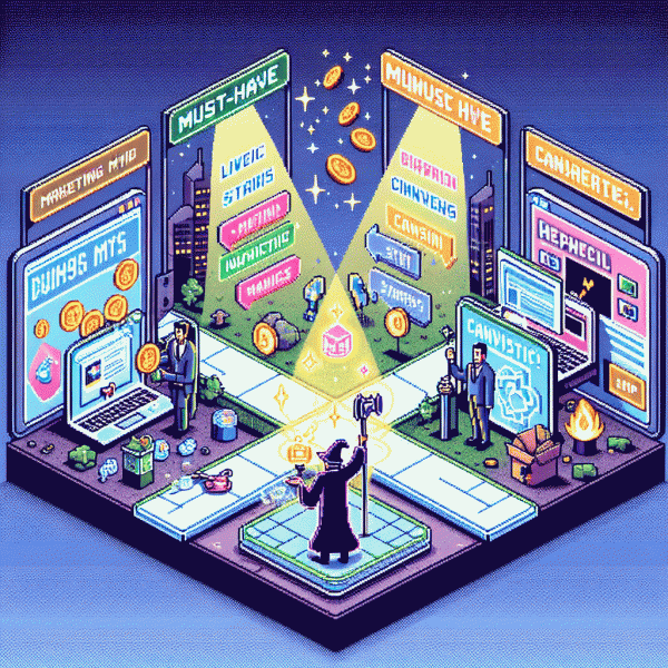
Landing Pages in 2025: Must-Have Magic or Marketing Myth?
From click to customer in 7 seconds: what your page must do
Seven seconds is not a guideline, it is a deadline. In that flash a visitor must see value, feel safe, and know what to do next. Use a microheadline that answers who benefits and why, a clear visual that demonstrates use, and a primary CTA that leaves no guesswork.
Above the fold make three things obvious: a one-sentence value prop that pronounces benefit, a visual that shows the product or result, and a bold primary action button. Keep secondary options minimal; every extra link is a siphon. Make the CTA label a tiny command like Start Free Trial or Book a Call now.
Speed and clarity win. Trim assets, lazy load noncritical media, and prioritize first contentful paint. Reduce cognitive load with short paragraphs, generous spacing, and predictable patterns. Mobile first typographic scale and touch targets matter more than decorative flourishes. Users scan; let them land on the single sentence that converts.
Remove friction before you ask for a commitment. Ask for the minimum data, offer social or single-tap sign ons, and use progressive profiling to gather details later. Show one or two trust signals near the CTA: a testimonial snippet, a security badge, or clear refund terms. Visual affordances must invite interaction.
Treat the first seven seconds as an experiment to iterate. Run small A B tests on headline, hero visual, and CTA copy; instrument heatmaps and micro conversions; measure micro funnel drop off. Then keep what moves the needle. Little wins compound fast; landing pages that earn attention earn customers.
Homepages leak, landing pages convert: here is why in 2025
Your homepage behaves like an open front door: curious visitors wander in, window-shop, and leave having liked your aesthetic but not your offer. In 2025 that wandering is amplified — more channels, tighter attention, and higher expectations — so the page meant to educate has to stop pretending it can also sell. Landing pages are single-minded dates: one promise, one action, zero awkward small talk. Design and copy that force a decision win more conversions than a beautiful but indecisive homepage ever will.
Conversion mechanics are boringly brilliant. Prioritize speed, a headline that answers the question in one sentence, and a single, clearly visible CTA. Strip global navigation, kill distractions, and ask for the minimal micro-commitment first (email > card). Layer in trust signals near the point of decision: concise social proof, a crisp privacy note, and a risk-reducing guarantee. In practice, a 300ms speed improvement plus removing two optional fields will often beat a complete visual overhaul.
Test like a scientist and personalize like a friend. Run modular A/Bs on hero copy, CTA verbs, and form length; segment by referrer and device; use lightweight personalization (referrer-specific headlines, local social proof) rather than heavy dynamic pages that slow you down. For an immediate uplift, seed credibility where people look first — your hero and CTA — for example by pairing high-converting pages with audience boosts such as trusted instagram followers, which can accelerate perceived social proof and nudge early testers toward conversion.
Close the loop with a ruthless 72-hour playbook: map one funnel, launch one focused landing page, run paid traffic in micro-campaigns, and measure CTR-to-form, form completion rate, and cost per lead. Iterate on the biggest bottleneck, not the prettiest detail. Treat homepages as discovery canvases and landing pages as the place where attention finally pays rent.
AI, privacy, and speed: the 2025 rules that favor focused pages
Think of 2025 landing pages as tiny, impatient stage plays: the audience wants relevance, speed, and privacy, in that order. AI can craft ultra-specific narratives that match micro intent, but heavy personalization must be balanced with clear consent and minimal data hoarding. Focused pages win because they reduce decision friction, lower load, and make privacy disclosures readable instead of scary legalese.
Keep the scope tight: one promise, one action, one journey. Use server side inference to tailor content without sending every keystroke to third parties, and prefer on device models for basic personalization to cut latency. When you need help scaling, check a specialized partner like safe instagram boosting service as a reminder that niche expertise can accelerate testing without bloating your stack.
Speed is non negotiable. Prioritize a lean critical path, inline only essential CSS, lazy load below the fold, and ship modern image formats with proper srcset. Measure real user metrics and optimize for First Input Delay and Largest Contentful Paint, not just lab grades. Small savings per asset compound into noticeably happier visitors and better conversion rates.
In practice, build focused templates, limit trackers to those that deliver clear value, and run A/B tests that weigh privacy friendly variants equally. Actionable rule: if a feature adds more than 100ms to median load without clear lift, drop it. Deliver succinct content, fast assets, and transparent controls, and the landing page will feel less like marketing and more like a thoughtful shortcut.
Skip the page? The rare cases: direct checkout, app installs, and LinkedIn lead gen
Skipping a full landing page can be brilliant or brittle depending on the campaign. When the proposition is ultra-familiar, the CTA is atomic, and the trust bar is already high, sending people straight to checkout, an app store, or a native LinkedIn lead form saves seconds and reduces friction.
Use a short checklist before you ship the shortcut: the audience must already know and trust the brand; the conversion is a single, well-defined action; the mobile experience is seamless; and the offer fits the channel context. If you cannot measure post-click conversions or fail any of those boxes, keep the mini-landing page.
- 💥 Checkout: ideal for repeat buyers and limited SKUs—minimize fields and prefill everything you can.
- 🤖 Installs: perfect when creative links directly to the app store; deep links and clear benefits boost install-to-open rates.
- 👥 Linkedin: native lead gen beats a page when B2B intent is high and form fields are short.
Operational tips: add a lightweight thank-you micropage for tracking and retargeting, run a small test against a full landing page, and prepare a retargeting funnel for visitors who bounce. That way you get speed without sacrificing learnings.
Steal this 5-section landing page blueprint for better conversions
Treat this five-section blueprint like a cheat code for conversions: compact, persuasive, and easy to steal. Each block has a single job so visitors don't guess. I'm not talking fluff — think razor-sharp headline, quick benefits, proof, objection-busting details, and a low-friction close. Implement these five parts in order and watch drop-offs turn into signups.
Start with a hero that does three things: stop, explain, and guide. Use a one-line benefit-driven headline, a two-line subhead that answers what's in it for me, and a single prominent CTA above the fold. Add a contextual visual (real product or use-case image) and one small trust cue — badge, partner logo, or customer count — to cut doubt fast.
Next, unpack the promise with benefit bullets, not features. Write three crisp statements that end with the customer benefit, each paired with a tiny visual or icon to aid scanning. Sprinkle microproof — a stat or mini-case — after each bullet to make abstract claims tangible. Keep copy conversational and use bold to highlight the payoff words.
Then, neutralize fears with social proof and a short FAQ. Lead with a striking testimonial or metric (video if possible), follow with recognizable logos, and include a two-question FAQ that tackles common objections and the return policy. Finish this section with a simple guarantee line to reduce perceived risk and justify the click.
Close with a repeat CTA, urgency cue, and friction-removal checklist (payment options, time to setup, support availability). Make the CTA specific — not "Submit" but "Start my 14-day plan" — and add a tiny P.S. under the button for last-minute nudges. Track clicks and heatmaps to iterate; small swaps here move real revenue.