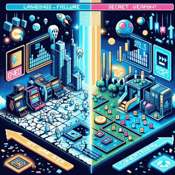
Landing Pages in 2025: Game Over or Secret Weapon?
Spoiler Alert: Your Homepage Is Not a Funnel and Here Is Why It Matters
Think of your homepage as the hotel lobby that greets everyone, not the private suite where the contract gets signed. It must welcome different intents, show where to go, and earn enough credibility for visitors to pick a path. In a world of tiny attention spans and fast scrolls, asking the homepage to act like a single funnel is a losing strategy. Cluttered choices, competing CTAs, and mixed messaging make conversions a game of chance.
Landing pages and homepages solve different problems. A landing page is single minded: one audience, one message, one action. The homepage is multiplex: many audiences, many goals, many signals. When you send paid traffic to the homepage you leak intent, muddle attribution, and slow down learning. Your analytics will suggest everything and nothing, while true conversion drivers stay hidden behind noise.
Start with a simple playbook. Map your top three traffic sources, then build focused landing pages that mirror the ad promise and remove extraneous navigation. Use campaign parameters to track origin, place a single prominent CTA above the fold, and test one variable at a time: headline, hero image, or CTA copy. Layer lightweight personalization so returning visitors see relevant offers, and measure micro conversions like CTA clicks, form starts, and video plays before optimizing for final sale.
Treat landing pages as your secret weapon: cheap to spin up, fast to iterate, and brutally honest about what resonates. If you want a practical next move, pick the highest value campaign, design a targeted page, and run a 7 day A/B experiment. Small, focused tests will yield outsized wins when you stop asking the homepage to do impossible jobs and let landing pages do what they do best.
5 Times Landing Pages Print Money and 3 Times They Do Not
Landing pages are the backyard BBQ of digital marketing: low fuss, big payoff when you bring the right people and the right sauce. Done well, they turn a curious click into a happy buyer; done sloppily, they leak dollars like a poorly wrapped burrito. Think of them as short, persuasive novels — no fluff, memorable ending.
They print money when you get five things right: a single, irresistible offer (limited discount, free trial or ultra-clear benefit) and a crystal-clear CTA that removes decision friction; paid traffic that's tightly targeted and has ad copy matched to page intent so visitors feel they've landed in the right place; trust builders — reviews, badges, and transparent pricing that erase doubt; micro-conversions like email or SMS opt-ins that let you nurture without asking for a full commitment; and a retargeting loop (pixel + sequenced messaging) that turns hesitant browsers into buyers.
- 🆓 Freebies: a lead magnet that actually solves a tiny problem and reliably captures emails for follow-up.
- 🚀 Speed: fast load times and a tight visual hierarchy that funnels attention straight to the CTA.
- 💥 Clarity: one promise, one CTA — every extra option is a leak in your conversion bucket.
They don't print money when you assume every visitor is ready to buy, bury CTAs in vague copy, or jam the page with too many choices and filler content. Indicators of trouble: conversion rates under 1%, sky-high bounce on the entry page, and form abandonment — these are the three classic killers. Fix the friction before you blame the traffic.
Actionable checklist: pick one landing page, A/B test two distinct CTAs, send a steady 7-day test traffic batch, and measure conversion lift plus micro-conversion rates. Strip nonessentials, iterate weekly, and you'll quickly spot which of the five money-makers to double down on — and which of the three killers to fire.
From Click to Conversion: The 7 Second Rule for 2025 Attention Spans
Attention in 2025 is not a polite handshake, it is a sprint. In the first seven seconds a visitor decides if your page is worth a second look or a swipe away. That is the window to convert curiosity into intent, and small design decisions win big. Thumb friendly CTAs, a crystal clear benefit line, and an instantly legible visual hierarchy are non negotiable. Think of the first seconds as a dating profile for your offer.
Start with these surgical improvements: lead with a benefit not a feature, place one primary action above the fold, show a single social proof nugget and remove top navigation clutter on initial view. Reduce cognitive load by trimming choices, use contrast to guide the eye, and compress loading time so the hero area paints a full picture almost immediately. Aim for 1 strong headline, 3 supporting words, 1 action button, 0 distractions.
- 🆓 Free: Offer a low friction commitment such as a trial, simple demo, or instant download to transform passive interest into a trackable lead.
- 🚀 Fast: Prioritize load and paint time. If the hero does not appear in under 1 second, the bounce rate will climb.
- 💥 Proof: Show one clear trust signal (testimonial, number, badge) so the brain can shortcut to credibility without reading paragraphs.
Finally, instrument everything and iterate. Track click to micro conversion, run headline and CTA color A B tests, review heatmaps and session replays, and treat mobile as the primary experience. Small experiments every week convert into large lifts over a quarter. Deliver an unmistakable first impression and the rest is optimization math, not magic.
AI, Ads, and Attribution: What Changed and How to Adapt Fast
The measurement landscape flipped from neat rowboats to a foggy ocean: AI bidding waves, privacy buoys, and fragmented signals make last-click storytelling obsolete. Instead of crying over lost pixels, treat attribution like probabilistic intelligence — design short experiments, expect noise, and let aggregated patterns guide budget shifts rather than single sessions.
Start with a simple playbook you can run this week:
- 🆓 Free: Use built-in ad-platform lift reports to spot directional wins without extra tools.
- 🐢 Slow: Run longer conversion windows and cohort analysis to capture delayed, real customer behavior.
- 🚀 Fast: Implement server-side event collection and run A/B tests that measure incremental revenue, not just clicks.
Want a fast sandbox to stress-test creative-to-conversion ideas? Try the best instagram boosting service as a controlled way to amplify small tests, observe response patterns, and iterate landing pages with real engagement signals.
Bottom line: stop chasing perfect attribution and start engineering clarity. Combine server-side data, holdout experiments, and broader KPIs (LTV, retention, cohort ROAS). Move budgets based on lift and margin, not vanity metrics — then let machine learning do the heavy lifting on the things you already proved work.
Do Not Scrap Them, Upgrade Them: A Simple 4 Block Template That Converts
Landing pages are not relics; they are short plays that either win a conversion or fumble attention. Swap the cluttered one pager for a tight four block stack and you will see fewer exits and more clicks. Think of it as surgical editing: remove noise, amplify value, and create a predictable path to action that is easy to test.
Block 1 — The Hero: Start with a punchy headline that answers what this is for in a single breath, a supporting one liner that sells the outcome, and one bold CTA. Use a crisp visual or a simple micro animation to illustrate the result rather than to decorate. Practical tip: pick one phrasing and one image per experiment so you learn what actually moves people.
Block 2 — Trust and Proof: Place social proof immediately after the hero: customer logos, a short outcome focused testimonial, and one concrete metric. Keep each proof element bite sized so it scans on mobile. Replace generic praise with specifics like percent improvements or time saved to turn curiosity into credibility and reduce hesitation.
Block 3 — The Offer Explained: Spell out three quick benefits and a clear next step, and include risk reversal such as a guarantee or trial. Make pricing visible or explain how to get a custom quote in one sentence. Short, honest explanations beat clever vagueness every time; clarity accelerates decisions.
Block 4 — The Close: Finish with a final CTA plus micro commitment options like try, subscribe, or schedule. Add one trust line and ensure the entire stack loads fast on phones. Then measure three KPIs — click through, lead rate, and time on page — and run single variable A B tests until the funnel gets reliably better.