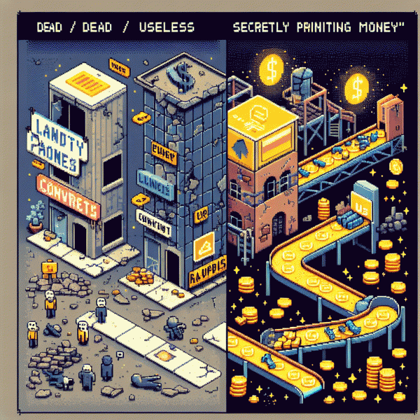
Landing Pages in 2025: Dead, Useless… or Secretly Printing Money?
The 10-second test: what your homepage can't do (but a landing page can)
In the 10-second test your homepage usually loses. Visitors scan, judge, and bounce before your navigation bar even has a chance to smile. Homepages are encyclopedias; landing pages are laser pointers. If someone can't answer “what do I get?” in under ten seconds, they're gone — and that's where a focused landing page quietly starts printing money.
Homepages try to serve everyone: press, partners, power users, and the CEO's hobbies. That creates choice paralysis, slow load times, and fuzzy messaging — all conversion killers. A landing page strips noise: one promise, one audience, one action. Actionable rule: craft a single bold headline, follow with one benefit line, and put the CTA above the fold; test whether clarity beats clever every time.
Quick checklist to pass the 10-second test:
- 🆓 Headline: One clear benefit that answers “what's in it for me?” immediately.
- 🐢 Load: Trim images and scripts so the page feels instant — aim for under 1s above the fold.
- 🚀 CTA: One primary action with commanding button text and no competing links.
Treat the 10-second test like a lab: pick a high-intent source, send traffic to a stripped-down landing, measure conversions, and iterate. Teams that stop polishing homepages and start shipping single-purpose pages routinely see double-digit uplifts. If your homepage can't pass the test, don't mourn — optimize for signals, bake the funnel into a landing, and measure the money.
Ads love clarity: why your CPC drops when your message has one job
When your ad has one job — say, 'get me signups for the free trial' — the auction's algorithms stop guessing. Clear intent means higher predicted relevance, faster learning, more conversions attributed to that creative. That clarity nudges your CTR up and your CPC down because the ad system rewards consistent signals: headline, creative, CTA and landing page all speaking the same language.
Think of it as lowering cognitive taxes for both humans and machines. Users scan faster, bounce less, and the platform's quality score or relevance predictor trusts your ad, lowering bid pressure. Where multiple promises introduce hesitation, a single, relentless promise removes friction: fewer clicks wasted on curiosity, more clicks that actually convert — which is the exact thing your CPA wants. That lower friction short-circuits wasted clicks and boosts your ad's conversion signal to the algorithm, which bids less on low-performing competitors.
- 🆓 Offer: Keep it one call-to-action — free trial, demo, download — not three choices.
- 🐢 Audience: Narrow to one intent cluster so signals compound instead of dilute.
- 🚀 Landing: Mirror the ad headline and CTA so the page immediately finishes the promise.
Run a 50/50 test: same creative, two pages — one doing one job, one doing five. You'll usually see the one-job page win with higher conversion rate, lower CPC, and more predictable scaling. Bonus: once a single-message funnel stabilizes, you can raise budgets without the auction freaking out, because the learning phase finishes faster and stays efficient. And the reporting gets cleaner: fewer micro-conversions, clearer optimization signals, faster scaling decisions.
Make this a rule: every campaign should answer 'what single action do I want right now?' in one crisp line. When ad and landing page march in lockstep, you stop leaking efficiency and start printing profit — quietly, like a machine that finally learned its job. Treat clarity as a budget multiplier, not a creative constraint.
AI chatbots, microsites, and product pages: who should own the first click in 2025?
Deciding who gets the first click in 2025 is less about turf wars and more about signal matching. High intent visitors want immediate answers and a straight purchase path; curious browsers want narrative space; and undecided prospects want a quick, helpful conversation. Map your click ownership to visitor intent, not ego.
Start by tagging traffic by source, copy, and creative so you can see which channel brings which intent. Look at micro conversions like chat starts, product previews, and email captures. If acquisition cost is rising, test shifting a slice of paid traffic from product pages to conversational bots for qualification and cleaner leads.
A simple decision rubric can keep experiments tidy:
- 🚀 Fast: product pages for search and retargeting where buyers are ready to convert right now.
- 🤖 Conversational: AI chatbots for qualifier flows, instant answers, and low friction lead capture.
- 👥 Discovery: microsites for storytelling, community building, and higher lifetime value experiments.
Integration matters. Give your chatbot product context via session tokens, let microsites drop cookies for personalized product pages, and keep canonical offers consistent. Run A/B tests that swap first click destination while holding creative constant. Measure time to value, cost per qualified lead, and revenue per visitor.
If you want one tactical start, route cold social to a microsite, warm traffic to a chatbot, and high intent search to product pages. Iterate weekly, not monthly. In many cases a smart stack of all three will out convert any single champion. Do the experiments and let the ROI decide.
Swipe-worthy examples: simple layouts that convert without a designer
People assume conversions demand pixel perfect design. They do not. The fastest path from visitor to customer is brutal clarity: one headline, one supporting line, one obvious CTA. High converting microlayouts lean on contrast, whitespace, and a tiny commitment so the visitor can act without thinking.
Here are three swipeable skeletons you can paste into any builder and test today:
- 🆓 Lead: Hero headline, one line subhead, single email field, tiny trust line under the field.
- 🚀 Product: Big photo at left, three benefit bullets at right, single purchase CTA, social proof row below.
- 💥 Trial: Short promise, 30 second explainer, clear scarcity or timer, one primary opt in button.
Copy hacks that move the needle: use a 5 to 7 word headline that names the outcome, three benefit bullets that start with verbs, and CTA text that promises value (examples: Get started free, Reserve my spot, Try 14 days). Use a high contrast color for the CTA, place a microcopy line under the button like no spam, unsubscribe anytime, and show one logo or testimonial near the fold for instant credibility.
Quick launch checklist: remove top navigation on test pages; limit form fields to one or two; swap only one element per variant; run each test for a minimum of 3 days or 500 visitors. Simple layouts win when you iterate fast. Swipe these blocks, launch, measure, and let data do the design work.
When to ditch it: a quick decision tree for campaigns, launches, and evergreen offers
Start by treating this like triage: is the landing page adding clarity, trust or conversion horsepower — or just another click between ad and sale? If your offer is single-click buy or a product with clear intent, the landing page often becomes friction. When the page is doing heavy lifting for objections, compliance, or long-form storytelling, keep it.
Use a quick checklist before you decide: traffic volume, conversion lift, CPA vs target, and tracking fidelity. If you have enough traffic (aim for 5k+ sessions) and the page underperforms a direct-to-checkout split, ditch it. If conversion rate on the page is below 2–3% while your product pages hit 4–5%, that's a clear signal.
- 🚀 Launch: Keep a landing page when you need controlled messaging, pre-launch waitlists, or staged scarcity; otherwise route high-intent clicks to checkout.
- 🐢 Test: For short experiments, swap the page for a product listing or instant-buy flow — if CAC drops ≥20%, cut the page.
- 🔥 Evergreen: If the offer relies on long-term content and lifecycle touchpoints, keep a modular landing page; if steady buys come from product pages, simplify.
Run a practical test: 2 weeks, minimum 5k clicks or ~200 conversions per variant, track CPA/ROAS and micro-conversions, and use server-side events to avoid attribution loss. If the alternative path reduces CAC without hurting AOV or return rate, move fast.
Final rule: landing pages are tools, not trophies. Keep them when they increase average order value, retention, or lifetime value; otherwise prefer checkout-first flows, deep-linked product pages, or conversational entry points. Ship the experiment, measure, and keep what prints money.