Landing Pages in 2025: Dead on Arrival or Secret Revenue Engine?
The 10 second test: can your offer survive the scroll
Think of the 10‑second test as a tiny, merciless focus group: if a visitor can’t understand your offer in a glance, they scroll. Nail a one‑line value claim, ditch jargon, and make the benefit painfully obvious—no clever metaphors required.
Visual hierarchy wins: a bold headline, a clear subhead that amplifies the single benefit, and a hero image that reinforces the outcome. Put one primary CTA above the fold, contrast it, and remove competing links so the eye has a single marching order.
Social proof should be near the CTA: a compact testimonial, a customer count, or logo strip that answers “who trusts this?” instantly. Reduce friction—short forms, progressive disclosure, and a promise of no spam make people hit the button instead of the back arrow.
Load time and mobile feel are non‑negotiable. Compress images, adopt system fonts, lazy‑load below‑the‑fold elements, and aim for a 2‑second paint. If your hero still stutters, the offer won’t get those precious ten seconds.
Measure what matters: heatmaps, click maps, and micro‑conversion funnels will expose where attention dies. Run headline and CTA A/Bs weekly; replace opinions with data and iterate faster than your competitors can write a new tagline.
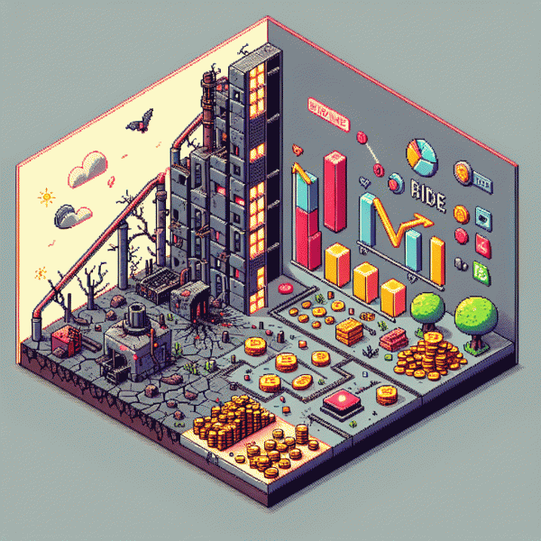
If you want fast social proof to test placements and boost credibility, try get free instagram followers, likes and views — sprinkle real momentum above the fold and watch whether your offer survives the scroll.
Homepage vs landing page: a friendly cage match with real numbers
Think of it as a friendly cage match: a homepage wearing the brand crown versus a lean, message-focused landing page. In our pooled sample across small-to-mid SaaS and DTC campaigns, homepages averaged about 1.2% conversion and a 65% bounce rate with 40–50 seconds on page; targeted landing pages clocked roughly 8.6% conversion, a 28% bounce rate, and 90–110 seconds of engaged time. Those aren't bragging numbers — they're the difference between "meh" and money.
Put it into dollars: send 10,000 visitors to each. The homepage nets ~120 conversions; the landing page ~860. If your average sale or qualified lead is worth $50, that's $6,000 versus $43,000 — a 7x revenue gap. Even if you apply conservative filters (lead-quality discounts, 30% to real customers), the landing page still transforms the same traffic into 2–4x more revenue. That's not luck; that's message-market fit.
So what wins in practice? Three quick plays: align the ad and headline so intent flows from click to offer; strip navigation and distractions so the single CTA isn't competing; and localize the proposition — different audiences, different pages. Run a 10% traffic split test for two weeks and watch lift. If you're measuring micro-conversions like demo clicks or add-to-carts, you'll see faster signals than waiting for final purchases.
Finally, don't romanticize the homepage — it's for discovery and brand depth, not conversion brute force. Treat it like a hub, not a campaign endpoint. For revenue-focused campaigns, build modular landing pages you can spin up, test, and retire quickly. Tweak copy, swap images, trim load times under 2 seconds, and iterate until that 8.6% becomes your baseline. Then invite the homepage to the afterparty. Push mobile-first templates, watch Core Web Vitals, and celebrate when your CPL drops and lifetime value climbs.
Ad scent and message match: small tweaks that unlock big conversions
Think of ad scent as the perfume trail you leave from ad to landing page: if the fragrance changes, prospects bail. Tiny mismatches — headline that promises “Instant ROI” but the page talks about features, a hero image that shows people when your ad showed product shots — kill momentum. In a short-attention 2025 feed, preserving that scent is the difference between click curiosity and cash conversion.
Actionable tweaks are delightfully low-effort: mirror the ad headline verbatim on the page, repeat the offer amount or time limit in the hero, and make the CTA copy a straight continuation of your ad line. Swap a vague “Learn more” for “Claim 20% off” if that's what the ad promised. Small copy and visual edits create a cohesive path that lowers friction and raises trust — fast.
To make this practical, run quick micro-experiments that prove the lift. Use this checklist as a starter:
- ⚙️ Test: A/B the exact headline wording from the best-performing ad vs. a generic headline.
- 🚀 Speed: Ensure the hero image, offer and CTA appear above the fold — faster alignments convert better.
- 👥 Audience: Tailor the first sentence to the ad's audience segment (e.g., founders vs. marketers).
Don't overcomplicate: schedule a 7-day scent audit, ship three micro-changes, then measure micro-conversions (click-to-form, scroll depth, CTA clicks). Those small wins compound into a secret revenue engine — and you'll sleep better knowing your landing pages actually keep the promise your ads made.
AI, personalization, and speed: what changed and what to do now
AI has stopped being a magic word and started being the landing page engine. Models now decide which headline, hero image, and offer will land with a visitor before the second scroll. The result is not just higher conversion rates but a different workflow: less guessing, more experiments that scale automatically.
Personalization moved from clunky content tokens to full micro-experiences. Think dynamic sections that rearrange based on intent signals, predictive offers that pre-fill forms, and visuals that match real-time audience attributes. All of this runs with an eye on privacy: rely on first-party signals, consented traits, and transient inference rather than hoarding raw profiles.
Make the shift without breaking things by running small, measurable bets. Use automated creative variants, route traffic to real-time models, and keep a human-in-the-loop for brand voice. A simple starting checklist:
- 🆓 Free: run a set of zero-cost creative swaps to test headlines and CTAs against a control.
- 🐢 Slow: stage heavier experiments behind a feature flag to limit exposure while models train.
- 🚀 Fast: deploy edge-rendered snippets and instant personalization for high-intent cohorts.
Speed now equals conversion. Prioritize edge CDNs, server-side rendering for critical content, and aggressive asset optimization so AI-driven swaps happen without latency. Prefetch predicted next-step assets and keep third-party scripts gated by engagement signals to avoid slowdowns that kill micro-moments.
Finally, measure and iterate: track lift by cohort, automate rollback thresholds, and package winning flows into composable templates. If you want a quick way to amplify social proof for segmented audiences, try this practical growth hook: get free instagram followers, likes and views and use that social signal as a personalization layer to boost credibility on your fastest-converting pages.
Quick wins checklist: copy, design, and trust cues you can ship today
Start small and ship fast: focus on the three parts that actually move metrics—headline, hero CTA, and objection-handling copy. Craft a single-sentence value proposition (6–12 words), hide or simplify top navigation, and remove any unnecessary links that tug attention away from the conversion path. These are tiny changes with outsized returns.
Copy quick wins you can implement today: lead with a benefit, follow with a one-line subhead that answers "what's in it for me", and add microcopy that preempts the top two objections (time and cost). Swap vague CTAs for benefit-led ones like Start saving 30% today or Get results in 7 days, shorten form labels, and surface one social proof line under the CTA to boost confidence.
Design quick wins are often simple: increase headline size, use a high-contrast CTA color, add comfortable mobile padding, and replace a staged portrait with an image that shows the outcome. Eliminate heavy animations, compress hero images, and make the button tappable area at least 44x44px. If you want an immediate credibility lift, consider tools for authentic social media boosting and display those engagement counts next to the CTA.
Trust cues to ship now: add three recognizable client logos, one concise testimonial with a small headshot, a security badge, and a clear money-back or guarantee line. Run a single A/B test (logos vs. five-star badge) and measure conversion lift. Ship one change, watch the data, then iterate—small wins stack into a serious revenue engine.