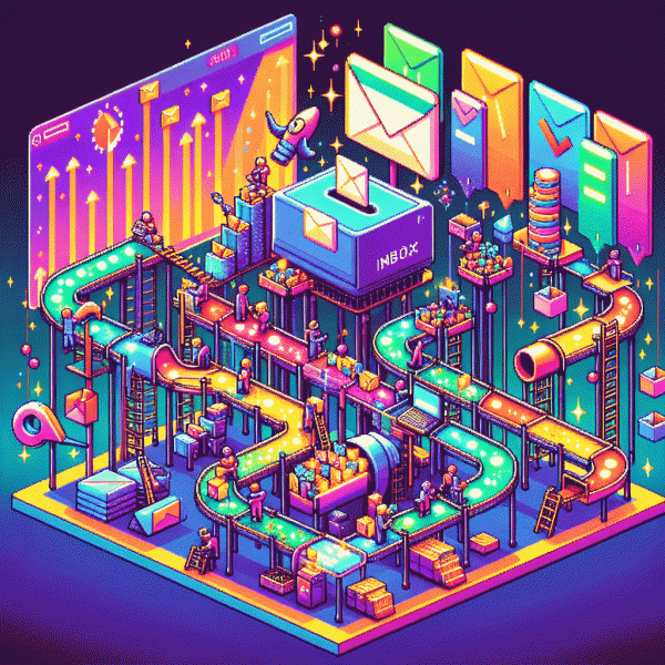
Email Marketing Isn’t Dead — You’re Just Doing It Wrong (Here’s How to Fix It Today)
Subject lines that get the click — hook them in 7 words
Seven words force focus — perfect for inbox skim culture where attention vanishes between swipes. On mobile, a tight headline must promise something concrete and immediate: a verb, a benefit, a number or timeframe, and a tiny curiosity hook. Try a pattern like: Verb + Number/Result + Object + Timeframe + Curiosity. That discipline turns vague lines into little headlines that earn opens — for example, "Save 30% on design work today — read how".
Make a quick checklist while you write: choose an active verb (Get, Save, Try), quantify the upside (5 tips, 30% off, 7 days), add urgency or a deadline word (now, today, last), then append a micro‑curiosity kicker (…no experience required). Keep language simple, avoid spammy ALL CAPS and excessive punctuation, and test whether personalization (name, city) fits within seven words without bloating the message.
Here are three ready-to-send seven-word blueprints you can swipe and adapt:
- 🆓 Free: "Free 7-day coaching starts tomorrow — join now"
- 🔥 Urgent: "Last chance: claim your 50% discount today"
- 💥 Curious: "They tried it — this is what happened"
Don't overthink perfection — measure it. Send each seven-word candidate to a 10–20% test segment, track open-to-click conversion, and scale the winner to the rest. If you want a fast boost to your campaign momentum, try a proven growth partner to amplify reach: get instagram growth boost. Small, sharp subject lines plus disciplined testing is the quickest route from ignored to opened.
Stop blasting — segment by intent and behavior
Mass emails are the marketing equivalent of shouting into a crowded room and hoping the right person hears their name. Instead, treat your list like a set of individual conversations: segment by intent and behavior so each recipient gets something relevant, timely, and not annoying. Intent tells you why someone is in your funnel; behavior shows what they actually did. Combine both and you can send messages that feel intelligent rather than invasive.
Start simple and expand. Build three action oriented groups and map one clear next step for each:
- 🚀 High intent: Completed product page views, cart activity, or repeat visits in 48 hours — send a targeted offer or low friction checkout link.
- 🔎 Consideration: Clicked content, opened multiple emails, or viewed comparison pages — send social proof, FAQ snippets, or a timed demo invite.
- 🐢 Dormant: No engagement for 60 plus days — send a reengagement sequence with a small value exchange like a checklist or exclusive tip.
Turn these segments into automated journeys with behavior triggers, not calendar blasts. Use event based rules like page view plus add to cart equals cart nudge, or two article reads plus no purchase equals educational series. A couple quick experiments to run this week: A/B test subject lines across the high intent group, test single CTA versus multiple CTAs in the consideration flow, and cap sends to dormant users at three emails in two weeks. Keep personalization lightweight — product name, last action, and predicted category work wonders.
Make a tiny checklist to implement today: capture the last action, create three segments, draft one tailored email per segment, automate triggers, and set measurement for conversion and engagement. Do that and email will stop being a spray and start being a scalpel.
Make it feel human — simple design, clear CTA, big wins
Think of every email as a conversation, not a billboard. Strip the clutter: single-column layouts, short header that actually helps, and a clear visual hierarchy so the eye lands where you want it to. Keep imagery supportive, not flashy, and write like a human — one friendly sentence at a time. A helpful preheader that complements the subject line is like the opening line of a chat: it sets expectations and lifts opens without shouting.
When it comes to action, less is more. Use one dominant CTA: bold, button-shaped, high-contrast, and labeled with a verb that explains the payoff (try 'Claim 20% off' rather than 'Learn More'). If you must repeat the CTA, keep it identical and spaced so readers can act at any scroll depth. Remove competing links that distract from the goal and make the CTA keyboard- and thumb-friendly on mobile.
Write scannable copy: short paragraphs, bold the one line you want remembered, and use microheadings to guide attention. Limit images to one strong visual with descriptive alt text so the message survives images-off inboxes. Show one clear social proof line — a short testimonial or customer count — and include transparent contact and unsubscribe links to build trust. White space is not wasted real estate; it's the frame that makes your message legible.
Deliver quick wins today: pick a clean template, swap a single CTA copy to 'Get my guide' or 'Start saving now', and send A/B tests for two subject lines to learn what tone clicks. Track clicks and conversions over opens, and test send times by small segments. Do these four small edits and you'll see better engagement — because when design, copy, and a single clear ask line up, email stops being a chore and starts being a conversation people actually want.
Timing and cadence — send when minds are open
Timing is less about clocks and more about attention. The best subject line in the world will land flat if your audience is juggling a commute, a meeting, or bedtime. Think in windows: early morning inbox triage, mid-morning focus, lunch skimming, and evening wind-down. Map your customer day, not just your local timezone, and send when minds are open — when they can actually act on your message instead of filing it under "later" (which often becomes never).
Make that mapping actionable. Segment by timezone and by typical behavior, use behavior-triggered sends for cart abandonment, welcome flows, and reengagement nudges, and run small A/B tests on send times for each segment. Favor mobile-first formatting for any slot that hits commutes or lunch. Use send-time optimization sparingly: it is a blunt tool unless your data set is deep. Finally, prune sleepy subscribers so your open rate reflects real attention, not stale addresses.
- 🚀 Fast: High-frequency drip during launches or flash sales when urgency converts best.
- 🐢 Slow: Low-frequency nurturing for long consideration cycles where trust matters.
- 🆓 Rhythmic: Regular, predictable updates for audiences who prefer a steady tempo and curated value.
Measure what matters: opens are a clue, but clicks, time to conversion, and retention tell the real story. Build a simple timing checklist before each campaign: identify target segments, pick the primary send window, schedule an A/B test, and set a reengagement trigger if the window misses. Do that and you will find inboxes opening when minds are ready — and conversions will follow.
Forget vanity metrics — optimize for clicks, replies, and revenue
Stop treating open rates like applause. The real score is who clicked, who replied, and who paid. Start each campaign with one clear objective, one dominant CTA, and one landing action that converts. Make the CTA benefit-first and impossible to ignore; use a sender name people recognize and a preheader that sets up the click and momentum.
If social proof or fast traffic will shorten your test cycle, send recipients to a landing page that looks busy — small credibility wins convert in 24-48 hours. For quick experiments, consider a one-click boost to social signals like get instagram followers fast so your early visitors see traction and click through.
Design emails to invite replies: ask a single, answerable question, say reply with YES, and route those replies into a sales workflow. Use unique promo codes and UTM-tagged links so every click maps back to revenue. Run A/B tests on the CTA verb, color, and placement — not the logo — and automate followups based on replies.
Measure click-to-reply and click-to-purchase rates, then reward what works. Aim for lift in dollars per recipient, not vanity metrics that flatter dashboards. Small iterative tests, clear attribution, and a ruthless focus on monetization will turn email from noise into a predictable profit engine; start today with one micro-test and scale winners.