Build a Money-Making Funnel That Converts Like Crazy—No Social Traffic Needed
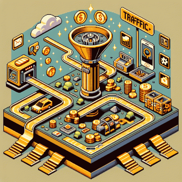
Steal This No-Ads Traffic Map: SEO, email, and partners that actually show up
Think of this as a treasure map for reliable attention: a three-lane route where search leads curious buyers, email turns casual readers into repeat customers, and partners amplify reach without paid ads. Treat each lane like a miniature product with its own conversion checkpoints, not a hoping machine for random virality.
Start with search by building topic clusters around the problems your offer solves. Create a pillar page, then spin off specific long tail posts that answer intent and funnel readers toward a single conversion page. Keep titles focused, meta descriptions inviting, and internal links obvious so search engines and people can follow the trail.
Mix channels with intent and speed in mind so you are not betting everything on one traffic source. Use this simple palette to decide where to invest time:
- 🆓 Organic: slow burn, evergreen content that accumulates authority and sends steady visitors over months.
- 🚀 Email: fast monetization when you convert search visitors into subscribers and deploy a tight welcome-to-offer sequence.
- 🤝 Partnerships: multiplier effect from co‑promotions, joint webinars, and content swaps that bring new audiences quickly.
For email, always lead with value. Offer a tiny, high perceived value lead magnet that maps directly to an initial sale. Then use a three part sequence: teach, prove, and invite. Segment subscribers by interest from day one so follow ups feel personal and lift conversions without extra traffic.
Finally, systemize partner outreach: create a brief partner kit, propose a clear swap, and measure each collab by new leads and revenue. Track actions on a simple ninety day plan and iterate. That is the no-ads map that actually shows up and converts.
Landing pages that whisper yes: crafting offers people can't resist
Think of your landing page as a gentle salesperson that never gets loud. Start by reducing noise: a single headline that names the outcome, one short subhead that explains how, and one offer line that removes decision fatigue. Replace long features lists with a crisp value sentence that answers the silent question visitors always have—what will this do for me right now?
Make the offer impossible to resist by stacking tiny, tangible wins: a clear price anchor, a risk reversal, and a micro-commitment that feels like a no-brainer. Use a seductive but honest guarantee, a short demo or visual proof, and a single call to action that tells people exactly what will happen when they click. For ready-to-use growth boosts you can test in minutes, try get free instagram followers, likes and views as a fast way to validate social proof without paid acquisition.
Remove friction ruthlessly. Cut the header navigation, prefill forms, and ask only for what is strictly necessary. Swap vague CTAs for behavior-oriented text like Start my 7‑day plan or Reserve my spot now. Layer trust with short testimonials, a logo row, and a tiny privacy note near the button so the last hesitation has no strong reason to persist.
Finally, treat your page like an experiment. Run A/B tests on headline verbs, button color, and the order of micro-benefits. Track conversion at each step, then double down on the microcopy and visuals that do the heavy lifting. Small, deliberate changes compound fast when the offer is truly tuned to say yes.
Frictionless flow: forms, CTAs, and checkout tweaks that boost conversions
Make the path to purchase feel like a glide, not an obstacle course. Trim your form to absolute essentials: name and email first, then use progressive profiling to collect more later. Validate inputs inline so users get immediate feedback instead of a surprise error page. Use placeholders and smart defaults to reduce thinking time and friction.
Buttons are the dealmakers. Replace vague CTAs with benefit-led verbs like Get my plan or Secure my spot. Make the primary CTA prominent in color and size, remove competing links on the page, and keep secondary actions visually subdued. Mobile-first sizing and touch targets are not negotiable when most buyers come from phones.
Checkout should feel fast and safe. Offer guest checkout, support autofill, and preselect sensible shipping or license options. Show totals and fees early, add a clear progress indicator, and surface trust badges near the final confirm button. One-click payments and saved cards lift conversion quickly, while free returns or a short guarantee remove last-second hesitation.
Run quick experiments with microcopy and layout tweaks, measure time-to-complete and dropoff by field, then iterate. Use urgency sparingly and pair it with real social proof so pressure feels credible. When you want to test a shortcut for growth, try a service like buy instagram followers cheap to validate demand signals and speed up validation cycles.
Follow-up that feels human: email sequences that sell while you sleep
Treat your inbox like a cozy shopfront: automated emails that feel like a neighbor dropping by with a helpful tip rather than a cold pitch. Design sequences to mimic real conversation with tiny questions, quick empathy, and a clear next step. When messages sound human, recipients open, click, and buy without you begging for social validation.
Start by mapping the customer journey into short, purposeful beats: welcome, value, objection handling, and a clear close. Use dynamic fields, plain text layouts, and a one-sentence opener that sounds like a human typed it. Trigger messages on behavior, not a calendar, so the right note lands at the right moment.
- 🆓 Free: a five-email welcome path that delivers value first, then plants a small offer once trust is earned.
- 🐢 Slow: a three-week drip that tells stories, layers social proof, and warms hesitant buyers with steady touches.
- 🚀 Fast: a tight cart-recovery trio that reminds, answers the main objection, and closes with a clear, low-friction CTA.
Write like a real person: trade jargon for plain talk, use one honest line of scarcity or social proof, and give a single actionable CTA per message. Run tiny A/B tests on subject lines and CTAs, watch opens and clicks, then double down on winners. Automation should amplify your best copy, not replace it.
Build the sequence once, then iterate. Small timing tweaks, a sharper opening line, or one better testimonial can lift conversions while you sleep. Sketch a welcome, a value followup, a soft pitch, a hard pitch, and a last-chance nudge, automate them, and check results daily until revenue becomes the new alarm clock.
Numbers don't lie: simple metrics to spot leaks—and fix them fast
Numbers are your map. Start by tracking five simple datapoints: visitors, leads, purchases, average order value, and bounce points. Calculate a basic conversion rate (purchases ÷ visitors) and a lead conversion rate (purchases ÷ leads). If the conversion rate is low but leads are high, your checkout or offer is leaking. If visitors are low but conversion is high, pump up the traffic. The point is to turn guessing into measurements you can fix in a day.
Use two fast checks every morning: a 60-second conversion audit and a 10-minute heatmap peek. The audit is just three numbers — visits, sales, revenue — to spot big swings. The heatmap shows where people stop clicking. When you see the drop, pick one micro-test: tweak the CTA, simplify the form, or add a single social proof line. Run the test for a week and keep what works. Small iterative wins compound faster than one giant relaunch.
- 🆓 Visitors: Count and segment by source so you know which channels convert.
- 🐢 Friction: Time-to-purchase and form fields — every extra field loses customers.
- 🚀 Velocity: Speed of follow-up — faster emails and DMs lift conversion dramatically.
If you want quick traffic experiments to validate fixes, try a controlled boost that focuses on intent rather than vanity metrics — for example, get free instagram followers, likes and views to stress-test your offer page under slightly higher load. Measure, tweak, and repeat: find the leak, patch it, and watch conversions climb without waiting on fickle social virality.