Are Landing Pages Still Necessary in 2026? The Plot Twist Your Ad Budget Needs
If You're Running Paid Traffic, This Is the Deal-Breaker
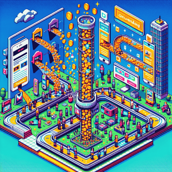
Paid traffic is merciless: you pay per click, not per guess. If the page your ad drops people onto feels like a different conversation — different claim, different mood, different CTA — cost-per-acquisition balloons. The deal-breaker isn't volume, it's relevance: ads promise, landing delivers.
Speed is credibility. A slow landing page on mobile tells a user to bail before the hero shot finishes loading. Compress images, defer nonessential scripts, and serve critical content first. Measure real-device load times and prioritize the elements visitors see in the first two seconds.
Message match is non-negotiable. Mirror the ad's primary phrase in the headline, use the same image or product shot, and keep the CTA language identical. Small tweaks erase cognitive friction and lift conversion rates without raising bids.
Cut friction ruthlessly. Reduce form fields to the bare minimum; use one obvious CTA above the fold; deploy smart defaults and autofill. Sprinkle just enough social proof and a clear privacy cue so people don't spend energy trusting you.
Track and iterate like a scientist. Fire events for every micro-conversion, visualize funnels, and run quick split tests. Server-side or enhanced conversion setups keep data intact when browsers try to hide it, so bidding algorithms have clean signals to optimize against.
Your short checklist: test message match, shave milliseconds off load time, cut form fields, and set up tight tracking. Do those four things and your ads stop hemorrhaging money — they start buying customers.
Homepage vs. LP vs. Checkout: Who Converts Best in 2026?
In the conversion triangle — homepage, landing page, checkout — the winner depends less on hype and more on context. For cold traffic coming from a targeted ad, a razor-focused landing page usually outperforms a generic homepage because it continues the ad's promise without distraction. For discovery or content-driven visits, the homepage still earns attention and trust. And for bottom-of-funnel shoppers, the checkout experience is the make-or-break moment: all prior persuasion collapses if the cart path is clunky.
Treat the homepage like your shop window: show the brand story, a couple of prioritized funnels, and crystal-clear entry points. Don't shove every product above the fold. Use clear CTAs for the three most valuable paths, fast loading, and visible trust signals. Homepage wins when the visitor is exploring, comparing, or researching — but it will rarely beat a tailored landing page for a single offer.
Landing pages are conversion surgery: controlled messaging, single goal, fewer exits. Build landing pages that mirror ad language, feature one prominent CTA, and surface social proof quickly. Run hyper-focused A/B tests — headline, hero image, and CTA copy are the high-leverage levers. If you want measurable ROAS improvements fast, prioritize creating a small library of campaign-specific LPs and iterate weekly.
Checkout is the last mile; optimize it relentlessly. Remove optional fields, enable guest checkout, show clear totals and trust badges, and offer one-click or saved payment options when possible. Measure drop-off by step and fix the biggest leak first. Practical rule of thumb for 2026 ad budgets: favor landing pages for new acquisition, use the homepage for brand nurture, and funnel savings into checkout UX — because the final touch often multiplies every dollar you spent earlier.
AI Funnels, Instant Checkout, and the Death (or Rebirth) of the LP
AI funnels and instant checkout are rewriting conversion choreography. Instead of sending people to a separate page to decide, you can surface a tailored offer inside the app, prefill payment details, and close the gap between curiosity and purchase in a heartbeat. That teleportation trick raises the bar for any page that expects a click through.
That does not mean landing pages are extinct. It means they must earn their pixels. Use them when you need storytelling, comparison tools, detailed FAQs or SEO reach. Where instant funnels win is speed and context relevance; where full pages win is education, nuanced objections and shareable links that bring in sustained organic traffic.
Decide with data and design for both. A short framework helps pick the right tool:
- 🧠 Complex: products with integrations, technical specs or demos still need room to breathe.
- ⭐ SEO: discoverability and long tail intent require indexable pages and rich content.
- 🚀 High-touch: enterprise offers or long sales cycles benefit from depth, forms and downloadable collateral.
If you want to accelerate validation for instant funnel experiments and build social proof faster, try targeted growth boosts like order instagram followers fast to seed momentum. Pair that with rapid A/B tests: measure CPA, micro-LTV and retention to avoid mistaking fast wins for true product-market fit. Keep the landing page when the product story needs a stage; otherwise let the funnel do the heavy lifting and iterate relentlessly.
Speed, Social Proof, and Trust: The 3-Second Survival Test
Three seconds is the tiny courtroom where your ad is judged. A slow load, awkward layout, or empty hero area triggers a quick guilty verdict and a wasted click. Ads will keep buying attention, but the landing experience must repay that expense with instant clarity, a credible signal, and a clear next step.
Speed checklist: compress and serve images as modern formats, inline critical CSS, defer non essential JavaScript, use a CDN and preconnect to important domains, and deliver a minimal HTML shell so content appears immediately on mobile. Aim for visually complete paint under three seconds rather than perfection later.
Social proof must arrive early. Lead with real metrics, a one line customer quote, or recognizable logos near the headline so the brain can shortcut uncertainty. Micro testimonials, number counters, and product photos from real customers all serve as social currency that reduces friction before a visitor scrolls away.
Trust signals do heavy lifting. Prominent security badges, a clear privacy line, transparent pricing, simple refund language, and a short form that asks only for what is essential create permission to convert. If you collect data, explain why in one sentence and show an option to continue as guest.
Keep landing pages when you need control: sophisticated segmentation, deep tracking, or multi variant testing. Otherwise build ultra light, trust first experiences that load as fast as native content. Run quick experiments, measure CPA and downstream value, and let raw speed plus upfront proof decide whether a full page is worth the ad spend.
Copy-and-Deploy: 5 Landing Page Frameworks That Still Print ROI
Think of these as plug‑and‑play scripts for growth — five compact landing page blueprints that still turn paid clicks into measurable customers. They are not design projects; they are focused performance plays you can copy, deploy, and iterate without blowing your media budget.
Here are the five quick frameworks to steal and ship: HERO — big promise, single CTA and a directional visual; PROOF — testimonial stack, quantified outcomes, and a low-risk guarantee; TRIAL — low-barrier lead capture with immediate value; MINI-SALE — single-item checkout with urgency hooks; CONTENT-GATED — premium asset behind a lightweight opt-in. Match each to one ad creative and one KPI for fast learnings.
Which offer type should you pick? Pick the one that fits the ad intent and the audience moment. Many teams test three variants: messaging, form length, and incentive. Keep creative consistent with headline, hero, and CTA to avoid dropoff from ad to landing page.
- 🆓 Free: Lead magnet pages that swap attention for email with a fast win.
- 💥 Fast: Short checkout funnels that remove friction and close on the first click.
- 🤖 Automated: Trial or demo funnels that trigger nurture sequences and conversion scoring.
Ship a version tonight: tight headline, bold proof, one visible CTA, and a tiny form. Run a 3‑day split or 300 clicks test, then double down on the winner. If ready to drop templates into campaigns, see safe instagram boosting service for quick reach that pairs well with copy‑and‑deploy pages.