Are Landing Pages Still Necessary in 2025? We Tested Them - Here Is What Happened
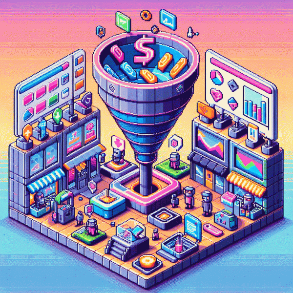
Wait, Didn't Funnels Kill Them? What Changed (and What Didn't) in 2025
For a few years we all treated funnels like the new religion: predictable steps, automated emails, and the promise that a sequence would render standalone landing pages obsolete. Reality in 2025 is messier and smarter. Funnels streamlined acquisition, but landing pages adapted instead of dying. They've become dynamic canvases—AI-driven, modular, and privacy-aware—where one URL can serve dozens of personalized experiences without breaking the funnel logic.
So what actually changed? First, AI can spin high-quality variants in seconds, so a landing page today is more of a living blueprint than a static brochure. Second, privacy shifts pushed marketers toward server-side data and zero-party prompts, which favors lightweight, conversion-focused pages that ask for value up front. And third, commerce moved into more channels (in-app checkout, social storefronts), meaning funnels sometimes bypass a traditional LP—but only when the offer is simple and trust isn't required.
What didn't change: humans still need clarity, speed, and trust. A messy funnel with confusing microcopy still loses. If your offer is complex, high-ticket, or requires education, a focused landing page with a single, bold ask will outperform a generic step in a funnel every time. Keep the hero promise obvious, the social proof visible, and the CTA unambiguous—those fundamentals haven't been AI-replaced.
Practical playbook: treat landing pages as modular assets you can plug into funnels; generate 3 headline variants with AI and A/B them for a week; instrument server-side events to track real conversions; and retire pages only after a 90-day test that looks at LTV, not just first-click conversion. Funnels didn't kill landing pages—2025 just made us smarter about when and how to use them.
Ads, AI, and Attention Spans: When a Landing Page Wins vs. Loses
Ads, AI, and shrinking attention spans are not a theory test; they are the new reality that decides whether a dedicated page helps or hurts. When creatives are personalized by models and feeds reward immediacy, landing pages must earn every second of attention with speed and relevance. That means clear intent matching between ad creative and page content, and ruthless focus on one action per visit.
Landing pages still win for complex offers: high average order value, subscription signups, B2B trials, or anything that needs trust, proof, and comparison. For those, use AI to prefill content, surface the most relevant case study, and show social proof dynamically. Include a clear CTA, pricing tiers, an FAQ accordion, and a single trust signal above the fold to avoid cognitive overload.
They lose when the value is tiny or the ad format is native. Social commerce, impulse discounts, or campaigns that expect an instant tap perform better with deep links, in-app checkout, or modular overlays. Use progressive profiling instead of full forms and prefer social proof native to the platform. Test short funnels first before investing design time in a long page.
- 🆓 Free: For low friction promos, link directly to an in-app claim or checkout.
- 🐢 Slow: For long decision cycles, invest in landing pages that educate and nurture.
- 🚀 Fast: For impulse buys, use one click flows and measure micro conversions.
Make it actionable: run parallel experiments — one creative to a landing page and one to a native flow — and let AI optimize creatives and audiences. Set guardrails for minimum uplift in conversion and lifetime value before keeping the page. If the native path yields equal CPA and higher ROAS, skip the page and double down on targeting and creative testing.
Landing Page Alternatives: LinkedIn Lead Gen, Link-in-Bio, or Product Page?
Forget the slow, filler-heavy pages of old; audiences now favor fewer clicks and faster answers. LinkedIn Lead Gen forms, link-in-bio hubs, and direct product pages are not identical substitutes, but each can replace a traditional landing page when used for the right goal.
LinkedIn Lead Gen: Platform-native forms auto-fill professional data, so lead quality for B2B campaigns often improves and friction drops. It is ideal for role- or account-based outreach and for campaigns where contact enrichment matters more than impulse buys. Connect the form to your CRM and follow up quickly to preserve value.
Link-in-Bio: A mobile-first bridge for creators and microbrands, link-in-bio keeps discovery flowing to multiple destinations without a heavy build. It wins on speed and simplicity but loses on deep conversion analytics and persuasive storytelling. Add a microlead capture or a highlighted hero link to nudge high-value actions.
Product Page: For pure transactional intent, a well-optimized product page converts better than any detour. Clear images, price, reviews, and a fast checkout remove barriers. Use this when traffic intent is high and the offer is easy to explain in one screen.
Which to pick depends on funnel stage, audience intent, and resources. If you need qualification or complex messaging, a dedicated landing page still earns its keep. If you prioritize speed, platform-native solutions often beat bespoke builds for early tests.
Actionable next step: run short, measurable experiments. Split traffic for two weeks between the landing page and the best alternative, track conversions, CPA, and lead quality. Keep whatever delivers acceptable cost and outcome for your business and iterate from there.
The 10-Second Test: A Quick Checklist to Decide If You Need One
Perform the ten second test like a bored human with a short attention span: open the link, watch the screen, and ask three blunt questions in under ten seconds — what is this, why should I care, and what do I do next? If those answers do not land fast, the link is losing people before they can convert.
Traffic source matters. Paid: Ads usually need a tightly matched landing page so message and offer remain consistent from click to conversion. Social: If the click arrives from curiosity, influencer content, or a broad feed, a focused landing page preserves narrative and prevents distraction. Organic: High intent search clicks may be fine with product pages.
Examine the offer. Single CTA: One straightforward action and simple copy often do not require a bespoke page. Complex Offer: Multi-tier pricing, qualification steps, or technical demos benefit from a dedicated landing page that can preframe value and filter unqualified leads before sales time is wasted.
Ask about testing and tracking. Analytics: Do you need separate tracking, A B tests, or custom pixels? A landing page gives you that tag friendly control and faster iteration. Speed: If you cannot build and measure a lightweight experiment quickly, start with a minimal landing template rather than piecing data across disparate pages.
Make the call: if three or more checks flag friction, mismatch, complexity, or measurement needs, build the landing page. If the click path is clear, intent is high, and the offer is simple, send users where they expect to finish. Ten seconds is enough to stop guessing and start optimizing.
If You Keep Them: The Non-Negotiables for Pages That Actually Convert
If you keep landing pages, treat them like the air traffic controllers of your funnel: they must manage flow, avoid collisions, and get people safely to the conversion runway. Lead with a single, razor sharp headline, one obvious primary CTA and a supporting visual that proves the promise instantly. Remove choice overload and let the page do the choosing for the visitor.
Design mobile first and obsess over speed: compress and serve adaptive images, lazy load below the fold, defer noncritical scripts and host static assets on a CDN. Aim for perceived load under two seconds with interactive elements ready quickly. Keep forms minimal, replace long signups with progressive profiling or social login, and use microcommitments to build momentum toward the final action.
Trust and proof are non negotiable. Surface recent activity counters, real testimonials with names and photos, recognizable customer logos and third party badges like SSL or payment partners. Add clear, friendly microcopy that explains why you ask for data and how it will be used. These signals reduce hesitation and prevent users from bouncing at the moment they most need reassurance.
Measure constantly and run rapid experiments: heatmaps, session replays, cohort funnels and single variable A B tests will reveal what actually moves the needle. If you want to simulate social traction while testing headline and layout variants, try get free instagram followers, likes and views to observe how perceived popularity alters behavior in a controlled way, then validate with genuine engagement.
Final checklist to ship today: one clear CTA, prioritized proof above the fold, minimal form fields, sub two second perceived load, mobile perfection and an active testing cadence. Landing pages in 2025 are not monuments to design, they are short lived experiments that earn their place in the stack. Keep them lean, measurable and ruthlessly user centered.