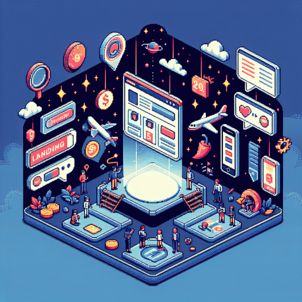
Are Landing Pages Still Necessary in 2025? The Spicy Truth Marketers Won't Tell You
The Case for Yes: Why Focused Pages Still Beat Homepage Detours
Stop treating every visitor like a mystery that must be solved by a homepage safari. A focused destination gives one promise, one path, and one likely outcome. That concentration cuts cognitive load, shrinks decision time, and turns curious clicks into measurable actions faster than a homepage that tries to be everything to everyone.
Clear headline, one strong offer, and a dominant call to action are not optional. They are conversion hygiene. Fast load times keep attention, tailored messaging speaks to intent, and tracking hooks let you learn what actually works. Think of a landing page as a compact experiment: simple variables, reliable results.
For tactical moves, keep tests small and rapid. Use a single hero message, remove navigation that distracts, and place the primary CTA above the fold. If you need traffic volume to validate a new angle, pair the page with a targeted push like buy facebook boosting service to get reliable early signals without messing with your organic funnel.
When in doubt, measure: bounce rate, time on page, and conversion per visitor tell the truth. A few focused pages aimed at distinct audiences will outperform a generic homepage detour every time. Trim the noise, amplify the promise, and iterate quickly.
When You Don't Need One: 7 Times a Landing Page Actually Hurts
Landing pages are great—until they're the thing standing between a curious click and a happy customer. They can introduce friction, kill momentum, and leak revenue when used as a reflex instead of a strategy. If your campaign creates more steps than answers, you're paying for lost conversions.
Case 1–3: For ultra-low-funnel ads (flash sales, one-click upgrades, or returning customers with stored payment), an extra page is unnecessary. When your audience is already in a trusted CRM segment or session-based app users expect immediate flow, a deep link or direct checkout often outperforms a landing page.
Case 4–5: Time-sensitive promos and influencer "link-in-bio" traffic hate delays; countdown urgency and native post mechanics beat a generic squeeze page. Similarly, mobile push or SMS campaigns should open into the exact app screen or cart, not a desktop-style mini-site that breaks the experience.
Case 6–7: Complex consultative sales and organic SEO articles can suffer from thin, conversion-first pages. If your landing page strips context to optimize clicks, you may lose trust, rankings, and long-term engagement—better to route people to content-rich pages or conversational channels.
Actionable move: audit journey length, measure time-to-action, and replace landing pages with deep links, instant-checkout, chatbots, or progressive profiles where appropriate. Keep the page only when it adds clarity, not when it adds steps—then test relentlessly and kill the ones that cost you momentum.
From Click to Customer: The 2025 Anatomy of a High-Converting Page
Treat the landing page as a short movie: the first three seconds decide if a viewer stays. In 2025 that means sub-two-second first paint, thumb-ready layouts, and headlines that answer a single question: what is in it for me. Mobile performance is not optional; slow pages leak prospects before the headline lands. Start by stripping heavyweight scripts, compressing imagery, and moving critical UI above the fold so value appears instantly. Use a skeleton screen to show progress and reduce perceived wait.
Design around micro-conversions: a hero that invites a tiny commitment, social proof that reduces doubt, and a single, bold next step. Swap vague features for clear outcomes and lead with the benefit, not the tech. Keep forms minimal, prefer contextual signups and progressive profiling, and sprinkle trust signals - ratings, recent order counts, and data-handling notes - to remove hesitation before the CTA.
The 2025 page is modular and measurable. Ship content as blocks you can reorder, experiment with, and personalize by referral source or ad creative. Instrument every module with lightweight analytics, heatmaps, and event-driven goals so you can calculate lift fast. A/B test microcopy, CTA color, and offer cadence; declare clear winners and roll them into a template to scale wins across campaigns.
Three quick moves you can do right now: Audit speed with a mobile-first throttle, Prune forms to one or two fields, and Write microcopy that tells shoppers the next small step and why it is safe. Done well, a landing page in 2025 is not a lonely gateway but a gentle hand guiding a curious click into a paying customer.
AI, Ads, and Algorithms: How Traffic Sources Changed the Rules
Ad platforms are no longer neutral streets — they're smart marketplaces that reward relevance and creative performance. AI bidding, creative automation, and algorithmic audience expansion mean the click you buy isn't the same as it used to be; every touch now carries a signal. Smarter traffic demands smarter pages that interpret intent, not just collect leads.
That shifts how you design the page funnel. Instead of static one-size-fits-all pages, think modular blocks that swap based on ad creative, platform, and predicted intent. Feed short-form ads into an AI that assembles headline, hero image and CTA on the fly; serve variants that match the ad's frame for instant consistency and higher conversions.
Privacy shifts and cookieless environments make first-party measurement a survival skill. Capture explicit micro-consent, instrument server-side events, and lean on deterministic signals where possible. Treat every landing interaction as a data moment: fast form fills, contextual microcopy and disposable identifiers that let you stitch journeys without violating user trust.
Metrics have moved from click-through to contribution-to-outcome. Algorithms optimize for platform objectives, so you must guard against false positives. Run small automated holdouts, test incrementality, and optimize for leading indicators like trial starts or qualified leads rather than raw CPA. Think LTV per acquisition channel, not just last-click.
The upshot: landing pages aren't dead, they need to evolve. Ship headless, make them lightning-fast, plug in an AI variant selector, and bake privacy-first tracking into the template. Want a one-paragraph checklist? Prioritize speed, dynamic content, server-side tracking, consented data capture, and an incrementality test — then iterate like the algorithm is watching.
Steal These Blueprints: Fast Builds for SaaS, DTC, and Service Brands
Think of these blueprints as cheat codes for launch week: super lean pages that convert without drama. For SaaS, DTC, and service brands this means swapping fluff for structure — a crystal clear value line, one obsessional CTA, and trust signals that do the heavy lifting while teams focus on growth.
For SaaS, lead with a measurable promise: headline that names a metric improvement, a 15 second explainer GIF, three benefit bullets, and a frictionless signup flow with demo booking or trial enabled. Reduce choices, use microcopy to remove doubt, instrument every click with analytics, and run rapid A B tests on pricing and signup barriers.
DTC pages are about mood and momentum. Use hero imagery that reads like a social post, a single benefit line, a carousel of UGC, and a simplified checkout with one click shipping and optional guest checkout. Prioritize fast load, mobile first display, sticky add to cart, and one time offers to nudge conversion and increase average order value.
- 🧰 SaaS: Single metric headline, demo CTA, checklist of integrations.
- 🚀 DTC: Bold product shot, UGC proof, one step checkout.
- 💁 Service: Problem statement, pricing tiers, easy booking form.
Take these templates, swap in brand voice, and shrink build time to hours not weeks. Keep pages modular so iterations are cheap. Track conversion rate, acquisition cost, and lifetime value; if a page earns its keep keep it, if not rip it down and launch the next experiment.