Are Landing Pages Still Necessary in 2025? Here's the Spicy Truth Marketers Won't Admit
The 10-Second Test: What Happens When You Send Ads to a Homepage vs. a Landing Page
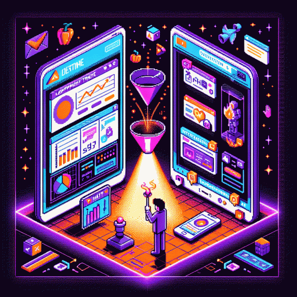
Ten seconds is all you get. When an ad dumps a visitor onto a homepage they meet navigation, noise, and a million choices; on a landing page they meet one clear promise. The 10‑second test separates distraction from clarity: either the value hook lands and the CTA wins, or the visitor moves on.
- 🆓 Free: Homepage with broad trust signals but scattered CTAs — visitors explore, not convert.
- 🐢 Slow: Homepage that loads heavy or buries the offer in long copy — interest fades before the ask appears.
- 🚀 Fast: Focused landing page with one promise, tight social proof, and a single CTA — conversions spike inside ten seconds.
Need a fast way to simulate social proof in your hero area and speed up validation? Add a controlled burst of engagement to reduce hesitation: get free instagram followers, likes and views.
Actionable checklist: measure time to first action, scroll depth at 10s, and CTA click rate; run a clean A/B with identical ad creative; iterate on headline, hero image, and one-choice CTA. The result will tell you whether your homepage can behave like a landing page or if a dedicated page is still the conversion weapon.
When You Can Ditch the Page: Direct-to-Checkout, Instagram DMs, and Other Fast Funnels
If your funnel goal is immediate revenue rather than persuasion theatre, skip the theatrical landing page. Direct-to-checkout links, Instagram DM automations, buy buttons inside stories, QR codes, and one-click payment SDKs can collapse days of friction into minutes. The trick is to only ditch the page when you have a crystal-clear offer, tiny friction, and a plan to recover lost analytics fast. Always design a minimal capture step so you still build remarketing audiences and own customer IDs.
Speed wins when your product is low-consideration, price is fixed, and creative does the convincing. But there are tradeoffs: fewer reliable A/B test slots, limited SEO upside, and harder-to-track micro-conversions. Compensate by making checkout part of the narrative—use dynamic order bumps, crisp microcopy, and DM pre-qual questions that reduce refunds. Keep a tiny confirmation screen to fire pixels, display social proof, and offer the first-tier upsell.
Operational playbook: implement deep links that open the intended screen, attach UTM-lite tags that do not scare users, and route traffic so TikTok, DMs, and paid ads land straight in cart. Add server-side events and receipt-based tagging to stitch sessions together. If you want a quick growth nudge to validate conversion velocity before investing in a full landing experience, test a micro-boost like buy instagram followers cheap and watch whether social proof accelerates checkout rates.
Do not treat this as an all-or-nothing decision. Run cohorts: funnel A keeps the landing page; funnel B shorts it out. Measure LTV, return rate, and acquisition cost per retained dollar. If short funnels lower CAC and do not tank retention, scale them. If churn rises or data goes blind, rebuild a lightweight landing page that loads in under one second and gets the last word across. Landing pages are not dead; they are on call when nuance matters.
AI-Powered Personalization: How Smart Pages Crush Bounce and Boost ROAS
Think of AI personalization as a smart stylist for the first few seconds a visitor spends on a page. It reads micro signals like referral source, device, time of day, and prior clicks, then swaps hero copy, image, and CTA to match intent. When a page feels written for one person, bounce drops and ad spend finds buyers faster.
Practical playbook: capture clean first party signals, build modular components for headlines, offers, and visuals, and let a lightweight model choose or test variants in real time. Measure micro conversions as signals not vanity. Run short, controlled experiments to avoid wrecking a winning creative. The payoff is fewer wasted impressions and measurable ROAS lifts in days.
- 🤖 Behavior: Personalize by last page visited or recent clicks to align the headline with intent.
- 👥 Segment: Serve different offers for first timers, return visitors, and known prospects to increase conversion rate.
- 🚀 Offer: Dynamically swap discounts, bundles, or urgency cues based on predicted willingness to buy.
Privacy safe tip: replace PII with intent tags and keep models server side. If you want to speed validation, use social proof controls like buy instagram followers cheap to get traffic signals fast while tuning personalization. Small voice and offer tweaks often beat big redesigns.
Design That Converts: The 7 Sections Every High-Performing Landing Page Needs
If you think a pretty page is enough, think again. A high-performing landing page is a choreography of seven parts: a razor headline, a hero visual, benefit bullets, features, social proof, pricing or offer, and a single conversion mechanism. Get those seven sections pulling in the same direction and you stop guessing and start converting.
Lead with a promise and prove it instantly. The hero section needs a succinct value statement, a supporting subheadline, and an uncluttered visual that demonstrates the outcome. Follow with 1–3 razor-sharp benefit bullets that answer Why now and What changes for the user, then position your primary CTA where the eye naturally pauses.
Break the middle into digestible chunks: benefits, how it works, and quick features. Use simple choice architecture so visitors self-qualify and move forward. For offers, present three clear paths so people can pick the level of commitment they want, for example:
- 🆓 Free: trial option that lowers commitment and boosts sign-ups quickly.
- 🐢 Slow: low-cost plan for browsers who need time to convert.
- 🚀 Fast: premium path for buyers who want instant results and justification.
Trust signals live next: testimonials, client logos, short case metrics, and micro-videos. If you need a quick experiment to validate social proof, try a small credibility push like get free instagram followers, likes and views before you scale ad spend.
Finish with clear pricing, a tiny FAQ to kill objections, and a single streamlined form or checkout. Tiny microcopy — security badges, concise button labels, and one-line guarantees — often lift conversions more than a whole redesign. Design each of the seven sections to funnel attention toward that one decisive click.
Speed, Trust, and Proof: The Three Levers That Make or Break 2025 Conversions
Conversions in 2025 live or die on three slotted levers: speed, trust, and proof. Speed is not just a performance KPI; it is the first impression. A page that loads in 1.2 seconds feels modern and trustworthy, while one that crawls to 4 seconds feels like a trap. Shave latency by compressing images, using modern formats, deferring noncritical scripts, and serving assets from a CDN close to your users.
Trust wins when microcopy, clear pricing, and privacy signals align with speed. Use human faces, short bios, and transparent refund policies to calm friction. For a fast example of social proof that still plays nice with conversion design, consider this easy source: buy instagram followers cheap, then pair any acquired boost with visible, verifiable reviews so visitors see outcomes not gimmicks.
Proof converts brains into clicks. Case studies with raw numbers, short video testimonials, and timestamped metrics crush skepticism. Run A/B tests where one variant shows a headline plus a one-line metric (”Saved 42% time”) and another adds a 10–20 second customer clip. The winner tells you whether visitors need data, story, or both.
These three levers interact. Too many trust badges can bloat a page and kill speed; too little proof makes trust feel hollow. Use lazy loading for widgets, skeleton screens to mask load times, and server hints like preconnect to prioritize resources. Keep one visible trust cue and one small proof element above the fold.
Action checklist: measure LCP and TTFB, add a single clear trust signal, display one short proof snippet, and run a 7–10 day experiment. Small iterative wins compound: optimize speed first, then layer trust, then amplify proof — that sequence turns curious visitors into paying customers.