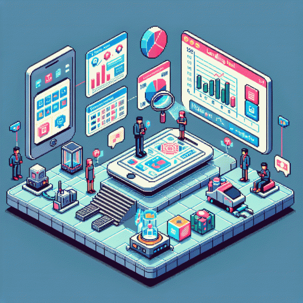
Are Landing Pages Still Necessary in 2025? Here’s the Shocking Answer (Backed by Data)
If You’re Sending Traffic to Your Homepage, Read This First
Sending paid or organic traffic straight to a homepage is like inviting people to a party and handing them a subway map — poetic but unhelpful. Homepages try to do everything: brand story, navigation, blog, careers. That dilution kills conversions. Visitors arrive with a specific task; if the page forces them to choose, many will bounce. Heatmaps and session recordings consistently show attention dispersing within seconds, so save the general hub for discovery and use focused pages for action.
Instead of dropping people on a general hub, match the landing experience to the campaign promise. Quick wins include:
- 🆓 Free: Lead magnet microsites — simple form, clear value, zero nav clutter, ideal for email capture.
- 🐢 Slow: Nurture funnels — multi-step pages that educate and qualify higher-ticket prospects.
- 🚀 Fast: Single-offer pages — one headline, one image, one CTA; built for immediate conversion and simple testing.
Make it measurable: run a clean A/B test where variation A sends to the homepage and variation B sends to a tailored page. Track micro-conversions like CTA clicks, scroll depth, and time to submit instead of only revenue. If you need inexpensive, fast traffic to validate a page before scaling, consider a targeted boost such as buy instagram followers cheap to shorten the learning loop without overcommitting ad spend.
Quick checklist before you reroute traffic: align ad copy with the page headline, remove header clutter, reduce form fields, and segment visitors by intent. Run one change at a time, measure micro and macro KPIs, and treat any winning landing page as a template to replicate. Keep experiments fast, iterate often, and let focused pages do the heavy lifting.
What’s Changed in 2025: Speed, Privacy, and AI Personalization
Welcome to the year where milliseconds, privacy rules, and clever algorithms are quietly tearing up the rulebook. Page weight that was tolerable five years ago now kills conversions, consent banners and tracking limits mean marketers cannot just spray-and-pray, and AI can flip hero images and CTAs on the fly. The upshot: landing pages remain useful, but they must be lean, respectful, and smart.
Speed is the new brand trust. Delivering an instant experience means edge caching, server-side rendering, compressed media, critical CSS inlined, and lazy-loading everything below the fold; every 100ms improvement can feel huge to a human. Want to simulate warmed traffic and iterate fast? Try get free instagram followers, likes and views as a quick traffic source for split tests — but always keep test payloads tiny and your measurement honest.
Privacy changes are not an obstacle but a design constraint that forces better UX. With third-party cookies fading, switch to first-party events, server-side tagging, hashed email matching, and contextual targeting. Use short, consent-first forms and progressive profiling as a value exchange; users respond to relevance delivered with respect, and those signals are far more durable than pixel scraps.
AI personalization is the final ingredient: dynamically assemble micro-landing slices for cohorts instead of building 50 static pages. Combine modular templates, real-time feature flags, and small experiments; pair AI suggestions with business rules so messaging never gets creepy. Prioritize load time and consent capture, optimize by server-side events, and you will have landing pages that convert in 2025 without feeling like a relic.
5 Scenarios Where a Landing Page Crushes Your Product Page
When your product page tries to be everything at once it becomes a maze. Landing pages, by contrast, are scalpel precise. They reduce decision friction, set expectations, and make one metric obvious. Below are five real world situations where a dedicated page will reliably outconvert a generic listing.
Paid acquisition and retargeting campaigns need razor focus. If you pay per click, every extra link or choice leaks conversions. For complex offers with multiple bundles, upsells, or trial options a landing page can present one clear path and pre qualify buyers before they hit the cart.
Segmentation wins demand personalization. Influencer traffic, email cohorts, or ad audiences each deserve tailored headlines, proof points, and CTAs. Seasonal and event driven promos like Black Friday or product launches benefit from urgency, countdowns, and special creative that would clutter a product catalog.
High ticket and consultative sales require lead capture and qualification flows that a product page cannot host cleanly. Landing pages are also ideal for fast A B testing of headlines, layouts, and offers without touching the core site. If you want to simulate channel bursts and validate which messaging sticks, try get free instagram followers, likes and views as a source to drive repeatable experiments.
When You Can Skip It: Seamless Paths That Still Convert
There are moments when ditching a dedicated landing page is not a sin but a smart shortcut. If your audience already knows you, the offer is tiny and the action is binary, you can funnel them straight to checkout, an app deep link, or a product page and keep conversions humming. The key is not laziness but design: one clear path, one obvious button, no detours, and copy that removes friction.
Real world triggers for skipping include authenticated email flows that carry prefilled data, retargeting ads with product level creatives, in app campaigns that open the exact screen, and SMS prompts with a direct buy link. Also think about loyalty audiences and repeat buyers who require almost zero persuasion. Before pulling the plug on a page, map the microsteps: how many taps, how many form fields, and whether any trust barrier exists. If the user can finish inside three touches, prioritize a short path and test it.
Technical and legal prerequisites matter. You need reliable tracking to attribute conversions, server side events or postbacks to avoid lost data, fast responses to keep mobile users, and clear consent handling for privacy compliance. Also make sure refunds, returns, and post purchase onboarding are operational because a smooth front door followed by chaos will tank retention. Instrument micro conversions so you know if the short path is just moving friction downstream.
When complexity creeps back in — long forms, comparison tools, high ticket objections, or SEO driven discovery — the landing page earns its keep. For experiments, use micro landing patterns: single section pages that mirror ad creative, lightweight modals that capture intent, or progressive disclosure that surfaces details only if users ask. Document decision rules so you know when to reintroduce the full page.
Start small and measure. Run a split where half your traffic sees the streamlined route and half sees the classic experience, track conversion rate plus early retention or refund signals, then iterate. If you want a ready made channel for direct to action campaigns, check fast and safe social media growth for scalable traffic options that play nicely with short funnels.
Steal These High-Impact Sections: Hero, Proof, Offer, CTA
Think like a copy thief: borrow only the parts that actually move metrics. The four heavyweight sections—hero, proof, offer, CTA—are the backbone that keeps conversions breathing, whether traffic arrives from ads, email, or a social bio. Treat each section as an experiment: version, measure, repeat.
Your hero is a 3-second audition. Lead with a benefit-driven headline (try a Benefit + Timeframe formula), follow with a micro-proofy subhead, and show a human or product image that does the heavy lifting. Make the primary CTA visible above the fold and design for thumb reach on mobile.
Proof turns promises into permission to buy. Swap vague badges for real numbers, short testimonials with full names and roles, and microcopy that preempts common objections. Consider a logo strip, a quantified result (percent or dollar), and one short case snippet that a skeptic can scan in two seconds.
Make the offer obvious and the CTA impossible to ignore: state price or trial, include a simple guarantee, and add honest scarcity if it exists. Use one clear CTA verb (Get, Start, Claim), contrast color, and duplicate the CTA at the top and bottom of the page. A/B test verbs, urgency, and button copy relentlessly.
- 🆓 Hero: One-line outcome + single supporting image.
- 🔥 Proof: 3 stats, 1 logo row, 1 short quote.
- 🚀 Offer: Price or trial + single bright CTA.